- AppSheet
- AppSheet Forum
- AppSheet Q&A
- Quickchart capabilities and displaying data with n...
- Subscribe to RSS Feed
- Mark Topic as New
- Mark Topic as Read
- Float this Topic for Current User
- Bookmark
- Subscribe
- Mute
- Printer Friendly Page
- Mark as New
- Bookmark
- Subscribe
- Mute
- Subscribe to RSS Feed
- Permalink
- Report Inappropriate Content
- Mark as New
- Bookmark
- Subscribe
- Mute
- Subscribe to RSS Feed
- Permalink
- Report Inappropriate Content
Hey guys,
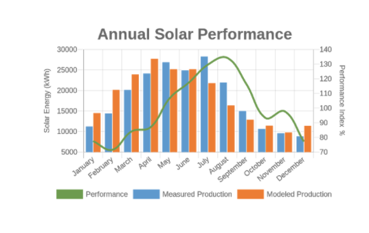
I’m really liking the new charts editor and I’m hoping they’re work to build it with multiple axes so I don’t have to use quick charts to generate this chart. Anyone know if that’s being planned?
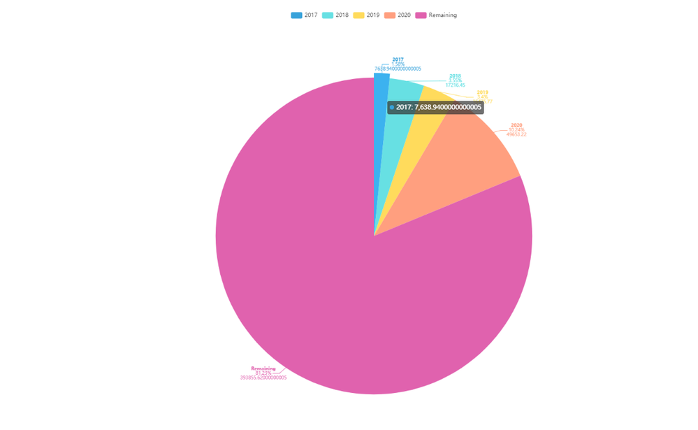
When I created a pie chart to show budget spent by year it isn’t in the price column format. Also, there are a lot of zeros in the amount, I’d like to only have 2 decimal places. Any suggestions?

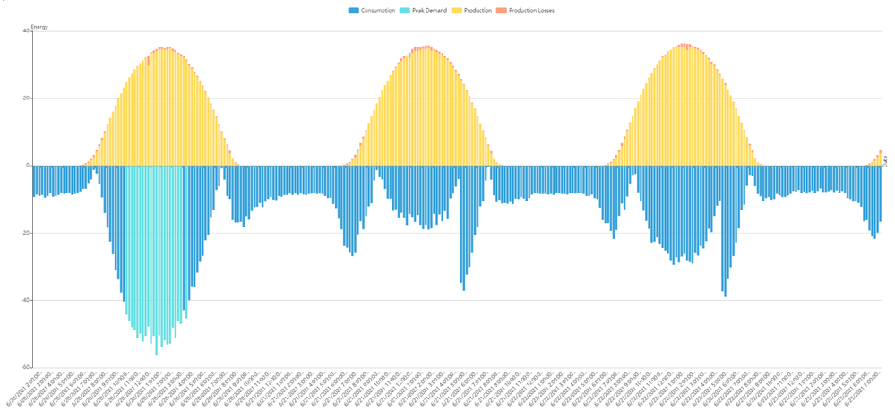
I’m trying out the idea of creating a column chart showing energy flow, there are about 3,000 rows of data per day / customer. It would be great if there were a way of displaying the day of the year as the columns to reduce the amount of data being stored, not sure what the limits are on the free account.
| Project | Date | Energy | Type |
|---|---|---|---|
| Facility 1 | 6/19/2021 8:45 | -26.75 | Consumption |
| Facility 1 | 6/19/2021 9:00 | -28.58 | Consumption |
| Facility 1 | 6/19/2021 9:15 | -33 | Consumption |
| Facility 1 | 6/19/2021 9:30 | -34.1 | Consumption |
| Facility 1 | 6/19/2021 9:45 | -37.7 | Consumption |
| Facility 1 | 6/19/2021 10:00 | -44.3 | Peak Demand |
| Facility 1 | 6/19/2021 10:15 | -48.4 | Peak Demand |
| Facility 1 | 6/19/2021 10:30 | -47.85 | Peak Demand |

Any suggestions on making the dates at the X axis shorter it all fits, it automatically changes it even though it’s a text column?
- Labels:
-
Automation
-
Data
-
UX
-
Account
1,676 -
App Management
3,098 -
AppSheet
1 -
Automation
10,319 -
Bug
982 -
Data
9,676 -
Errors
5,732 -
Expressions
11,777 -
General Miscellaneous
1 -
Google Cloud Deploy
1 -
image and text
1 -
Integrations
1,608 -
Intelligence
578 -
Introductions
85 -
Other
2,902 -
Photos
1 -
Resources
537 -
Security
827 -
Templates
1,308 -
Users
1,558 -
UX
9,109
- « Previous
- Next »
| User | Count |
|---|---|
| 39 | |
| 29 | |
| 23 | |
| 23 | |
| 13 |

 Twitter