- AppSheet
- AppSheet Forum
- AppSheet Q&A
- Slices with Group by
- Subscribe to RSS Feed
- Mark Topic as New
- Mark Topic as Read
- Float this Topic for Current User
- Bookmark
- Subscribe
- Mute
- Printer Friendly Page
- Mark as New
- Bookmark
- Subscribe
- Mute
- Subscribe to RSS Feed
- Permalink
- Report Inappropriate Content
- Mark as New
- Bookmark
- Subscribe
- Mute
- Subscribe to RSS Feed
- Permalink
- Report Inappropriate Content
As the title says, I haven’t been able to find anything like the possibility of creating slices with a Group By feature. I think this would enhance considerably the possibility to create charts without the need to do hacks or workarounds.
Consider a Sales table and the need to chart sales grouped by day / week / month.
Currently, to my understanding, this is only possible through hacks like:
- creating a query in the Sheet itself and importing it into AppSheet like a new Table;
- creating an empty table in AppSheet and creating cumbersome workflows to add records to this table when new sales are created. And make a chart on this table
Or am I missing something?
- Labels:
-
Data
- Mark as New
- Bookmark
- Subscribe
- Mute
- Subscribe to RSS Feed
- Permalink
- Report Inappropriate Content
- Mark as New
- Bookmark
- Subscribe
- Mute
- Subscribe to RSS Feed
- Permalink
- Report Inappropriate Content
I’m not clear on what you’re suggestion. Slices can already limit a data set to a particular group, and can be implemented in a way that allows the app user to choose the group.
- Mark as New
- Bookmark
- Subscribe
- Mute
- Subscribe to RSS Feed
- Permalink
- Report Inappropriate Content
- Mark as New
- Bookmark
- Subscribe
- Mute
- Subscribe to RSS Feed
- Permalink
- Report Inappropriate Content
Consider the sale table with several sales for each day. I want to chart the total revenue by day, or week or month. In the X axis I want to see the days (or weeks, or months) and in the Y axis the total revenue after grouping the sales records relevant for that day / week / month.
- Mark as New
- Bookmark
- Subscribe
- Mute
- Subscribe to RSS Feed
- Permalink
- Report Inappropriate Content
- Mark as New
- Bookmark
- Subscribe
- Mute
- Subscribe to RSS Feed
- Permalink
- Report Inappropriate Content
This would be accomplished through your slice (by limiting the data) and a chart view.
Slice formulas
Today’s Sales
DAY(TODAY()) = DAY([Sales_Date])
This Week
Weeknum(TODAY()) = WEEKNUM([Sales_Date])
This Month
Month(Today()) = Month([Sales_Date])
- Grouping is a display thing (the actual visual effect of putting a list of records under a singular heading).
- Slices are sub-sets of your tables, but they are essentially still the table (just a smaller version).
Think about (Slices) as the same thing as a table
There is a new chart builder in the works - if I’m not mistaken, it’s nearing a point of being released - it will have more fine control over how a chart looks.
- Mark as New
- Bookmark
- Subscribe
- Mute
- Subscribe to RSS Feed
- Permalink
- Report Inappropriate Content
- Mark as New
- Bookmark
- Subscribe
- Mute
- Subscribe to RSS Feed
- Permalink
- Report Inappropriate Content
Thanks for the very detailed answer!
However, unfortunately, the slices you suggest are not enough. For example, the Today’s sales you wrote is the chart point as of today. I want to chart all the history of the daily points.
This is typical chart for a BI system.
Let’s wait for the new chart builder, so.
Thanks!
- Mark as New
- Bookmark
- Subscribe
- Mute
- Subscribe to RSS Feed
- Permalink
- Report Inappropriate Content
- Mark as New
- Bookmark
- Subscribe
- Mute
- Subscribe to RSS Feed
- Permalink
- Report Inappropriate Content
I understand what you want to do, you can do it with virtual columns and grouping. but you cannot do this by slice.


- Mark as New
- Bookmark
- Subscribe
- Mute
- Subscribe to RSS Feed
- Permalink
- Report Inappropriate Content
- Mark as New
- Bookmark
- Subscribe
- Mute
- Subscribe to RSS Feed
- Permalink
- Report Inappropriate Content
@HBT we now see that you have done it (note that I was not asking how can I do it?, instead I was requesting a new feature in order to make it simpler); we see that you have done it, but you didn’t explain how.
What does it mean exactly:
- Mark as New
- Bookmark
- Subscribe
- Mute
- Subscribe to RSS Feed
- Permalink
- Report Inappropriate Content
- Mark as New
- Bookmark
- Subscribe
- Mute
- Subscribe to RSS Feed
- Permalink
- Report Inappropriate Content
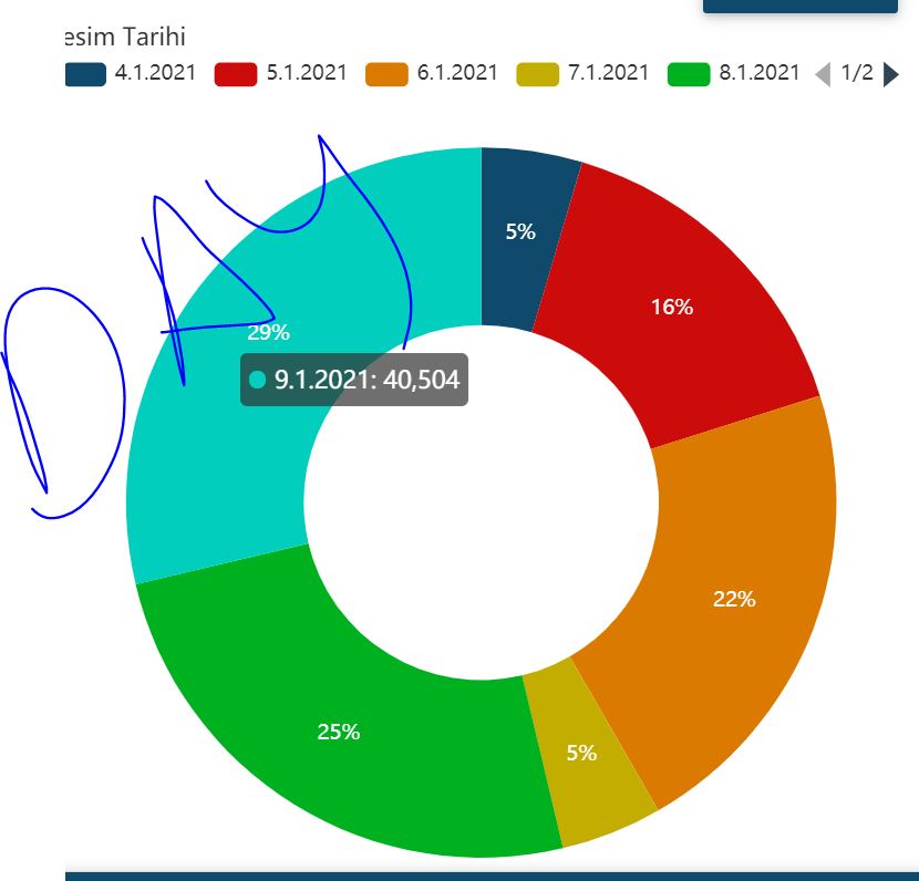
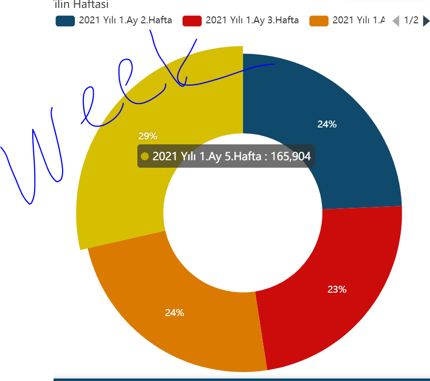
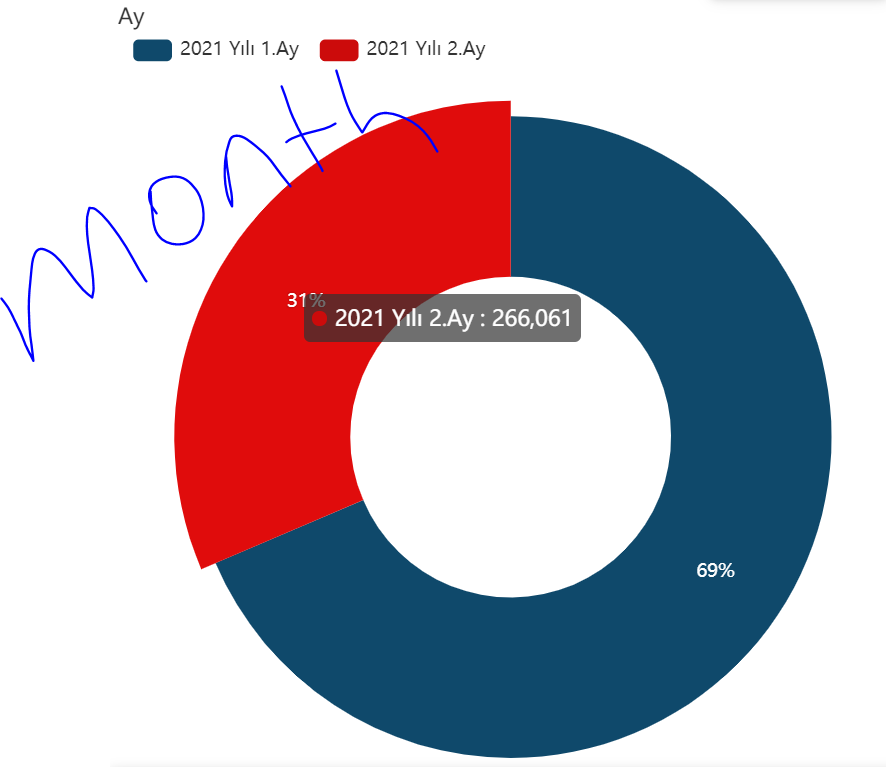
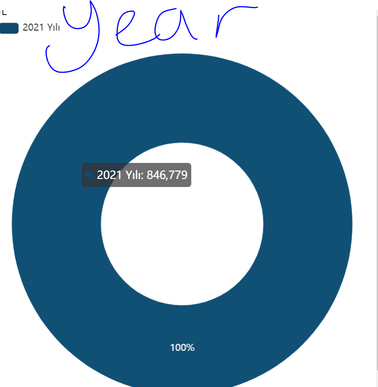
1- Add 3 virtual columns to the sales table.
[Date]: Date column in your Sales table
a- Column Name: Year
App formula: YEAR([DATE])&" Year"
b- Colomun Name: months
App formula: YEAR ([DATE]) & “Year” & Month ([DATE]) & “. Mnth”
c- Column Name: Week
App formula: YEAR ([DATE]) & “Year” & Month ([DATE]) & “. Mnth” & WEEKNUM ([DATE]) & “. Week”
2-UX-New View-
- View type: Chart
- Chart type: Histogram or Horizonatl Histogram or etc …
- Group aggregate: Sum :: Total (total column in the Sales table)
- Chart columns:
a- Year
b-Months
c-Week
d- Date (date column in the Sales Table)
e- Or others
If you follow the two steps above, you will get the result you want.
- Mark as New
- Bookmark
- Subscribe
- Mute
- Subscribe to RSS Feed
- Permalink
- Report Inappropriate Content
- Mark as New
- Bookmark
- Subscribe
- Mute
- Subscribe to RSS Feed
- Permalink
- Report Inappropriate Content
No, those type of chart are meaningless in order to show the evolution of sales. Sorry if I haven’t explicitated that, but the need is to display a chart with times (days / weeks / months) on the X-axis and sales on the Y-axis.
That’s why the only way to reach this goal is to attach the chart to a table (or slice) with no more than one record for each time frame.
As described here:
- Mark as New
- Bookmark
- Subscribe
- Mute
- Subscribe to RSS Feed
- Permalink
- Report Inappropriate Content
- Mark as New
- Bookmark
- Subscribe
- Mute
- Subscribe to RSS Feed
- Permalink
- Report Inappropriate Content
I found quite an elegant way to make it.
I created a table of Sales by Date, with 2 columns, ID and Date. Dates are unique.
In the Sales table, I added a ref column to table Sales by Date.
Whenever a new Sales record is added, an automated task adds (if missing) a new record to Sales by Date table and sets its ID to the new Sales record.
In this way, when clicking in the chart of the Daily Sales, it’s possible to navigate to the Sales contributing to get the value displayed in the chart.
- Mark as New
- Bookmark
- Subscribe
- Mute
- Subscribe to RSS Feed
- Permalink
- Report Inappropriate Content
- Mark as New
- Bookmark
- Subscribe
- Mute
- Subscribe to RSS Feed
- Permalink
- Report Inappropriate Content
I wouldn’t particularly recommend Appsheet as a BI system, Tableau or the like would be much better suited for that. Not that Appsheet can’t do it but more it’s not a purpose built BI system. As someone in BI, I just wouldn’t go through the headache.
-
Account
1,673 -
App Management
3,073 -
AppSheet
1 -
Automation
10,293 -
Bug
967 -
Data
9,657 -
Errors
5,719 -
Expressions
11,750 -
General Miscellaneous
1 -
Google Cloud Deploy
1 -
image and text
1 -
Integrations
1,599 -
Intelligence
578 -
Introductions
85 -
Other
2,882 -
Photos
1 -
Resources
535 -
Security
827 -
Templates
1,300 -
Users
1,551 -
UX
9,096
- « Previous
- Next »
| User | Count |
|---|---|
| 44 | |
| 29 | |
| 22 | |
| 20 | |
| 14 |

 Twitter