- AppSheet
- Feature Ideas
- Update Form Side-by-Side so that Lists are full wi...
- Subscribe to RSS Feed
- Mark as New
- Mark as Read
- Bookmark
- Subscribe
- Printer Friendly Page
- Report Inappropriate Content
- Mark as New
- Bookmark
- Subscribe
- Mute
- Subscribe to RSS Feed
- Permalink
- Report Inappropriate Content
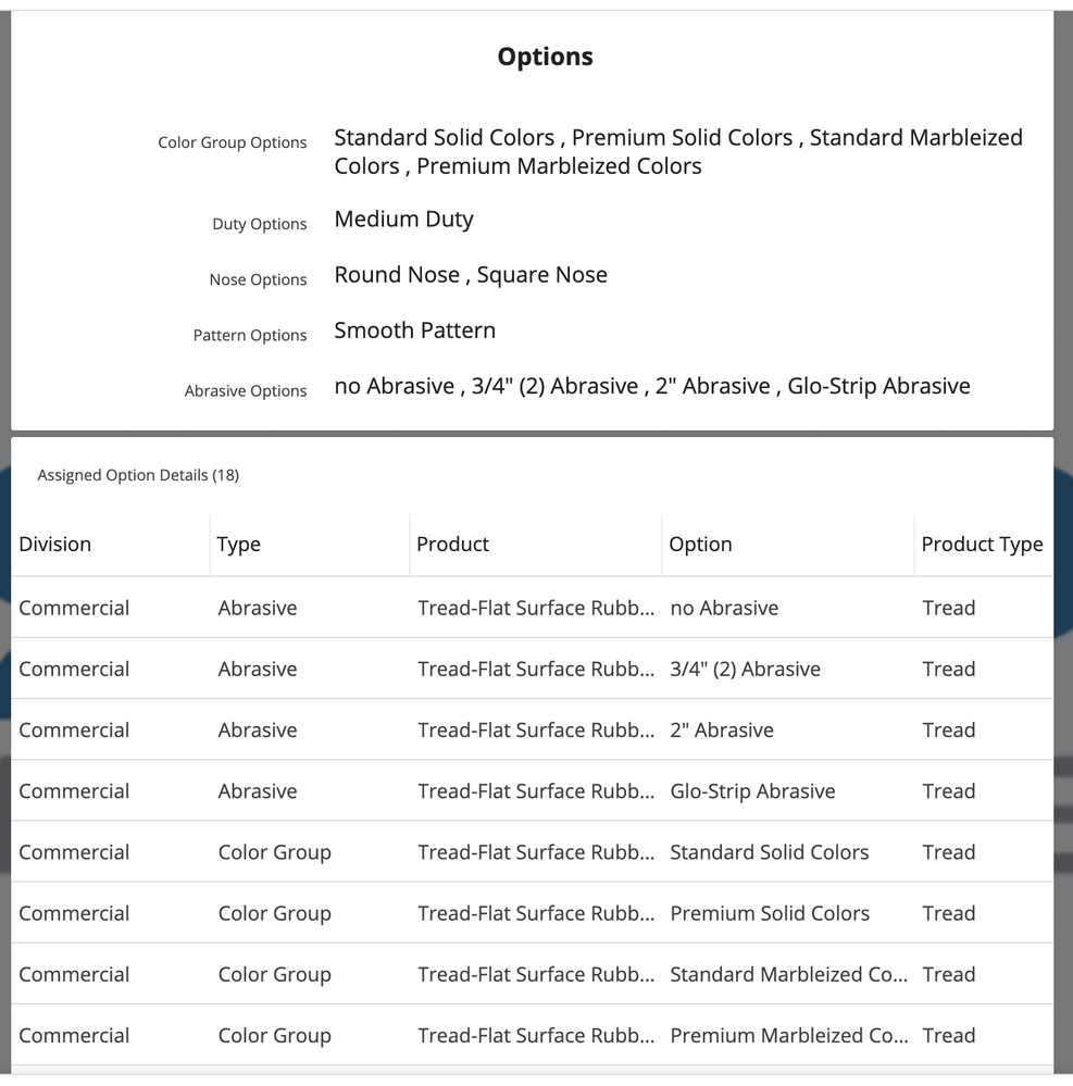
When a Detail View is set to Side-By-Side, Lists are still shown in the “normal” view with the column name on top and the inline table (and other inline view types) displayed across the full width of the panel. This creates a very nice clean look and the break between the fields and list is perfect. See image.

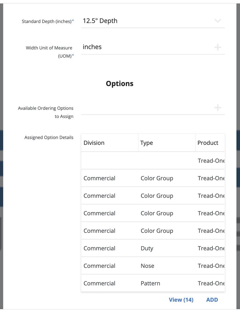
But in a Form view set Side-By-Side, the inline table is squeezed to the side. It doesn’t look natural or professional. The image below is snapped from a 27 inch monitor - as good as the view is going to get for width.

I would like to request that a Form view in side-by-side mode use the same display requirements for lists as has been done in a Detail View in side-by-side mode. It looks much better and keeps the look-and-feel consistent.

 Twitter