- AppSheet
- Release Notes & Announcements
- Announcements
- Updates to the expanding "bubble widgets" design c...
- Subscribe to RSS Feed
- Mark Topic as New
- Mark Topic as Read
- Float this Topic for Current User
- Bookmark
- Subscribe
- Mute
- Printer Friendly Page
- Mark as New
- Bookmark
- Subscribe
- Mute
- Subscribe to RSS Feed
- Permalink
- Report Inappropriate Content
- Mark as New
- Bookmark
- Subscribe
- Mute
- Subscribe to RSS Feed
- Permalink
- Report Inappropriate Content
Hey everyone!
We’ve been hearing from the community and through our UX research efforts that the expandable “bubble widgets” used in AppSheet can be problematic.

Some of the challenges we’ve heard are:
- When the content in a bubble is too long, there’s a lot of scrolling back and forth to get to the right place, and sometimes we get two scroll bars which can make scrolling very confusing. It’s also difficult to remember which item you were looking at, because the title disappears.

-
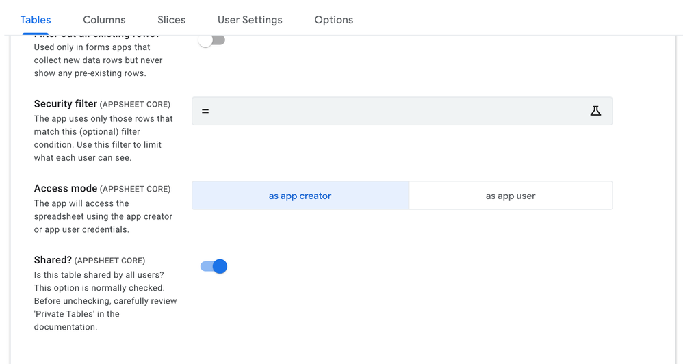
The action buttons overflow on small screens, or when the app preview is expanded.
-
Some of the text isn’t accessible, and the tab order is inconsistent/confusing.
-
Bubbles inconsistently stay expanded between tabs.
We’re considering some changes to improve this experience and we’d love to get your thoughts! We hope these changes will make it easier to move around the AppSheet editor:
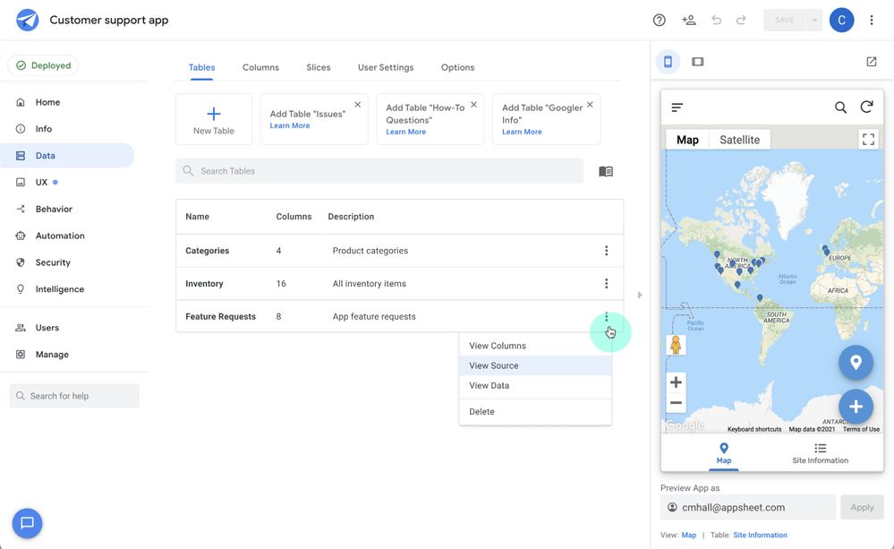
- The expandable bubble pattern will be replaced with a Material Design-inspired list. Each row will be clickable and sortable, which means for those of you with lots of tables, you’ll be able to see a lot more in the list, and quickly sort/filter them:

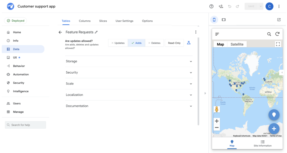
- When you click an item in the list (e.g. a table, a slice, or a view), you’ll be taken to a dedicated detail page to view and edit it. The title will be persistent/sticky here, so you’ll always know what you’re looking at.

-
All titles will be editable by clicking directly on the title:
-
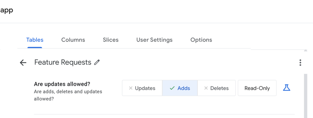
When there isn’t enough horizontal space, the buttons will collapse into an overflow menu:
-
When there is enough space, we’ll keep the buttons the way they are today:

Thanks everyone!
- Labels:
-
UX
- Mark as New
- Bookmark
- Subscribe
- Mute
- Subscribe to RSS Feed
- Permalink
- Report Inappropriate Content
- Mark as New
- Bookmark
- Subscribe
- Mute
- Subscribe to RSS Feed
- Permalink
- Report Inappropriate Content
Would be nice if you could define “bubble”. I have no idea what you’re talking about.
- Mark as New
- Bookmark
- Subscribe
- Mute
- Subscribe to RSS Feed
- Permalink
- Report Inappropriate Content
- Mark as New
- Bookmark
- Subscribe
- Mute
- Subscribe to RSS Feed
- Permalink
- Report Inappropriate Content
Thanks Steve! Looks like I missed an image in there. Edited.
- Mark as New
- Bookmark
- Subscribe
- Mute
- Subscribe to RSS Feed
- Permalink
- Report Inappropriate Content
- Mark as New
- Bookmark
- Subscribe
- Mute
- Subscribe to RSS Feed
- Permalink
- Report Inappropriate Content
I love the idea of having a dedicated detail page! For tables specifically, would we be able to click the three dots on the top to quickly go to “View Columns”, “View Source”, “View Data”, and “Delete” in the dedicated detail page or would we have to go back to the general page to have access to those actions? I assume the former, which is my preference, but I’d like some clarification.
- Mark as New
- Bookmark
- Subscribe
- Mute
- Subscribe to RSS Feed
- Permalink
- Report Inappropriate Content
- Mark as New
- Bookmark
- Subscribe
- Mute
- Subscribe to RSS Feed
- Permalink
- Report Inappropriate Content
Yep, you’ve got it – we’re looking at making sure common actions are available everywhere it makes sense, via the “more” ••• menu.
- Mark as New
- Bookmark
- Subscribe
- Mute
- Subscribe to RSS Feed
- Permalink
- Report Inappropriate Content
- Mark as New
- Bookmark
- Subscribe
- Mute
- Subscribe to RSS Feed
- Permalink
- Report Inappropriate Content
I appreciate this change, thanks for the hard work!
- Mark as New
- Bookmark
- Subscribe
- Mute
- Subscribe to RSS Feed
- Permalink
- Report Inappropriate Content
- Mark as New
- Bookmark
- Subscribe
- Mute
- Subscribe to RSS Feed
- Permalink
- Report Inappropriate Content
to make certain we are all clear, these changes will only impact the Editor. Correct?
- Mark as New
- Bookmark
- Subscribe
- Mute
- Subscribe to RSS Feed
- Permalink
- Report Inappropriate Content
- Mark as New
- Bookmark
- Subscribe
- Mute
- Subscribe to RSS Feed
- Permalink
- Report Inappropriate Content
Yep, that’s right. Only places where we have the expandable “bubbles” in the editor.
- Mark as New
- Bookmark
- Subscribe
- Mute
- Subscribe to RSS Feed
- Permalink
- Report Inappropriate Content
- Mark as New
- Bookmark
- Subscribe
- Mute
- Subscribe to RSS Feed
- Permalink
- Report Inappropriate Content
Once it turns to be list type view, instead of listed bubbles (more precisely we call Card?) , it is natural we expect that we can “sort” the list, explicitely either ascn/descn.
Furthermore, we wish to have capability to change the order as we wish arbitrarily.
This is because it could be useful we place the most frequently working tables on the top of the list for quick and easy access.
- Mark as New
- Bookmark
- Subscribe
- Mute
- Subscribe to RSS Feed
- Permalink
- Report Inappropriate Content
- Mark as New
- Bookmark
- Subscribe
- Mute
- Subscribe to RSS Feed
- Permalink
- Report Inappropriate Content
This update sounds good.
![]() @Brandon_S This would also be a welcome change. I’m fairly certain there’s an existing feature request.
@Brandon_S This would also be a welcome change. I’m fairly certain there’s an existing feature request.
- Mark as New
- Bookmark
- Subscribe
- Mute
- Subscribe to RSS Feed
- Permalink
- Report Inappropriate Content
- Mark as New
- Bookmark
- Subscribe
- Mute
- Subscribe to RSS Feed
- Permalink
- Report Inappropriate Content
Just a “draggable” type of experiences, to move the item (table) up and down to sort as we want!
And then this user oriented manual sort states will be saved rather than short-live for that session.
- Mark as New
- Bookmark
- Subscribe
- Mute
- Subscribe to RSS Feed
- Permalink
- Report Inappropriate Content
- Mark as New
- Bookmark
- Subscribe
- Mute
- Subscribe to RSS Feed
- Permalink
- Report Inappropriate Content
Here is the Feature Request.
- Mark as New
- Bookmark
- Subscribe
- Mute
- Subscribe to RSS Feed
- Permalink
- Report Inappropriate Content
- Mark as New
- Bookmark
- Subscribe
- Mute
- Subscribe to RSS Feed
- Permalink
- Report Inappropriate Content
We’re for sure making these sortable! Adding a “recently modified” column comes with some extra complications, so we’ll be looking into it.
- Mark as New
- Bookmark
- Subscribe
- Mute
- Subscribe to RSS Feed
- Permalink
- Report Inappropriate Content
- Mark as New
- Bookmark
- Subscribe
- Mute
- Subscribe to RSS Feed
- Permalink
- Report Inappropriate Content
![]() !!
!!
- Mark as New
- Bookmark
- Subscribe
- Mute
- Subscribe to RSS Feed
- Permalink
- Report Inappropriate Content
- Mark as New
- Bookmark
- Subscribe
- Mute
- Subscribe to RSS Feed
- Permalink
- Report Inappropriate Content
Another question is is thsi planed across the apps for other areas?
Apply to Column, Slice tabs?
Actions, VIew settings as well?
- Mark as New
- Bookmark
- Subscribe
- Mute
- Subscribe to RSS Feed
- Permalink
- Report Inappropriate Content
- Mark as New
- Bookmark
- Subscribe
- Mute
- Subscribe to RSS Feed
- Permalink
- Report Inappropriate Content
Yes, this will apply everywhere we use these bubbles, where there is an n number of possible items in a list (Tables, Slices, Columns, Views, Security Filters, etc.).
- Mark as New
- Bookmark
- Subscribe
- Mute
- Subscribe to RSS Feed
- Permalink
- Report Inappropriate Content
- Mark as New
- Bookmark
- Subscribe
- Mute
- Subscribe to RSS Feed
- Permalink
- Report Inappropriate Content
I can’t wait for this. Hope to see the changes soon.
-
Account
3 -
Announcements
30 -
App Management
8 -
Automation
30 -
Data
31 -
Errors
17 -
Expressions
21 -
Integrations
24 -
Intelligence
5 -
Other
15 -
Resources
15 -
Security
5 -
Templates
13 -
Users
7 -
UX
34

 Twitter