- AppSheet
- Release Notes & Announcements
- Announcements
- Visual updates to Gallery view
- Subscribe to RSS Feed
- Mark Topic as New
- Mark Topic as Read
- Float this Topic for Current User
- Bookmark
- Subscribe
- Mute
- Printer Friendly Page
- Mark as New
- Bookmark
- Subscribe
- Mute
- Subscribe to RSS Feed
- Permalink
- Report Inappropriate Content
- Mark as New
- Bookmark
- Subscribe
- Mute
- Subscribe to RSS Feed
- Permalink
- Report Inappropriate Content
There’s some small fixes coming to Gallery view.
- These are visual changes to the app; no editor changes.
1. Consistent spacing w/ responsive sizing
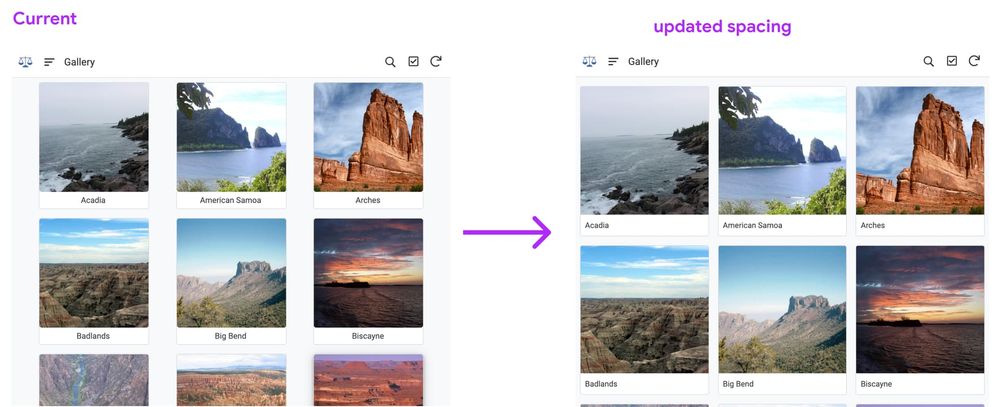
- We’ve had an issue with uneven spacing for a while now. It results in some viewports as rendering with some large gutters between columns (or none at all, and images are jam packed like sardines).
We’re fixing that to get more even spacing and structure:
2. Bottom row left alignment
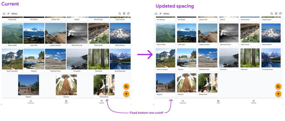
- This means the last incomplete row aligns to the left.
- This, along with left text alignment (see below) allows for an orderly visual scan of the labels and images.
- We’ve also fixed a bug in which the last row is wedged underneath the bottom appbar in some cases:
- This means images are more expansive, and can grow to fit many more viewport sizes evenly.
2. Bug: border round corner at bottom of image
- Some may have noticed the bottom corners of the image picking of a rounded border in small and tiny sizes. That should be fixed.
3. Bug: title padding and margin squeezed out in certain viewport sizes
- In some configurations, the title was squeezed up against the edge of the image and title boundary.
4. Text alignment change: left-alignment
- Along with a more structured gallery, we’re left aligning the title text.
- This allows the eye to quickly scan up and down, and provides a stable position for the titles in the image card. This is helpful in circumstances where there’s wide variance in label length across images.
5. Font size change: ‘tiny’ image size with smaller text
- We’ve reduced the font size default in tiny size to 12px equivalent, which is a little more than 1px smaller. Since tiny images have smaller containers, it sizes down slightly with this form factor.
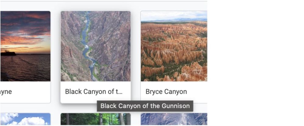
6. Tooltips on hover (desktop)
- For titles that extend, we have truncation, and on hover, it will reveal the full title:
- Labels:
-
UX
- Mark as New
- Bookmark
- Subscribe
- Mute
- Subscribe to RSS Feed
- Permalink
- Report Inappropriate Content
- Mark as New
- Bookmark
- Subscribe
- Mute
- Subscribe to RSS Feed
- Permalink
- Report Inappropriate Content
Congratulations! It´s beatiful.
- Mark as New
- Bookmark
- Subscribe
- Mute
- Subscribe to RSS Feed
- Permalink
- Report Inappropriate Content
- Mark as New
- Bookmark
- Subscribe
- Mute
- Subscribe to RSS Feed
- Permalink
- Report Inappropriate Content
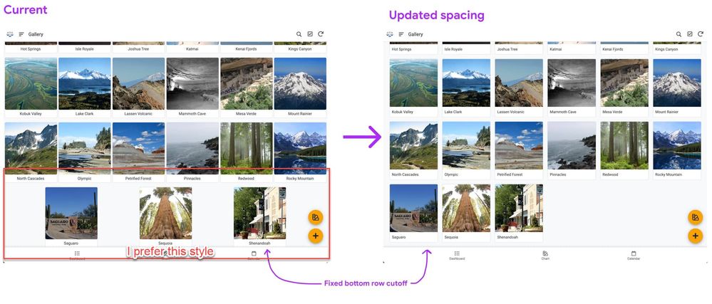
In terms of aignment for the items, I prefer the old style, i.e. items were centered horizontally, rather than left aligned all of them.
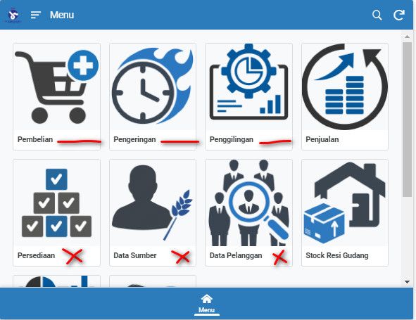
For instance, we are using the gallery view for view navigation menus, sometimes, and we just have few items, like three or four.
It used to be displayed in the middle of sreeen, which was perfect.
But now small chunk of cards are pushed into the upper left corner… Not user friendly.
I assume AppSheet should have been using Flexbox CSS to control the alignment.
I preferr the center alighnment with the evenly spread the space, which was old style.
- Mark as New
- Bookmark
- Subscribe
- Mute
- Subscribe to RSS Feed
- Permalink
- Report Inappropriate Content
- Mark as New
- Bookmark
- Subscribe
- Mute
- Subscribe to RSS Feed
- Permalink
- Report Inappropriate Content
I Agree with u
it’s not good, and Not user friendly
- Mark as New
- Bookmark
- Subscribe
- Mute
- Subscribe to RSS Feed
- Permalink
- Report Inappropriate Content
- Mark as New
- Bookmark
- Subscribe
- Mute
- Subscribe to RSS Feed
- Permalink
- Report Inappropriate Content
Hi Koichi,
Just to be clear, you preferred when the tiles were centered, but were you ok with the spacing when you had 2 or 3 tiles on the last row?
- Mark as New
- Bookmark
- Subscribe
- Mute
- Subscribe to RSS Feed
- Permalink
- Report Inappropriate Content
- Mark as New
- Bookmark
- Subscribe
- Mute
- Subscribe to RSS Feed
- Permalink
- Report Inappropriate Content
hi @Arthur_Rallu
Short answer is yes to your question.
- Mark as New
- Bookmark
- Subscribe
- Mute
- Subscribe to RSS Feed
- Permalink
- Report Inappropriate Content
- Mark as New
- Bookmark
- Subscribe
- Mute
- Subscribe to RSS Feed
- Permalink
- Report Inappropriate Content
If possible please add an option for user to choose the alignment for the image and text.
- Mark as New
- Bookmark
- Subscribe
- Mute
- Subscribe to RSS Feed
- Permalink
- Report Inappropriate Content
- Mark as New
- Bookmark
- Subscribe
- Mute
- Subscribe to RSS Feed
- Permalink
- Report Inappropriate Content
I agree! My whole team is pissed at me
- Mark as New
- Bookmark
- Subscribe
- Mute
- Subscribe to RSS Feed
- Permalink
- Report Inappropriate Content
- Mark as New
- Bookmark
- Subscribe
- Mute
- Subscribe to RSS Feed
- Permalink
- Report Inappropriate Content
I Agree with you.
Hi Team Dev, Please reture last version. Thanks
- Mark as New
- Bookmark
- Subscribe
- Mute
- Subscribe to RSS Feed
- Permalink
- Report Inappropriate Content
- Mark as New
- Bookmark
- Subscribe
- Mute
- Subscribe to RSS Feed
- Permalink
- Report Inappropriate Content
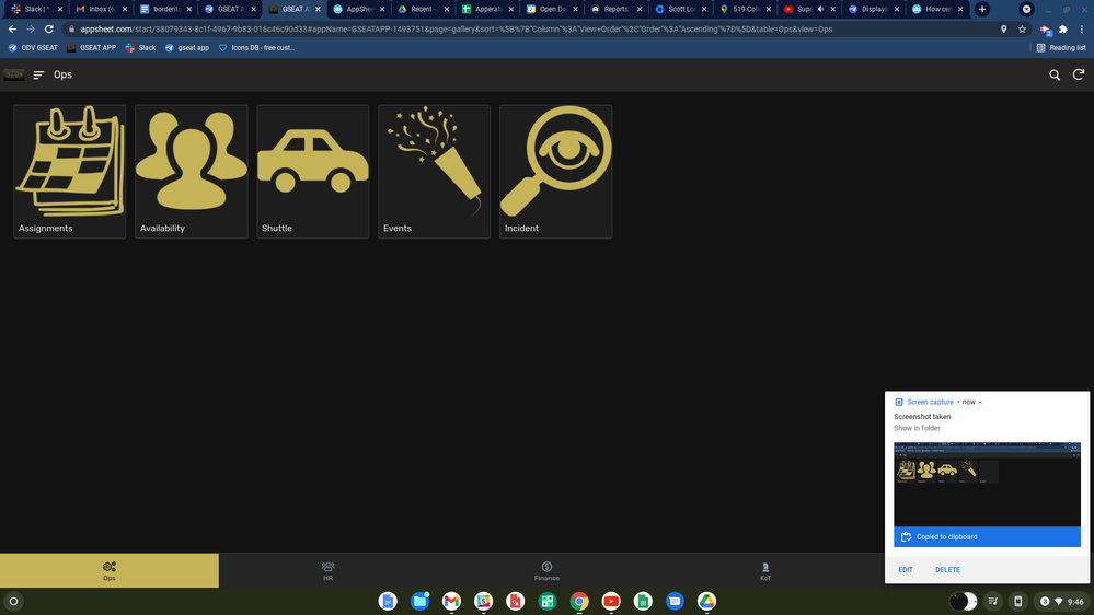
I completely agree with @tsuji_koichi on this.
In terms of Alignment, the Old style looked much better and user-friendly.
In almost 90% of my apps, I use Gallery for creating navigation menus for different views.
If there are only 3-4 icons on the screen it looks bad. Earlier it used to center itself and looked pleasing to the eyes.
Please please at least allow us to select the alignment. I strongly believe app creators should be given a choice whether we want to include the new features in the existing apps. Most of the apps were working great and now again we might need to change how the app looks because of these UI updates.
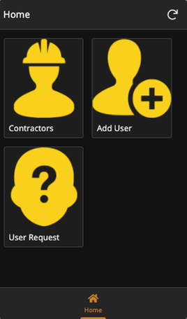
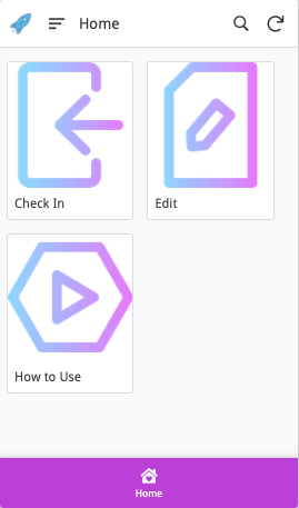
For ex - See the attached screenshots and please try to think from a customer perspective. It looks bad. Earlier everything was center-aligned and looked great.
I really hope we will be provided some solution to this. Either allow us to select the alignment or give us a choice to opt in to the new UI features.
- Mark as New
- Bookmark
- Subscribe
- Mute
- Subscribe to RSS Feed
- Permalink
- Report Inappropriate Content
- Mark as New
- Bookmark
- Subscribe
- Mute
- Subscribe to RSS Feed
- Permalink
- Report Inappropriate Content
I echor you.
Now new gallery view styling and appearance is getting more closer to what we see in card view…
We are losing the uniqueness in terms of gallery view styling which we used to have before.
New gallery view styling can be imitated by card view to get similar results, which is posing a question to me why we have specifically gallery view… while we lose the beauties we used to have
- Mark as New
- Bookmark
- Subscribe
- Mute
- Subscribe to RSS Feed
- Permalink
- Report Inappropriate Content
- Mark as New
- Bookmark
- Subscribe
- Mute
- Subscribe to RSS Feed
- Permalink
- Report Inappropriate Content
I believe this update has affected most of the applications with the navigation menu as you mentioned. I hope it rolls back soon. This is not at all user-friendly.
- Mark as New
- Bookmark
- Subscribe
- Mute
- Subscribe to RSS Feed
- Permalink
- Report Inappropriate Content
- Mark as New
- Bookmark
- Subscribe
- Mute
- Subscribe to RSS Feed
- Permalink
- Report Inappropriate Content
Yes. I thought my browser error.
- Mark as New
- Bookmark
- Subscribe
- Mute
- Subscribe to RSS Feed
- Permalink
- Report Inappropriate Content
- Mark as New
- Bookmark
- Subscribe
- Mute
- Subscribe to RSS Feed
- Permalink
- Report Inappropriate Content
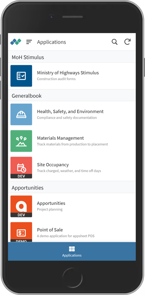
From my standpoint, more choice in app layout is always better… But if I were forced to chose between the new Gallery style vs old, I much prefer the newer style for photo gallery as well as navigation menus… just my 2¢.
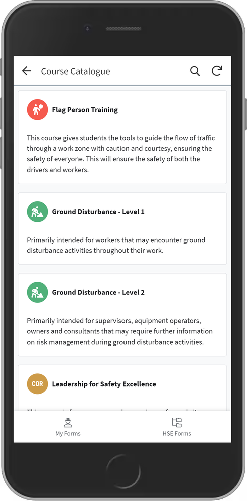
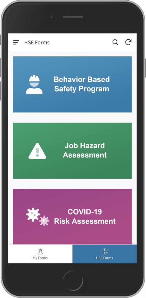
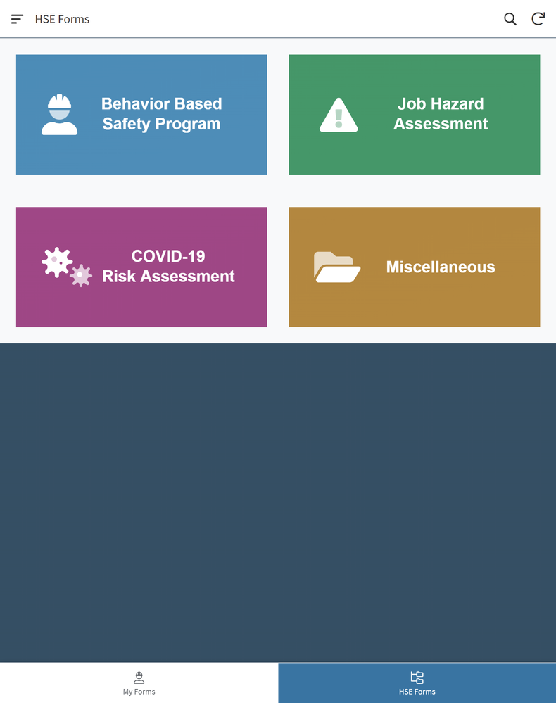
I used to use gallery for navigation menus, but I have found card a much more flexible + visually appealing option since their addition… For example:
- Mark as New
- Bookmark
- Subscribe
- Mute
- Subscribe to RSS Feed
- Permalink
- Report Inappropriate Content
- Mark as New
- Bookmark
- Subscribe
- Mute
- Subscribe to RSS Feed
- Permalink
- Report Inappropriate Content
Dear AppSheet Team, Please roll back this change or ideally give us the option to set the position of the label in the UX designer. While choosing the view our team very carefully considered the wording of our gallery labels to suit the layout. Sadly with this update they no longer look aesthetically pleasing. May we also have a borderless image option back (No harm in trying).
- Mark as New
- Bookmark
- Subscribe
- Mute
- Subscribe to RSS Feed
- Permalink
- Report Inappropriate Content
- Mark as New
- Bookmark
- Subscribe
- Mute
- Subscribe to RSS Feed
- Permalink
- Report Inappropriate Content
God damn it. Another update with no option to choose to go back to old style/format. It’s exactly like 2 years ago when they changed the theme/brand color scheme. It’s so frustrating i wanna scream. Visual changes are really sensitive when you have no options to choose from. My navigation menu looks… not so good. It was better.
- Mark as New
- Bookmark
- Subscribe
- Mute
- Subscribe to RSS Feed
- Permalink
- Report Inappropriate Content
- Mark as New
- Bookmark
- Subscribe
- Mute
- Subscribe to RSS Feed
- Permalink
- Report Inappropriate Content
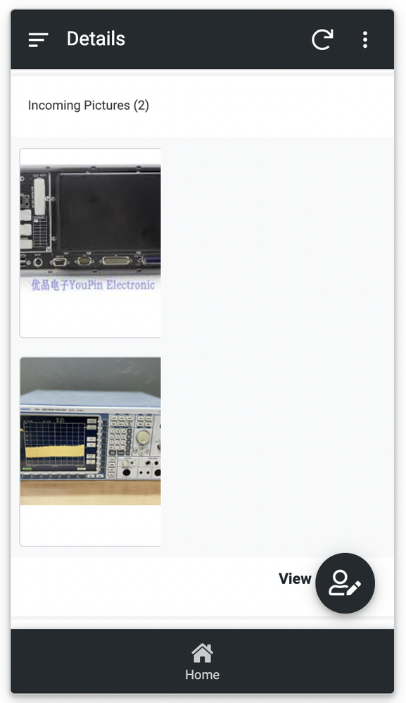
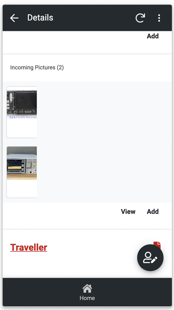
I am not sure if this is intended or a bug but it looks really bad.
- Mark as New
- Bookmark
- Subscribe
- Mute
- Subscribe to RSS Feed
- Permalink
- Report Inappropriate Content
- Mark as New
- Bookmark
- Subscribe
- Mute
- Subscribe to RSS Feed
- Permalink
- Report Inappropriate Content
definitely a bug. Reported…
- Mark as New
- Bookmark
- Subscribe
- Mute
- Subscribe to RSS Feed
- Permalink
- Report Inappropriate Content
- Mark as New
- Bookmark
- Subscribe
- Mute
- Subscribe to RSS Feed
- Permalink
- Report Inappropriate Content
Hi,
Can you please shed some light on whether we will be given an option to roll back to old gallery view? Or to at least adjust the alignment?
I have made detailed comment above to explain my issues.
Thank you.
- Mark as New
- Bookmark
- Subscribe
- Mute
- Subscribe to RSS Feed
- Permalink
- Report Inappropriate Content
- Mark as New
- Bookmark
- Subscribe
- Mute
- Subscribe to RSS Feed
- Permalink
- Report Inappropriate Content
My menu now looks very bad!
- Mark as New
- Bookmark
- Subscribe
- Mute
- Subscribe to RSS Feed
- Permalink
- Report Inappropriate Content
- Mark as New
- Bookmark
- Subscribe
- Mute
- Subscribe to RSS Feed
- Permalink
- Report Inappropriate Content
I prefer old style for gallery views, and wondering if grouping is getting avaiable for gallery view.
Gallery view is one of list type views, but also it is one one view where grouping is not available, not sure why.
- Mark as New
- Bookmark
- Subscribe
- Mute
- Subscribe to RSS Feed
- Permalink
- Report Inappropriate Content
- Mark as New
- Bookmark
- Subscribe
- Mute
- Subscribe to RSS Feed
- Permalink
- Report Inappropriate Content
@tsuji_koichi Gallery view has been fairly limited, and it makes sense that we allow group by, especially as it applies to other card-like views, especially with large amounts of images. That has been noted.
Another thing about gallery view, is that it’s often being used for dual purposes: a high volume ‘photo album’ style layout, and also as a low volume ‘launcher’ style component, with core actions, similar to what is seen on a lot of homepages, where it launches the user to a focused set of different tasks and locations. The launcher kind of UI lends itself to a more compact limited grid, as there’s usually only 3-10 core actions, often represented by just an icon and a label. This is the other use case we have been thinking about, especially as we start some efforts on desktop viewports as well.
- Mark as New
- Bookmark
- Subscribe
- Mute
- Subscribe to RSS Feed
- Permalink
- Report Inappropriate Content
- Mark as New
- Bookmark
- Subscribe
- Mute
- Subscribe to RSS Feed
- Permalink
- Report Inappropriate Content
It might be worth noting that AppSheet itself uses (used?) the gallery view for at least the launcher sample app, and likely in other sample apps. This approach absolutely originated with AppSheet.
- Mark as New
- Bookmark
- Subscribe
- Mute
- Subscribe to RSS Feed
- Permalink
- Report Inappropriate Content
- Mark as New
- Bookmark
- Subscribe
- Mute
- Subscribe to RSS Feed
- Permalink
- Report Inappropriate Content
@Mike_Moss I don’t want to sound rude but I don’t see a way in wich AppSheet is better than other alternatives as a ‘photo album’ solution. Personally I’m using the Gallery view just for ‘launcher’ style wich is advice by AppSheet as @Steve said.
I like the fact that you are always working hard in order to give a better UX, but I think you need more insights from the other teams to better understand how this kind of changes would impact users. Maybe even applying UX changes just after user feedback. I’m just giving my opinion, maybe you have statistics about the gallery view usage or something like that. I’m having the same problems others have said, and also think that options is the best way of introducing things
- Mark as New
- Bookmark
- Subscribe
- Mute
- Subscribe to RSS Feed
- Permalink
- Report Inappropriate Content
- Mark as New
- Bookmark
- Subscribe
- Mute
- Subscribe to RSS Feed
- Permalink
- Report Inappropriate Content
Thanks everyone for the feedback on this.
It’s pretty clear app creators have been using the Gallery View for different purposes. As Mike mentioned, there are at least 2 clear use cases: a gallery with a high-volume of images and some sort of portal to different views or apps (with usually a smaller number of options).
Some of you do not like the new UI for the second use case, primarily because of the left-alignment of the tiles and the left-alignment of the text within each tile. When there are less tiles, it’s not as important for the eye to be able to quickly scan the tiles - one of the benefits of the new UI.
We’ll work on enabling this use case and get back to you after. Note that the solution will not let app creators control each of these settings (text alignment, tile alignment, spacing between tiles, padding, etc) independently. While we understand that some of you would like to have that kind of customization flexibility, our aim is to provide a cohesive UI that works well, that is more easily maintainable, and that gets app creators to a working app as quickly as possible.
- Mark as New
- Bookmark
- Subscribe
- Mute
- Subscribe to RSS Feed
- Permalink
- Report Inappropriate Content
- Mark as New
- Bookmark
- Subscribe
- Mute
- Subscribe to RSS Feed
- Permalink
- Report Inappropriate Content
Here´s my vote also to go back to center the text under the icons in Gallery View!
Thanks @Arthur_Rallu for hearing us out, and look for a solution.
- Mark as New
- Bookmark
- Subscribe
- Mute
- Subscribe to RSS Feed
- Permalink
- Report Inappropriate Content
- Mark as New
- Bookmark
- Subscribe
- Mute
- Subscribe to RSS Feed
- Permalink
- Report Inappropriate Content
A hide text option Too.
- Mark as New
- Bookmark
- Subscribe
- Mute
- Subscribe to RSS Feed
- Permalink
- Report Inappropriate Content
- Mark as New
- Bookmark
- Subscribe
- Mute
- Subscribe to RSS Feed
- Permalink
- Report Inappropriate Content
Totally agree. New visual style is not visually pleasing. When I first notice it, I did not know it was done intentionally by Appsheet. I thought something went wrong with it. Spent quite a bit of time trying to see if I can fix it, but unable to find anyway to do it. Now I know why after I saw this announcement.
I think while it is good that it solve one problem, but it causes another problem. Preferably, the change should fix both problems, but if it can only fix one, I prefer to keep the old visual where it was centered.
If possible, have an option for which style the user will like to choose. Hope it can be rolled back asap.
Thanks.
- Mark as New
- Bookmark
- Subscribe
- Mute
- Subscribe to RSS Feed
- Permalink
- Report Inappropriate Content
- Mark as New
- Bookmark
- Subscribe
- Mute
- Subscribe to RSS Feed
- Permalink
- Report Inappropriate Content
User should be given an option to choose the alignments.
- Mark as New
- Bookmark
- Subscribe
- Mute
- Subscribe to RSS Feed
- Permalink
- Report Inappropriate Content
- Mark as New
- Bookmark
- Subscribe
- Mute
- Subscribe to RSS Feed
- Permalink
- Report Inappropriate Content
The “About” page still looks ugly left aligned as well.
- Mark as New
- Bookmark
- Subscribe
- Mute
- Subscribe to RSS Feed
- Permalink
- Report Inappropriate Content
- Mark as New
- Bookmark
- Subscribe
- Mute
- Subscribe to RSS Feed
- Permalink
- Report Inappropriate Content
Updates on use cases
To recap a comment I discussed w/ Koichi: There’s two patterns we see people using the Gallery view for. Here’s a peek about our thinking on this.
1. The Image gallery pattern
We have the photo style, expansive gallery. That’s the primary changes I showed at the top of the post. It’s suitable for high cardinality, image based browsing: comparing, choosing, etc.
Now, I want to discuss the second use case I mentioned: that of a Launcher style UI.
2. The Launcher pattern
For the launcher use case, we tend to see destinations or core actions, often expressed as an icon, with a brief text label (similar to a phone home screen). It’s ‘go somewhere’ or 'do something’.
Even before the changes to gallery view, we don’t think that a launcher UI grid has to span all the way across a large viewport.
Let’s illustrate a difference: You have 8 or so base destinations or processes.
(Launcher UI patterns tend to be lower cardinality than image galleries)
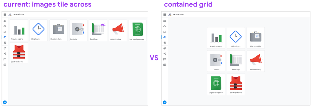
Layout: a unified grid (tablet / desktop)
On mobile, this won’t really be different. Items will be placed at the top, and there’s only room for a few columns max. Space is always the constraint. Items are naturally packed together.
It’s tablets and desktop where it renders a bit different. Our goal is a contained grid-like structure that doesn’t stretch too far across the viewport, and maintains structure. We want to avoid the bottom row with just one or two dangling items. Here’s a sketch:
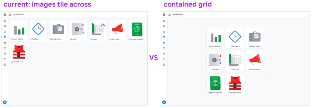
Determining the columns to rows balance is something we’re working towards; this is a heads up.
Image / icon sizing
Another change we want is for your icons to have some whitespace around them. Currently, since the image is automatically set to ‘fill’ the card, we see a lot of apps where icons have little to no space and bleed to the edges:
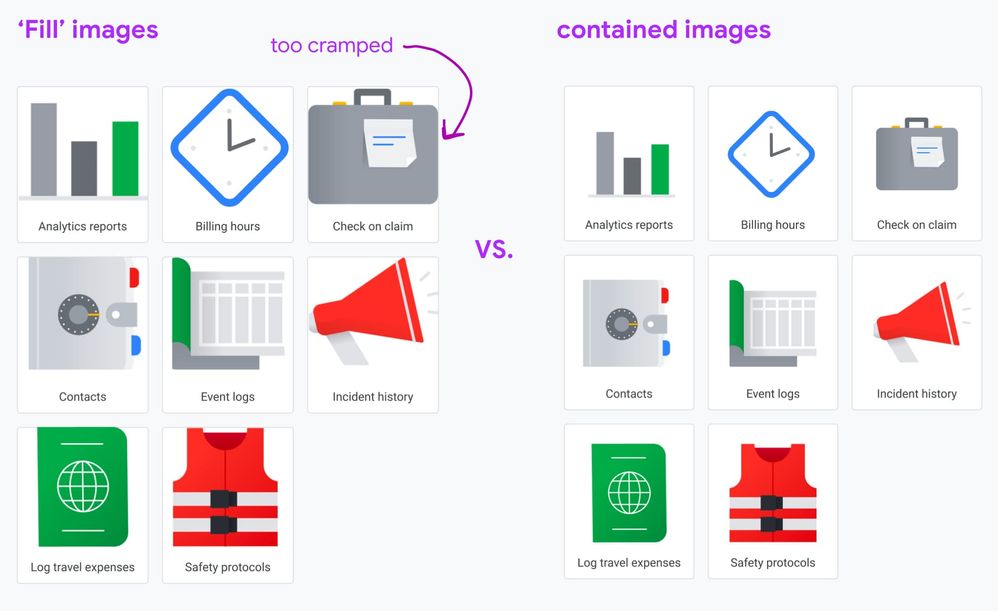
We’re planning on having a way where we can fit the images. We want to cut down on some of the slicing and dicing work you’d have to do so icons fit in a balanced way.
Stay tuned for more…
- Mark as New
- Bookmark
- Subscribe
- Mute
- Subscribe to RSS Feed
- Permalink
- Report Inappropriate Content
- Mark as New
- Bookmark
- Subscribe
- Mute
- Subscribe to RSS Feed
- Permalink
- Report Inappropriate Content
This is great.
For the text at the bottom on each tile, we prefer to be center aligne, I reckon this is also taken into account for the upgrade, thank you for listening to our voice!
- Mark as New
- Bookmark
- Subscribe
- Mute
- Subscribe to RSS Feed
- Permalink
- Report Inappropriate Content
- Mark as New
- Bookmark
- Subscribe
- Mute
- Subscribe to RSS Feed
- Permalink
- Report Inappropriate Content
Very Nice…thank you for listening to our voice ![]()
- Mark as New
- Bookmark
- Subscribe
- Mute
- Subscribe to RSS Feed
- Permalink
- Report Inappropriate Content
- Mark as New
- Bookmark
- Subscribe
- Mute
- Subscribe to RSS Feed
- Permalink
- Report Inappropriate Content
Great. I’m sure this changes will make our user’s experience better
- Mark as New
- Bookmark
- Subscribe
- Mute
- Subscribe to RSS Feed
- Permalink
- Report Inappropriate Content
- Mark as New
- Bookmark
- Subscribe
- Mute
- Subscribe to RSS Feed
- Permalink
- Report Inappropriate Content
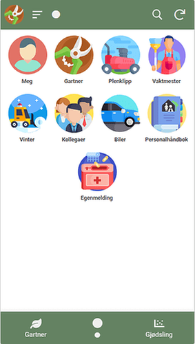
Before my menu gallery was this:
Now it is like:
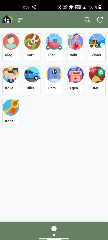
Hey wait… what is that sidemenu? It looks awesome. ![]() And how do I make it like that?
And how do I make it like that?
- Mark as New
- Bookmark
- Subscribe
- Mute
- Subscribe to RSS Feed
- Permalink
- Report Inappropriate Content
- Mark as New
- Bookmark
- Subscribe
- Mute
- Subscribe to RSS Feed
- Permalink
- Report Inappropriate Content
- Mark as New
- Bookmark
- Subscribe
- Mute
- Subscribe to RSS Feed
- Permalink
- Report Inappropriate Content
- Mark as New
- Bookmark
- Subscribe
- Mute
- Subscribe to RSS Feed
- Permalink
- Report Inappropriate Content
Hi @Mike_Moss have you seen this post?
- Mark as New
- Bookmark
- Subscribe
- Mute
- Subscribe to RSS Feed
- Permalink
- Report Inappropriate Content
- Mark as New
- Bookmark
- Subscribe
- Mute
- Subscribe to RSS Feed
- Permalink
- Report Inappropriate Content
@Mike_Moss Are there any updates here?
- Mark as New
- Bookmark
- Subscribe
- Mute
- Subscribe to RSS Feed
- Permalink
- Report Inappropriate Content
- Mark as New
- Bookmark
- Subscribe
- Mute
- Subscribe to RSS Feed
- Permalink
- Report Inappropriate Content
There it goes another good feature deleted in pro of a “we think this is better” change.
I don’t understand why this as well as the Range slider was changed without any feedback before any rollout.
This is so stupid… I’m sorry but any time I see my App Launcher I remember that we do not own our apps 100%, I’m kinda scared about the changes that are coming to us in the future if they are going to be implemented as wrongly as these ones
- Mark as New
- Bookmark
- Subscribe
- Mute
- Subscribe to RSS Feed
- Permalink
- Report Inappropriate Content
- Mark as New
- Bookmark
- Subscribe
- Mute
- Subscribe to RSS Feed
- Permalink
- Report Inappropriate Content
I think that we can just expect that this will never be fixed to our real needs
-
Account
3 -
Announcements
30 -
App Management
8 -
Automation
30 -
Data
31 -
Errors
17 -
Expressions
21 -
Integrations
24 -
Intelligence
5 -
Other
15 -
Resources
15 -
Security
5 -
Templates
13 -
Users
7 -
UX
34

 Twitter