- AppSheet
- Release Notes & Announcements
- Announcements
- Re: In Preview: New UI design for desktop users
- Subscribe to RSS Feed
- Mark Topic as New
- Mark Topic as Read
- Float this Topic for Current User
- Bookmark
- Subscribe
- Mute
- Printer Friendly Page
- Mark as New
- Bookmark
- Subscribe
- Mute
- Subscribe to RSS Feed
- Permalink
- Report Inappropriate Content
- Mark as New
- Bookmark
- Subscribe
- Mute
- Subscribe to RSS Feed
- Permalink
- Report Inappropriate Content
Hey everyone,
We’re excited to announce we are now previewing our new visual design for applications that are accessed on desktop browsers.
Currently, your AppSheet applications tend to follow mobile design patterns even when your users have large screens and these patterns can be confusing to desktop users. The new design lets these desktop users navigate their apps more easily and access information in context, and provides an efficient way to create and update records without losing context. App creators can also present more information by leveraging the larger screens but still keep it organized.
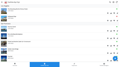
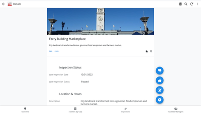
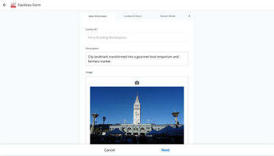
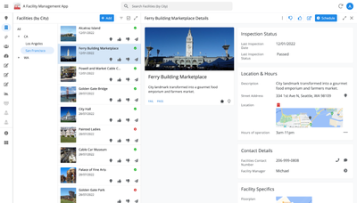
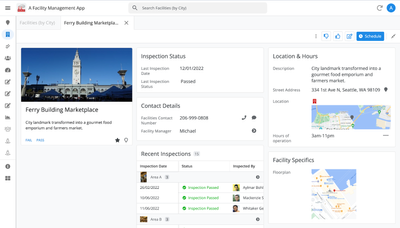
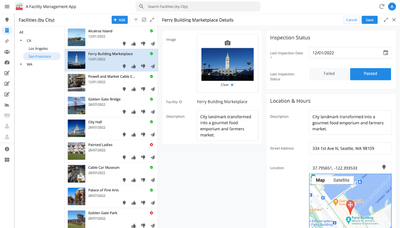
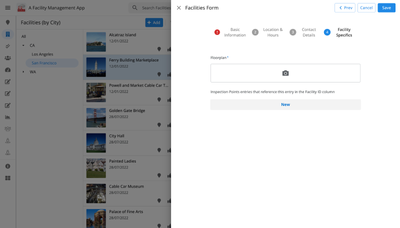
Here are some before and after images that better illustrate the design changes.
Legacy Design - Screenshot #1: Sifting through a collection of records grouped by City and State after selecting a State (Deck View)
Legacy Design - Screenshot #2: Looking at a specific record after selecting that record in the screen above (Detail View)
Legacy Design - Screenshot #3: Editing an existing record/Creating a new record (Form View)
New Design - Screenshot #1: Seeing your data in context (Deck View + Detail View)
New Design - Screenshot #2: Focusing on a specific record (Detail View)
New Design - Screenshot #3: Editing in place an existing record
New Design - Screenshot #4: Creating a new record (Form View)
What’s next? Well, this is still a work in progress. We’ve been gathering feedback from a number of design partners, including some of you in the AppSheet Community, and we know there is more to do before it can properly support all of your applications. At this stage, we feel that it would be good to let you play with the new design and to give you an opportunity to share your feedback - what you like, what doesn't work, what you think could use some improvements. This represents a significant change and your feedback will help us guide our next steps.
As this feature is in Preview, you may see visual changes in your apps as we work to improve the new desktop design in real-time. We don't recommend using the new desktop design in your production apps.
Thank you
The AppSheet Team
FAQ
How do I get access to this new desktop design?
We are currently slowly ramping this new experience over the next week or so, so you may not see this option in the editor immediately.
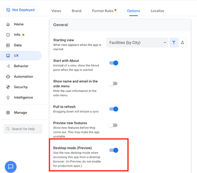
For each application, you can opt-in to use the new desktop design. You can toggle between the new and legacy desktop modes, as desired.
Follow these steps to enable the new design in your app:
- Open the app in the app editor
- Navigate to the UX > Options pane
- Enable the Desktop mode (Preview) option - see screenshot below
- Save the app in the Editor
All users of this application that access the app on a desktop browser will then see the new design after their next sync.
How do I configure the design of my app? I don’t see any new settings in the Editor!
There are minimal changes to the Editor for now. Mostly, the same settings are leveraged to specify the desktop and mobile designs. Let me give you an example.
Your apps have “primary views” and “menu views”. With the new desktop design, all of your views will be accessible from a side menu. That menu will list first the “primary views” and then the “secondary views”. In the future, we will adjust the configuration settings and in particular the language so that it makes sense for both mobile and desktop apps. For example, position values of "left most" and "right most" don't make sense for the new desktop design with its vertical menu structure.
We’ll be giving app creators more controls over some features that are currently set by default.
Is there some documentation or more information on what changed?
See Optimize the user experience using the new desktop design (Preview). We’ll update it over time.
Is there a list of functionalities that are known to not work with the new design?
Yes.
First, here is a list [as of July 31st] of (high-level) issues and requests that were reported to us and that still need fixes or assessments. Some of them are independent of the desktop mode, but we're still listing them here since people may want to know about them and so they don't need to report them unless it was reported for different app configurations :
| General theme | Issues |
| Form View |
|
| Navigation expressions: LINKTOROW(), LINKTOFORM(), etc |
|
| Format rules |
|
| Detail View UI |
- In some configurations, showing the wrong display names in a Detail tab - Edit-in-place in Dashboard view - Sync gets the app user out of Editing mode in a Detail View |
| General UI |
- Improvement requests on the subnav bar (e.g. larger text button, better responsiveness w.r.t. title, actions, text) - Clicking in grey area around onboarding view should not navigate the app in the background - Filtering on Dashboard - Tooltip for icon action buttons - Chart Views do not behave like other views |
| Localization of strings | Some strings are missing |
| CSV import/export |
|
| Other app functionalities |
- Missing Share, Feedback buttons - App Gallery behaving differently - Support of Amazon Cognito (missing account icon) - OCR not working on Desktop |
| Functionalities for app creators | “Preview as” is not available for the desktop emulator |
Second, here is a list of some issues and feature requests that we know we are not going to tackle, at least for now.
| Supporting multiple navigation actions in a grouped action |
This is not something that we support. The team very intentionally did not want to support this. App creators should not rely on it and it won’t work in desktop mode. |
| Multiple requests to improve the Table View UI |
We got requests to improve the Table View in general. The requests are valid, but that is out of scope for desktop mode. Changes we would be making would also impact the legacy UI and mobile apps. |
| LINKTOPARENTVIEW() not supported | For desktop users, there are better options to navigate back: the browser’s back button and the breadcrumbs. |
| Font size changes (via app settings) lead to layout issues | Generally, we recommend using the browser’s zoom which does a better job at resizing the app. |
| Background image |
See also Limitations and known issues.
How do I provide feedback?
Please share your feedback in this thread below this message!
- Mark as New
- Bookmark
- Subscribe
- Mute
- Subscribe to RSS Feed
- Permalink
- Report Inappropriate Content
- Mark as New
- Bookmark
- Subscribe
- Mute
- Subscribe to RSS Feed
- Permalink
- Report Inappropriate Content
@Peter-Google Could we please get an update on this? I hope we're not going to experience the same silence as from Appsheet support.
It's important for us to stay informed so we can update our clients accordingly. A simple yes or no would be really helpful. It's quite challenging to keep our clients waiting for a response for weeks or months. Thank you for your time and attention to this matter.
- Mark as New
- Bookmark
- Subscribe
- Mute
- Subscribe to RSS Feed
- Permalink
- Report Inappropriate Content
- Mark as New
- Bookmark
- Subscribe
- Mute
- Subscribe to RSS Feed
- Permalink
- Report Inappropriate Content
Hi @Rifad I've queued up these topics (including from the followup thread) for more internal discussion but I can't give an ETA and my initial sense is that it's unlikely any larger/highly-involved changes would happen before GA. Will see if smaller tweaks are more admissible.
It seems an on-edit-in-place-change-saved event allows for a partial workaround, b/c detail views can be made fullscreen on desktop. I'm guessing w/o that event you can't use edit-in-place as much because you can't wire together follow up logic as easily (although I imagine automation provides a more indirect workaround as automation can trigger on data change).
I didn't entirely understand the "bad data in" comment from customer. Ideally bad data is prevented via choosing proper column types, proper validation on values, etc.
Thanks @Ceke1992 for comment as well.
- Mark as New
- Bookmark
- Subscribe
- Mute
- Subscribe to RSS Feed
- Permalink
- Report Inappropriate Content
- Mark as New
- Bookmark
- Subscribe
- Mute
- Subscribe to RSS Feed
- Permalink
- Report Inappropriate Content
@Peter-Google wrote:
I've queued up these topics (including from the followup thread) for more internal discussion
I'm truly grateful for the effort you've put into this. Every small enhancement made to an application can create a major difference in the user experience. This is particularly true for business tools like AppSheet, where internal users require an effective interface for both entering and displaying data.
@Peter-Google wrote:
(although I imagine automation provides a more indirect workaround as automation can trigger on data change).
While this approach serves as a temporary solution and is applied across all backend processes, there are numerous instances where updating parent-child relationships immediately is crucial to prevent the display of incorrect data. This is particularly important for elements like costs, margins, and dates, which need to reference parent records in real-time. I utilize automation wherever feasible.
@Peter-Google wrote:
I didn't entirely understand the "bad data in" comment from customer.
The client pointed out issues with "bad data entry" in the current form view, which is positioned at the side of the screen. While this layout isn't inherently problematic – as many use cases effectively utilize side-positioned forms – it becomes less efficient when the data entry process is complex. A significant challenge arises, particularly in cases where long text boxes that cannot be expanded are involved (a separate issue for discussion). Switching to a fullscreen view can enhance the user experience by providing a comprehensive overview of a record in multi-tabbed forms.
I want to clarify that I am not entirely opposed to the current side-panel form view. However, it's essential to have the flexibility to toggle between form types, choosing either a fullscreen or side panel layout based on the user's preference.
- Mark as New
- Bookmark
- Subscribe
- Mute
- Subscribe to RSS Feed
- Permalink
- Report Inappropriate Content
- Mark as New
- Bookmark
- Subscribe
- Mute
- Subscribe to RSS Feed
- Permalink
- Report Inappropriate Content
@Peter-Google Further details on the same topic: pay attention to the inefficiency of the form view.
I appreciated how it appears, everything is fine. However, the size is too small compared to the screen. I have to zoom in my browser to 150% each time I need to enter data. As I referred to CLICKUP's user interface, it's significant to note the emphasis they place on data input. To better understand, please refer to the attached image. It's a blend of detailed and form view.
- Mark as New
- Bookmark
- Subscribe
- Mute
- Subscribe to RSS Feed
- Permalink
- Report Inappropriate Content
- Mark as New
- Bookmark
- Subscribe
- Mute
- Subscribe to RSS Feed
- Permalink
- Report Inappropriate Content
@Rifad wrote:
I want to emphasize the importance of this view for data inputs, as it is crucial and cannot be overlooked by Google engineers. @Peter-Google
- Mark as New
- Bookmark
- Subscribe
- Mute
- Subscribe to RSS Feed
- Permalink
- Report Inappropriate Content
- Mark as New
- Bookmark
- Subscribe
- Mute
- Subscribe to RSS Feed
- Permalink
- Report Inappropriate Content
Upon adding the form view to the menu, it automatically opened in full-screen mode. Is there a possibility for us to introduce a feature that allows us to transition from the existing form view on the side to a full-screen view more seamlessly?
To maximize our impact, we need to make our FORM views more visible and prominent while also enriching the level of detail they provide. Currently, these forms may seem less significant, but it's crucial to understand that they are pivotal for accurate data collection. AppSheet's primary purpose revolves around this data collection function, and the current state of our forms is hindering this essential process.
Its really bad that edit in place also does not support the form save event actions.
@Arthur_Rallu I deeply appreciate all the hard work and dedication that has gone into the new UI. However, I would like to request that the team also prioritizes the enhancement of our fundamental and core data collection processes even more effectively.
- Mark as New
- Bookmark
- Subscribe
- Mute
- Subscribe to RSS Feed
- Permalink
- Report Inappropriate Content
- Mark as New
- Bookmark
- Subscribe
- Mute
- Subscribe to RSS Feed
- Permalink
- Report Inappropriate Content
Thanks @Rifad for this as well. I'm not sure what precisely you mean by "transition... more seamlessly", so I want to clarify. Do you mean:
1) Mostly, that you want to take advantage of the screen real estate when a form view is displayed full screen
2) Or that, even if you access a form from the menu, you still want it to "overlay" some other view in certain situations?
etc thanks
- Mark as New
- Bookmark
- Subscribe
- Mute
- Subscribe to RSS Feed
- Permalink
- Report Inappropriate Content
- Mark as New
- Bookmark
- Subscribe
- Mute
- Subscribe to RSS Feed
- Permalink
- Report Inappropriate Content
@Peter-Google wrote:
2) Or that, even if you access a form from the menu, you still want it to "overlay" some other view in certain situations?
Greetings, @Peter-Google ! When users need to input data into our critical forms, it would greatly enhance the user experience if we could provide a more prominent space on the screen for data input. Presently, approximately 70% of the screen remains unutilized, which can impede the efficiency of the data entry process.
@Peter-Google wrote:
1) Mostly, that you want to take advantage of the screen real estate when a form view is displayed full screen
In this particular scenario, the use case revolves around enriching forms containing a substantial amount of data. It would be ideal to have the option to seamlessly switch between two types of forms as needed. However, at present, enhancing the existing "Edit in place" functionality with features such as support for an "OnSave" event, akin to a form save event, would meet our requirements.
I extend my gratitude for your continued consideration, as always!
- Mark as New
- Bookmark
- Subscribe
- Mute
- Subscribe to RSS Feed
- Permalink
- Report Inappropriate Content
- Mark as New
- Bookmark
- Subscribe
- Mute
- Subscribe to RSS Feed
- Permalink
- Report Inappropriate Content
Thanks @Rifad , let's use the thread below to discuss form width, col layout, etc topics. Let's just use this thread to discuss data-change-save events.
The natural way to support an edit-in-place save would be to have an analogue "on edit-in-place save event" in the detail view. Please note this is just my off-the-cuff thoughts, not a final design or anything. For example, in the Form view, we have:
However, in the detail view (since edit-in-place happens on the detail view), we don't have any event that is triggered when an edit-in-place is saved:
So really, adding an "on edit-in-place save event" should address the consideration. Again, this is not a final design idea, I'm just discussing for transparency and to show I take these requests seriously.
Let me know if this makes sense, thanks.
- Mark as New
- Bookmark
- Subscribe
- Mute
- Subscribe to RSS Feed
- Permalink
- Report Inappropriate Content
- Mark as New
- Bookmark
- Subscribe
- Mute
- Subscribe to RSS Feed
- Permalink
- Report Inappropriate Content
@Peter-Google wrote:
So really, adding an "on edit-in-place save event" should address the consideration.
Yes absolutely. Something Like this:
So we already have it for other views:
- Mark as New
- Bookmark
- Subscribe
- Mute
- Subscribe to RSS Feed
- Permalink
- Report Inappropriate Content
- Mark as New
- Bookmark
- Subscribe
- Mute
- Subscribe to RSS Feed
- Permalink
- Report Inappropriate Content
Hey @Peter-Google Just circling back after 4 months as we've noticed that this is a crucial step for 80% of our company's projects. Any new information you can provide would be greatly appreciated. Thanks so much!
- Mark as New
- Bookmark
- Subscribe
- Mute
- Subscribe to RSS Feed
- Permalink
- Report Inappropriate Content
- Mark as New
- Bookmark
- Subscribe
- Mute
- Subscribe to RSS Feed
- Permalink
- Report Inappropriate Content
@Peter-Google I want to make sure you and the AppSheet team understand that I think the side panel form is great. I'm not against it at all. It can be really useful for things like adjusting user settings or quickly inputting data. The sideways form is perfect for more minor tasks or tasks in between bigger ones.
But when it comes to major data inputs, like the one below, the 'Detail' view is the best solution (Right now)
Having multiple tabs with multiple pages for full input is essential for a business to operate effectively on a global scale. Let's take a closer look at how this is done in the current 'FORM' view in appsheet right now as shown below:
Now take a moment to evaluate the current form view by comparing it to the first one I shared here. It's unacceptable and criminal to give users a less prominent experience in a desktop business application.
We need the ability to easily switch between multiple column layouts and the option to choose between fullscreen or half screen.
- Mark as New
- Bookmark
- Subscribe
- Mute
- Subscribe to RSS Feed
- Permalink
- Report Inappropriate Content
- Mark as New
- Bookmark
- Subscribe
- Mute
- Subscribe to RSS Feed
- Permalink
- Report Inappropriate Content
The following issue was fixed in the November 9, 2023 release:
| Item | Description |
| Bug | For the desktop UI (preview), updated inline views with a grouping column to scroll vertically instead of horizontally. Now in Desktop UI, horizontal scrolling should only happen for:
|
- Mark as New
- Bookmark
- Subscribe
- Mute
- Subscribe to RSS Feed
- Permalink
- Report Inappropriate Content
- Mark as New
- Bookmark
- Subscribe
- Mute
- Subscribe to RSS Feed
- Permalink
- Report Inappropriate Content
Hi AppSheet Team
I would suggest a slight improvement over the Desktop view with Nested Row Display set to zero:
The item count should be attached to the column name as it is in the mobile view:
Thanks, and keep up the great work!
- Mark as New
- Bookmark
- Subscribe
- Mute
- Subscribe to RSS Feed
- Permalink
- Report Inappropriate Content
- Mark as New
- Bookmark
- Subscribe
- Mute
- Subscribe to RSS Feed
- Permalink
- Report Inappropriate Content
That looks like a bug! Can you send me a direct message with your app info and enable support so I can take a look at your app to get a repro?
- Mark as New
- Bookmark
- Subscribe
- Mute
- Subscribe to RSS Feed
- Permalink
- Report Inappropriate Content
- Mark as New
- Bookmark
- Subscribe
- Mute
- Subscribe to RSS Feed
- Permalink
- Report Inappropriate Content
- Mark as New
- Bookmark
- Subscribe
- Mute
- Subscribe to RSS Feed
- Permalink
- Report Inappropriate Content
- Mark as New
- Bookmark
- Subscribe
- Mute
- Subscribe to RSS Feed
- Permalink
- Report Inappropriate Content
Hello,
I want to report that in Table type views, if you search for a value in the search bar and then select a record, after opening the detail view in split mode, the table view returns to showing all values without considering the search result.
Angelo
- Mark as New
- Bookmark
- Subscribe
- Mute
- Subscribe to RSS Feed
- Permalink
- Report Inappropriate Content
- Mark as New
- Bookmark
- Subscribe
- Mute
- Subscribe to RSS Feed
- Permalink
- Report Inappropriate Content
Hello, I'm not able to reproduce this on my apps (might be a configuration reason?), can you send me a direct message with your app info and enable support so I can take a look at your app? Thanks!
- Mark as New
- Bookmark
- Subscribe
- Mute
- Subscribe to RSS Feed
- Permalink
- Report Inappropriate Content
- Mark as New
- Bookmark
- Subscribe
- Mute
- Subscribe to RSS Feed
- Permalink
- Report Inappropriate Content
Hi @angeloiaia , just checking on this. @amyplin hasn't heard from you yet, so please send her private message so we can reproduce your situation exactly. Thanks.
- Mark as New
- Bookmark
- Subscribe
- Mute
- Subscribe to RSS Feed
- Permalink
- Report Inappropriate Content
- Mark as New
- Bookmark
- Subscribe
- Mute
- Subscribe to RSS Feed
- Permalink
- Report Inappropriate Content
@Arthur_Rallu wrote:
- Edit-in-place in Dashboard view
Is there any updates regarding this ?
- Mark as New
- Bookmark
- Subscribe
- Mute
- Subscribe to RSS Feed
- Permalink
- Report Inappropriate Content
- Mark as New
- Bookmark
- Subscribe
- Mute
- Subscribe to RSS Feed
- Permalink
- Report Inappropriate Content
Hi @Rifad , thanks, addressing edit-in-place for Dashboard view requires first fixing an underlying part of the desktop code system. The work is enqueued and will ideally happen in the next few weeks but I can't give an exact ETA. One the underlying issue is addressed, it allows us to return to edit-in-place in dashboard view, and in fact being able to fix edit-in-place in dashboard view helps us validate that the underlying fix is sound. HTH.
- Mark as New
- Bookmark
- Subscribe
- Mute
- Subscribe to RSS Feed
- Permalink
- Report Inappropriate Content
- Mark as New
- Bookmark
- Subscribe
- Mute
- Subscribe to RSS Feed
- Permalink
- Report Inappropriate Content
For clarity, this work is still ongoing and I'll still reply later once we've made the needed internal progress. Thanks.
- Mark as New
- Bookmark
- Subscribe
- Mute
- Subscribe to RSS Feed
- Permalink
- Report Inappropriate Content
- Mark as New
- Bookmark
- Subscribe
- Mute
- Subscribe to RSS Feed
- Permalink
- Report Inappropriate Content
Hi @Arthur_Rallu @lizlynch , there is this bug with INPUT() function in the Desktop UI where if the input is a new record, that has to be added from the dropdown list, the form to add that new record would not be accessible because it appears in a deeper layer:
- Mark as New
- Bookmark
- Subscribe
- Mute
- Subscribe to RSS Feed
- Permalink
- Report Inappropriate Content
- Mark as New
- Bookmark
- Subscribe
- Mute
- Subscribe to RSS Feed
- Permalink
- Report Inappropriate Content
Hi @Karimmc2 , thanks for sharing this, I'll send you a private message to get more info. Thanks.
- Mark as New
- Bookmark
- Subscribe
- Mute
- Subscribe to RSS Feed
- Permalink
- Report Inappropriate Content
- Mark as New
- Bookmark
- Subscribe
- Mute
- Subscribe to RSS Feed
- Permalink
- Report Inappropriate Content
> In desktop Mode,
Issue Description:
- The problem is related to navigation in desktop mode when using the browser's back button or breadcrumbs.
- After clicking on the "n-1"th record in a table to check its detailed view, going back should ideally return to the "n-1"th record, but it currently takes the user to the top of the table.
Current Behavior:
- Breadcrumbs are not functioning as expected in table view.
- After clicking on a specific record, the back navigation does not return to the selected record but goes to the top of the table.
Expected Behavior:
- The desired behavior is that when navigating back, the user should land on the same "n-1"th record that was previously viewed, preserving the context.
- Mark as New
- Bookmark
- Subscribe
- Mute
- Subscribe to RSS Feed
- Permalink
- Report Inappropriate Content
- Mark as New
- Bookmark
- Subscribe
- Mute
- Subscribe to RSS Feed
- Permalink
- Report Inappropriate Content
I think you should explain in detail when you are seeing issues with the back button vs breadcrumbs.
From my pov, it seems like you are using the back button all the time and it will obviously introduce issues since it's a web app
- Mark as New
- Bookmark
- Subscribe
- Mute
- Subscribe to RSS Feed
- Permalink
- Report Inappropriate Content
- Mark as New
- Bookmark
- Subscribe
- Mute
- Subscribe to RSS Feed
- Permalink
- Report Inappropriate Content
Hi , following up on what @SkrOYC mentioned, if at all possible can you share a screen recording / screencast of the particular UI experience.
- Mark as New
- Bookmark
- Subscribe
- Mute
- Subscribe to RSS Feed
- Permalink
- Report Inappropriate Content
- Mark as New
- Bookmark
- Subscribe
- Mute
- Subscribe to RSS Feed
- Permalink
- Report Inappropriate Content
Hey ! I tried to looks for 'tabs' suggestion in this thread, couldn't find.
It would be cool to be able to show this kind of display in desktop mode. This is a dashboard with views displayed in tabs.
Sadly, we can't show tabs in that way in desktop mode.
Of the few people I asked, they unanimously find the mobile display better than quickedit to filter fields/current tabs of desktop mode.
- Mark as New
- Bookmark
- Subscribe
- Mute
- Subscribe to RSS Feed
- Permalink
- Report Inappropriate Content
- Mark as New
- Bookmark
- Subscribe
- Mute
- Subscribe to RSS Feed
- Permalink
- Report Inappropriate Content
Hi @baba_sawane , thanks for this feedback. I've added it to an internal list for consideration after GA (unlikely we'll get to it before GA). Thanks.
- Mark as New
- Bookmark
- Subscribe
- Mute
- Subscribe to RSS Feed
- Permalink
- Report Inappropriate Content
- Mark as New
- Bookmark
- Subscribe
- Mute
- Subscribe to RSS Feed
- Permalink
- Report Inappropriate Content
The following issue was fixed in the December 8, 2023 release notes:
| Item | Description |
| Bug | For desktop UI, EnumList drop-downs now support "select all" in conjunction with search filters to add all the values that match the filter. |
- Mark as New
- Bookmark
- Subscribe
- Mute
- Subscribe to RSS Feed
- Permalink
- Report Inappropriate Content
- Mark as New
- Bookmark
- Subscribe
- Mute
- Subscribe to RSS Feed
- Permalink
- Report Inappropriate Content
In the desktop user interface, the icon label appears very small and is difficult to see clearly when using the 'group by' feature. However, this issue is not present in the mobile user interface, where the icon label appears appropriately sized.
DESKTOP UI:
MOBILE UI:
- Mark as New
- Bookmark
- Subscribe
- Mute
- Subscribe to RSS Feed
- Permalink
- Report Inappropriate Content
- Mark as New
- Bookmark
- Subscribe
- Mute
- Subscribe to RSS Feed
- Permalink
- Report Inappropriate Content
Hi @Rifad , thanks for this feedback. I've added it to an internal list for consideration after GA (unlikely we'll get to it before GA). Thanks.
- Mark as New
- Bookmark
- Subscribe
- Mute
- Subscribe to RSS Feed
- Permalink
- Report Inappropriate Content
- Mark as New
- Bookmark
- Subscribe
- Mute
- Subscribe to RSS Feed
- Permalink
- Report Inappropriate Content
Thanks @Peter-Google Currently its almost invisible.
- Mark as New
- Bookmark
- Subscribe
- Mute
- Subscribe to RSS Feed
- Permalink
- Report Inappropriate Content
- Mark as New
- Bookmark
- Subscribe
- Mute
- Subscribe to RSS Feed
- Permalink
- Report Inappropriate Content
@Arthur_Rallu Bug! Invalid Value error text is not displaying in desktop preview.
Editor View
Desktop Preview
For more information, the Valid_If statement for the FormTotal field is
IF([QuoteID].[QuoteSource] = "Project",([QuoteID].[StartingFunds] - [QuoteID].[QuoteTotal]) > [FormTotal] - [TotalCost],TRUE)and furthermore, the form is obeying the rule and not allowing the save to happen, it just does not display the reason.
- Mark as New
- Bookmark
- Subscribe
- Mute
- Subscribe to RSS Feed
- Permalink
- Report Inappropriate Content
- Mark as New
- Bookmark
- Subscribe
- Mute
- Subscribe to RSS Feed
- Permalink
- Report Inappropriate Content
Hi @scott192 , thanks for the report, I pinged you in private message for more info. Thanks.
- Mark as New
- Bookmark
- Subscribe
- Mute
- Subscribe to RSS Feed
- Permalink
- Report Inappropriate Content
- Mark as New
- Bookmark
- Subscribe
- Mute
- Subscribe to RSS Feed
- Permalink
- Report Inappropriate Content
Scott confirmed in private message that this validation issue wasn't happening anymore.
- Mark as New
- Bookmark
- Subscribe
- Mute
- Subscribe to RSS Feed
- Permalink
- Report Inappropriate Content
- Mark as New
- Bookmark
- Subscribe
- Mute
- Subscribe to RSS Feed
- Permalink
- Report Inappropriate Content
Hi @Arthur_Rallu I see that related tables of a detail view with Desktop multicolumn layout toggled on does not seem to follow the detailed view column order selected when a view goes over more than one pane.
See below
- Mark as New
- Bookmark
- Subscribe
- Mute
- Subscribe to RSS Feed
- Permalink
- Report Inappropriate Content
- Mark as New
- Bookmark
- Subscribe
- Mute
- Subscribe to RSS Feed
- Permalink
- Report Inappropriate Content
Hi @Skip2MiLu , thanks for this report, I've added it to an internal list of reports to discuss.
- Mark as New
- Bookmark
- Subscribe
- Mute
- Subscribe to RSS Feed
- Permalink
- Report Inappropriate Content
- Mark as New
- Bookmark
- Subscribe
- Mute
- Subscribe to RSS Feed
- Permalink
- Report Inappropriate Content
Hi @Skip2MiLu , broadly speaking, the detail view divides the content into cards, which are laid out in a Z pattern:
Fields that require inline views get their own cards, and consecutive runs of non-inline-view fields get grouped into a single card (such as card "0" in the annotated screenshot above). The detail view help page also describes how you can enable show columns/types for detail views in your app settings, you can also use the page_header type to group content into cards.
- Mark as New
- Bookmark
- Subscribe
- Mute
- Subscribe to RSS Feed
- Permalink
- Report Inappropriate Content
- Mark as New
- Bookmark
- Subscribe
- Mute
- Subscribe to RSS Feed
- Permalink
- Report Inappropriate Content
@Peter-Google Maybe it's just me but it still feels strange somehow. I do beleive the space on the left below image is still not utilized well. Perhaps there is a way to utilize space better and find a simpler way to control multi column layout ordering.
-
Account
3 -
Announcements
30 -
App Management
8 -
Automation
31 -
Data
32 -
Errors
17 -
Expressions
21 -
Integrations
25 -
Intelligence
5 -
Other
15 -
Resources
15 -
Security
5 -
Templates
13 -
Users
7 -
UX
34

 Twitter