- AppSheet
- Release Notes & Announcements
- Announcements
- Re: New Charts in AppSheet applications - in Previ...
- Subscribe to RSS Feed
- Mark Topic as New
- Mark Topic as Read
- Float this Topic for Current User
- Bookmark
- Subscribe
- Mute
- Printer Friendly Page
- Mark as New
- Bookmark
- Subscribe
- Mute
- Subscribe to RSS Feed
- Permalink
- Report Inappropriate Content
- Mark as New
- Bookmark
- Subscribe
- Mute
- Subscribe to RSS Feed
- Permalink
- Report Inappropriate Content
The following feature has been added to the Preview Program. Feel free to test the feature and report issues or possible improvements in this thread.
App Creators can now make use of our new chart editor and the new and improved charts it can create. There are still features to be added before general availability, and the new charts should not be used in production apps until general availability as they may be unstable in the future.
We’ve been trying to create a charting experience that allows creators to create charts with more flexibility than they currently have, and which tries to be smart about picking the type of chart that will best represent your data.
How do I start creating new charts?
If you have enabled the preview program for your app (make sure to save after turning on the preview program), you should be able to see a toggle to switch between the current experience and the new experience the next time you are viewing a chart under UX → Views. Just press “Try it out” and you should be able to play with it.
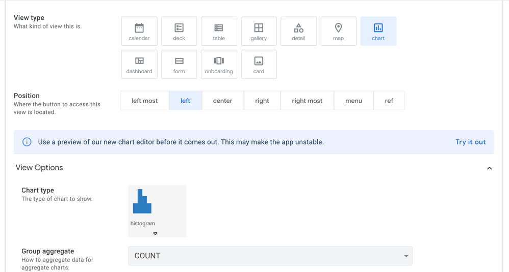
How do I use the new editor?
The new editor will show you the columns in your app, and you can drag them into appropriate Configuration slots. We will then try to guess the type of chart that is appropriate for that type of data - however you can change this should you wish.
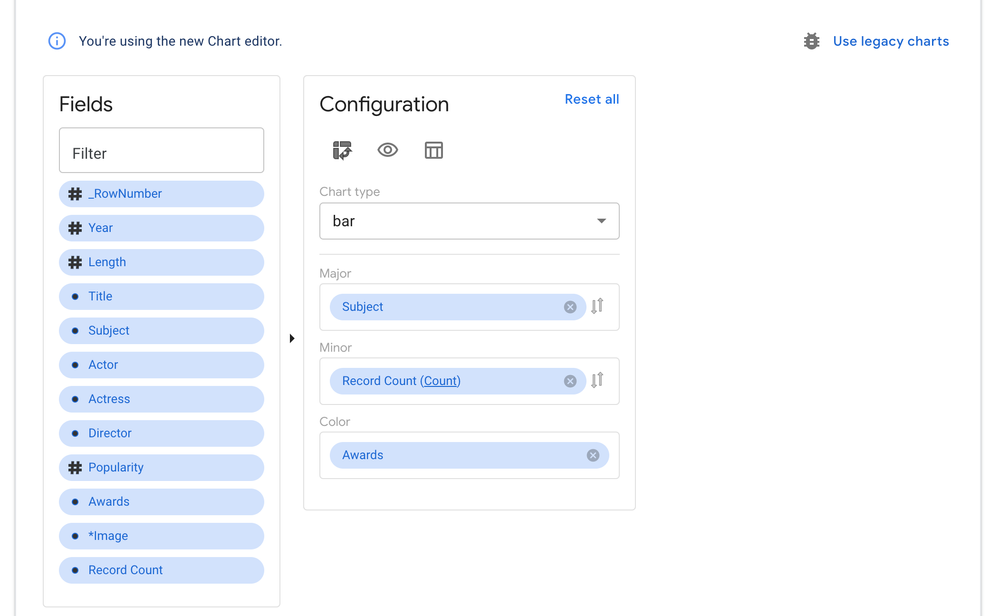
We’re also very interested in feedback as to the usability and discoverability of the features of this editor, so do please explore and let us know what you found.
What chart types are we supporting?
We are currently supporting bar, line, area, scatter, pie, and doughnut charts.
But what about my existing charts?
You can feel free to play around with this chart editor even on top of an existing chart, as they are co-existing alongside one another. You can switch back to your old chart by just pressing the “Use legacy charts” button.
What features are upcoming?
We’ll be rolling out new improvements to this periodically (so stay tuned to the Release Notes to get an exact accounting of what’s coming!), some notable features that will be coming soon are
- The ability to pick from several different themes for the colours in the chart
- The ability to show and hide the title and the ability to turn off clicking through the data on the chart
- The ability to customize what is in the tooltips that users see when over a chart
And more!
- Labels:
-
UX
- Mark as New
- Bookmark
- Subscribe
- Mute
- Subscribe to RSS Feed
- Permalink
- Report Inappropriate Content
- Mark as New
- Bookmark
- Subscribe
- Mute
- Subscribe to RSS Feed
- Permalink
- Report Inappropriate Content
the new graphics are very good, except for the bugs, of course. A bug that is preventing me from using the new graphs, is when I click on the graph, and the application shows the “detail” of an entry, and not a list of entries referring to that graph.
- Mark as New
- Bookmark
- Subscribe
- Mute
- Subscribe to RSS Feed
- Permalink
- Report Inappropriate Content
- Mark as New
- Bookmark
- Subscribe
- Mute
- Subscribe to RSS Feed
- Permalink
- Report Inappropriate Content
Yes indeed, need more improvement for new charts.
But it is still preview and Beta, which means, dont use in our production apps.
What we do is to give words to their sales and devs team what the problem is and why we feel it is a problem to make the platform better for everyone.
For preview features, dont think about it will come. BETA can not be happen afterwords.
P
- Mark as New
- Bookmark
- Subscribe
- Mute
- Subscribe to RSS Feed
- Permalink
- Report Inappropriate Content
- Mark as New
- Bookmark
- Subscribe
- Mute
- Subscribe to RSS Feed
- Permalink
- Report Inappropriate Content
@benhare How's it hangin'?
- Mark as New
- Bookmark
- Subscribe
- Mute
- Subscribe to RSS Feed
- Permalink
- Report Inappropriate Content
- Mark as New
- Bookmark
- Subscribe
- Mute
- Subscribe to RSS Feed
- Permalink
- Report Inappropriate Content
Hello Diego - thanks I’m glad you like the look so far. Thanks for mentioning that bug, I’m aware of it - it’s a complicated one, but it’s in my backlog.
- Mark as New
- Bookmark
- Subscribe
- Mute
- Subscribe to RSS Feed
- Permalink
- Report Inappropriate Content
- Mark as New
- Bookmark
- Subscribe
- Mute
- Subscribe to RSS Feed
- Permalink
- Report Inappropriate Content
Thank you @benhare and @tsuji_koichi .
- Mark as New
- Bookmark
- Subscribe
- Mute
- Subscribe to RSS Feed
- Permalink
- Report Inappropriate Content
- Mark as New
- Bookmark
- Subscribe
- Mute
- Subscribe to RSS Feed
- Permalink
- Report Inappropriate Content
Thank you for building this Ben. My question is, if I begin incorporating these new kinds of charts will they still be working if or when this feature becomes standard in the appsheet? I’m a bit worried either my work will not be compatible with future iterations or the charts somehow break other parts of my appliclation.
Thanks again,
D
- Mark as New
- Bookmark
- Subscribe
- Mute
- Subscribe to RSS Feed
- Permalink
- Report Inappropriate Content
- Mark as New
- Bookmark
- Subscribe
- Mute
- Subscribe to RSS Feed
- Permalink
- Report Inappropriate Content
Y-axis should be able to be filtered according to multiple selections, a single column is not enough. Thanks.
- Mark as New
- Bookmark
- Subscribe
- Mute
- Subscribe to RSS Feed
- Permalink
- Report Inappropriate Content
- Mark as New
- Bookmark
- Subscribe
- Mute
- Subscribe to RSS Feed
- Permalink
- Report Inappropriate Content
Hello Dario - I wouldn’t incorporate these new charts anywhere you’d be concerned if they stopped working. For now this is in a preview/test phase and does not have the support that our released features would have (for instance if you released an app with them and then found a bug it might not get fixed). I will try to ensure that future iterations are compatible with charts as they are now but I can’t give you a guarantee on that so I would again abstain from using them in production apps until this is released as a full feature.
- Mark as New
- Bookmark
- Subscribe
- Mute
- Subscribe to RSS Feed
- Permalink
- Report Inappropriate Content
- Mark as New
- Bookmark
- Subscribe
- Mute
- Subscribe to RSS Feed
- Permalink
- Report Inappropriate Content
Thanks Ben. I’m just a bit worried at the current chart functionality because its so limited. Do you anticipate these new features will become full features within the next six months, or do you think it will take much longer?
Thanks again for the great work.
X
- Mark as New
- Bookmark
- Subscribe
- Mute
- Subscribe to RSS Feed
- Permalink
- Report Inappropriate Content
- Mark as New
- Bookmark
- Subscribe
- Mute
- Subscribe to RSS Feed
- Permalink
- Report Inappropriate Content
You’re kind to thank me for the work. I wish I could give you a timeline but I really cannot and should not at the moment. I work on small things when I get time, but there’s not as much of that as I would like right now. When I do have an update on a timeline, or even on work coming off of pause I will be sure to make an announcement of some kind in the community though (well me or someone else will), I promise.
- Mark as New
- Bookmark
- Subscribe
- Mute
- Subscribe to RSS Feed
- Permalink
- Report Inappropriate Content
- Mark as New
- Bookmark
- Subscribe
- Mute
- Subscribe to RSS Feed
- Permalink
- Report Inappropriate Content
Thanks. In the meantime I’m going to see how far I can build with the multi line chart using these kinds of data structures. Hopefully it’s not too much of a hassle to implement and maintain.
Thanks for the feedback Ben, cheers for now.
- Mark as New
- Bookmark
- Subscribe
- Mute
- Subscribe to RSS Feed
- Permalink
- Report Inappropriate Content
- Mark as New
- Bookmark
- Subscribe
- Mute
- Subscribe to RSS Feed
- Permalink
- Report Inappropriate Content
Hello is possible include one action bottom in the chart view? Thank you.
- Mark as New
- Bookmark
- Subscribe
- Mute
- Subscribe to RSS Feed
- Permalink
- Report Inappropriate Content
- Mark as New
- Bookmark
- Subscribe
- Mute
- Subscribe to RSS Feed
- Permalink
- Report Inappropriate Content
FILTERED VIEWS ON CLICK THROUGH
The biggest drawback in the New Chart Editor is the broken link to filtered views of the data when you click on sections of a chart. When clicking the charts only launched a random Detail View, I thought I was doing something wrong and couldn’t find information after lots of searching. I added various new actions, filters, and references to try to get it working. I can’t wait to have this very useful feature working in the new version of Charts.
SPECIAL REQUEST
When there are known limitations like this, I would love to have a footnote in a main description like “Charts: The Essentials”. Or in the design interface for the View itself, something like:
“You’re using the Chart editor.
*Note: Linking to a filtered view of the data from click through of a chart is currently not functional in this beta version. We are working on implementing this feature.”
- Mark as New
- Bookmark
- Subscribe
- Mute
- Subscribe to RSS Feed
- Permalink
- Report Inappropriate Content
- Mark as New
- Bookmark
- Subscribe
- Mute
- Subscribe to RSS Feed
- Permalink
- Report Inappropriate Content
I’m just going to leave this here.
SOME SPECIAL REQUESTS
“FILTERS” button similar to “DATA”:
I love that these charts allow users to set their own filters. For the longest time I didn’t notice that there are filters tucked into an icon in the top right corner. Perhaps the option in the backend to add a button with the word “Filter”?
Custom label for UNITS:
The more visible labels in the new Charts is a huge upgrade. I can think of a few use cases where explicit units would make the chart more readable. Perhaps a couple fields in the backend to enter custom unit. (inches or ", orders, lbs). Ex:
1 yields: “box”
2+ yields: “boxes”
Result on chart labels: 27 boxes
…Or even just a label for the axes (“Average size of lots in hectares”)
TOTAL
An option to show Total in the chart (center of a Pie Chart, top of a Bar Graph, etc) would yield some valuable information that my users keep trying to find. My current workarounds for this break other features. For instance, creating a Dashboard view with the chart in one view and Total in another view is messy, requires extra table and formulas, and removes the ability to filter the data. ![]()
That said, I find the new Charts design much more intuitive and very attractive. Thank you Appsheet designers!!
- Mark as New
- Bookmark
- Subscribe
- Mute
- Subscribe to RSS Feed
- Permalink
- Report Inappropriate Content
- Mark as New
- Bookmark
- Subscribe
- Mute
- Subscribe to RSS Feed
- Permalink
- Report Inappropriate Content
Hello @PocketDragon, thanks for those requests. The filtered click through not working is probably the most important item. I’ve tried to fix it, but it’s hard and I keep having to swap off of it. I do like the idea of including something that shows active issues for things in our preview program, that would help future people not have the problem you did where you thought you were doing something incorrect.
For your other suggestions, I think the Filter button would be a good add, although my feature backlog is fairly long for Charts as is so I’m not sure when I/we will be able to get to it.
For the Custom label, I think you can accomplish this for values on the chart itself (within the Tooltips) with a Display Name for the column, something of the form:
IF([NumBoxes] = “1”, [NumBoxes] “Box”, [NumBoxes] “Boxes”)
The axes labels should also respect Display Names too, where you can write whatever you like for the Display Name. It’d be neat if it autogenerated something like that though when you’re aggregating by Sum/Average etc.
I like the Total option too, I’ve added it to the feature backlog for new charts.
I’m glad you like them as they are so far, I still would caution against their usage in production apps until we’ve worked out the kinks in them.
- Mark as New
- Bookmark
- Subscribe
- Mute
- Subscribe to RSS Feed
- Permalink
- Report Inappropriate Content
- Mark as New
- Bookmark
- Subscribe
- Mute
- Subscribe to RSS Feed
- Permalink
- Report Inappropriate Content
The chart features are improved and that is great.
For the scatterplot, are you planning to add data labels and a legend? Without those the features, the scatterplot is literally one dimensional as you can not tell what record you are looking at, only the distribution. The ability to have separate colors for the records would be great as well.
When you mouse over the scatter plot, it also only tells you what row is being referenced, which again is not very useful.
Thanks,
George
- Mark as New
- Bookmark
- Subscribe
- Mute
- Subscribe to RSS Feed
- Permalink
- Report Inappropriate Content
- Mark as New
- Bookmark
- Subscribe
- Mute
- Subscribe to RSS Feed
- Permalink
- Report Inappropriate Content
Yes we’re hoping to add more configurability to the charts eventually, those are some of the things I’m hoping to add.
- Mark as New
- Bookmark
- Subscribe
- Mute
- Subscribe to RSS Feed
- Permalink
- Report Inappropriate Content
- Mark as New
- Bookmark
- Subscribe
- Mute
- Subscribe to RSS Feed
- Permalink
- Report Inappropriate Content
I noticed the new chart does not work on the interactive dashboard.
When we select the bar chart or any other chart, on selecting the elemenet, then the rest of the view on the dashboard should be filtered. But it does not work in that way.
- Mark as New
- Bookmark
- Subscribe
- Mute
- Subscribe to RSS Feed
- Permalink
- Report Inappropriate Content
- Mark as New
- Bookmark
- Subscribe
- Mute
- Subscribe to RSS Feed
- Permalink
- Report Inappropriate Content
So if I think I’m understanding you, you mean that we can’t click into elements on the dashboard. That’s because those charts are set with Disable Click Through (you can set that for new charts with the chart editor yourself), which was a conscious choice by @prithpal when we were building them.
- Mark as New
- Bookmark
- Subscribe
- Mute
- Subscribe to RSS Feed
- Permalink
- Report Inappropriate Content
- Mark as New
- Bookmark
- Subscribe
- Mute
- Subscribe to RSS Feed
- Permalink
- Report Inappropriate Content
Im not sure if this new chart feature project is attended or abandoned, as I do not see any improvement, nor any fix is given after we pointed out the bugs and improvement as feedbacks, whihc is sad.
Hitting over the element of chart like bar or lines, which should be prompted to the selected row(s) to view the data, like we have the same function on legacy version of the chart, but currently the first (or the last) record of the source table is always be opened. Have reported few time for months, no response.
Selecting Ref type colmn, will break up the chart. Seems Ref type column can not be selected as major for new chart.
Enum type with base type as number, should be taken as measure, but take as dimension oddly. Passing enum end with the same story, i.e. the chat will not be drawn at all.
If the project is ceased, it is unfortune for me.
- Mark as New
- Bookmark
- Subscribe
- Mute
- Subscribe to RSS Feed
- Permalink
- Report Inappropriate Content
- Mark as New
- Bookmark
- Subscribe
- Mute
- Subscribe to RSS Feed
- Permalink
- Report Inappropriate Content
Hello Koichi, thanks for the messages (also apologies for a late reply, I was out last week). I wouldn’t say that this project is abandoned, it’s just on pause for me - I fully intend to get back to it. I’ve still been recording improvements (as well as that bug you mentioned, I am aware of it I just don’t have the bandwidth to fix it).
Those last couple are new bugs to me, so I will add them to the list too but similarly I don’t know when I can get to them.
Ben.
- Mark as New
- Bookmark
- Subscribe
- Mute
- Subscribe to RSS Feed
- Permalink
- Report Inappropriate Content
- Mark as New
- Bookmark
- Subscribe
- Mute
- Subscribe to RSS Feed
- Permalink
- Report Inappropriate Content
Hi @benhare
Thanks you for your message, and glad to hear the project was not abandoned, just on a pause for the moment. I supplied bunch of feedbacks after spending few weeks for testing when the feature was released. I just wanted not to throw my effort away.
British said "Strike while the iron is hot. "
As the time goes by, naturally, interst from the community member will fade out.
Hope your management team will place the priority over this project once again rather than give a pause this.
Honestly, i lost my memory what sort of recommendation for improvement for the new chart feature were given, as it was long time ago now.
Recently, I noticed by pushing [related XXXs] list type colunm to measure will not draw the chart. Naturally, chart engine should treat this as measures, with users option to count the list either uniquely or not.
Pushing REF type column to dimention, but chart become whilte-out completely. In essense, it will display the label name of the referenced table though. I call as a bug.
There should be bunch of stuffs remainig to new chart engine workable.
Cheers
- Mark as New
- Bookmark
- Subscribe
- Mute
- Subscribe to RSS Feed
- Permalink
- Report Inappropriate Content
- Mark as New
- Bookmark
- Subscribe
- Mute
- Subscribe to RSS Feed
- Permalink
- Report Inappropriate Content
I have what I think is most of your feedback from then captured in our document (Thierry helped with that), along with the multiple bugs you’ve kindly found and again I really want to get back to this work myself. I put a lot of effort into it myself that I’d hate seen thrown away/not finished. I think those bugs are recorded in my list (list type columns/ref type columns not working as expected), and I’ll post here when I’ve fixed them if you’d be able to verify that I understood it correctly.
Thanks for following up on this thread (both to you and all else who’ve posted their feedback), it’s helpful to me/us here at AppSheet to see the desire for the feature in community. At the least it helps me prioritize what to work on next.
- Mark as New
- Bookmark
- Subscribe
- Mute
- Subscribe to RSS Feed
- Permalink
- Report Inappropriate Content
- Mark as New
- Bookmark
- Subscribe
- Mute
- Subscribe to RSS Feed
- Permalink
- Report Inappropriate Content
Hi @benhare
Thank you for your response.
Yes, I spent quite a long time with Thierry to deliver my feedback in person before. Hope you have the list of my suggestion to make this new chart funciton far better.
If the development works to fix the bugs and add new feature for a while, I would suggest that you also pause “the preview release” until you managed to find a time to fix the observed issues.
I dont think it is a good idea to let buch of user to test new chart through preview programm which is currently contains bugs. The testing for feature which include bugs is not making perfect sense to me.
Yes, from developpers prospectives, the testing is just to gather the feedback (mostly the bug reports) but you should have already accumulate the enough amount of feedbacks, so better to close the preview release for a while, as we do not want to keep testing problemactic features.
Thank you.
- Mark as New
- Bookmark
- Subscribe
- Mute
- Subscribe to RSS Feed
- Permalink
- Report Inappropriate Content
- Mark as New
- Bookmark
- Subscribe
- Mute
- Subscribe to RSS Feed
- Permalink
- Report Inappropriate Content
Dear AppSheet Team,
thank you for this new feature. I’m not sure if I am missing something out. In the legacy version in has been possible to choose the single points from the table columns to be shown in the chart.
That made it possible to be able to visualize f.e. the history of a data (of one single row, the values were comming from the columns). As shown here:
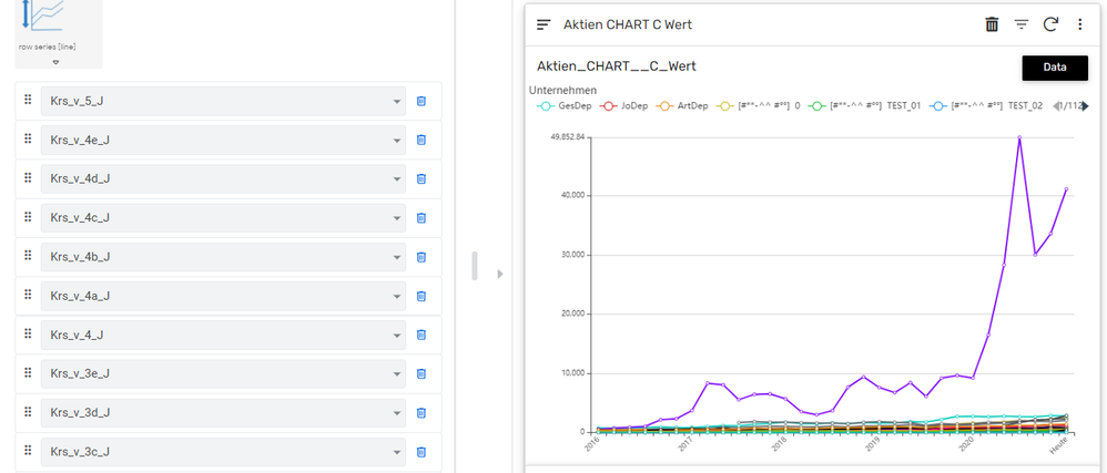
With the new kind of I couldn’t have find a way to make that possible.
As I understand, it is not allowed to pull f.e. single point-data (columns with the values I want to be shown) into the field “major”.
Major has to be the key of the kolumn. Right?
So with this line chart is just possible to show the difference of different (key) rows to each other. But not to show the line chart of a single row. Or didn’t I just find the way how to do it?
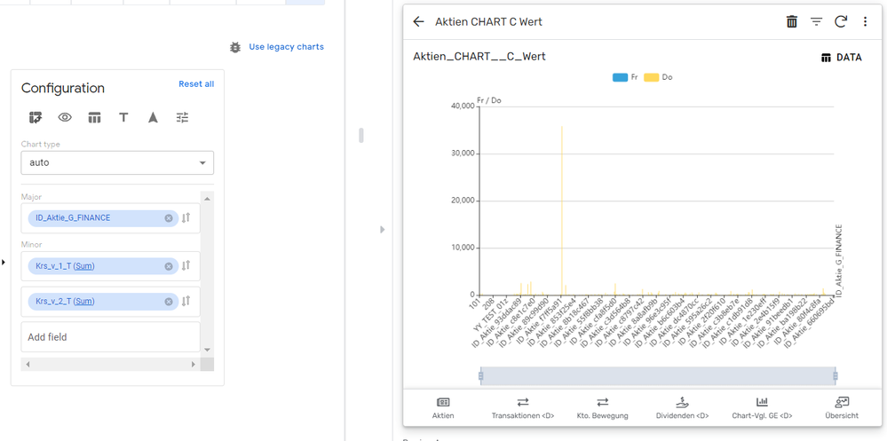
Thank you much!
- Mark as New
- Bookmark
- Subscribe
- Mute
- Subscribe to RSS Feed
- Permalink
- Report Inappropriate Content
- Mark as New
- Bookmark
- Subscribe
- Mute
- Subscribe to RSS Feed
- Permalink
- Report Inappropriate Content
It looks like your chart type is bar char instead of line chart.
Currently it is set to “Auto” whcih is Bar chart by default, so go there and pick up line chart from the dropdown.
- Mark as New
- Bookmark
- Subscribe
- Mute
- Subscribe to RSS Feed
- Permalink
- Report Inappropriate Content
- Mark as New
- Bookmark
- Subscribe
- Mute
- Subscribe to RSS Feed
- Permalink
- Report Inappropriate Content
Hey Tsuji,
thank you for your kwick reply. Actually I have also tried with line chart. The problem stays the same…

I would like to achieve the result where the coumns are set in the major field, not the rows. Is that possible with the new feature?
Thank you ![]()
- Mark as New
- Bookmark
- Subscribe
- Mute
- Subscribe to RSS Feed
- Permalink
- Report Inappropriate Content
- Mark as New
- Bookmark
- Subscribe
- Mute
- Subscribe to RSS Feed
- Permalink
- Report Inappropriate Content
I could be possibly a bug, I suggest you formally report to AppSheet support desk.
- Mark as New
- Bookmark
- Subscribe
- Mute
- Subscribe to RSS Feed
- Permalink
- Report Inappropriate Content
- Mark as New
- Bookmark
- Subscribe
- Mute
- Subscribe to RSS Feed
- Permalink
- Report Inappropriate Content
HI Stuggijo_h,
I’m not sure I understand the issue you are facing.
I just tested it now and was able to add a Time dimension on major and two individual metrics on minor which is similar to your first example with the legacy charts…
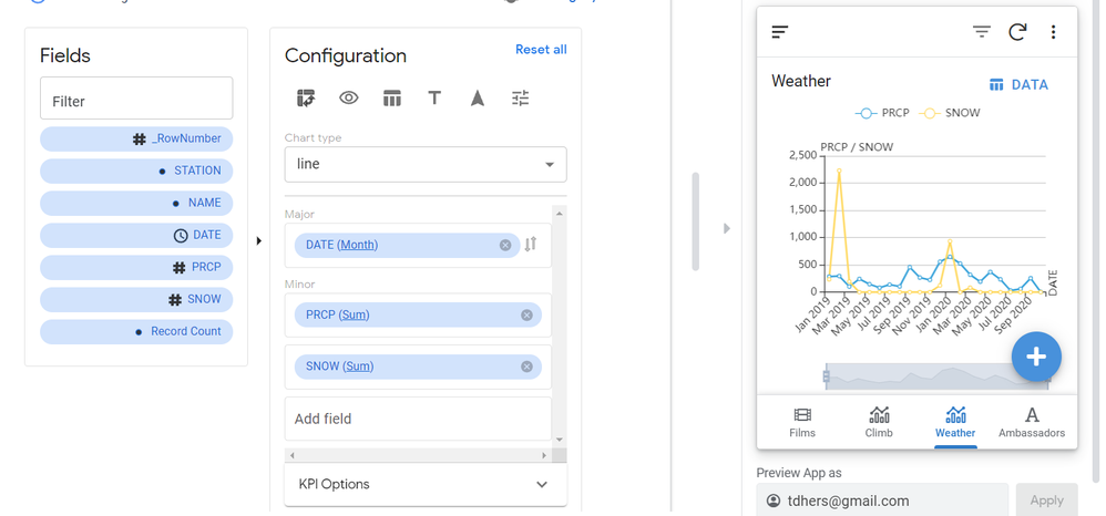
Unless I am missing something…
Thierry
- Mark as New
- Bookmark
- Subscribe
- Mute
- Subscribe to RSS Feed
- Permalink
- Report Inappropriate Content
- Mark as New
- Bookmark
- Subscribe
- Mute
- Subscribe to RSS Feed
- Permalink
- Report Inappropriate Content
@benhare Very new user here, but I would STRONGLY advocate for a time series or time line chart type. Almost all the visualization I need to do is of the “change in metric value” vs “date” for a person type.
I would also very, very strongly advocate for the ability to chart un-aggregated values in any field. As I play with the new features I notice that I cannot make the columns I’m interested in charting simply graph the value in the cell. They don’t give a “None” choice for aggregation. This makes it impossible to see what I need to see.
Have been really happy with AppSheet so far, with the exception of charting! You guys have a great community and an awesome product. I’ve already been able to solve 3 nagging problems in the past week or so.
- Mark as New
- Bookmark
- Subscribe
- Mute
- Subscribe to RSS Feed
- Permalink
- Report Inappropriate Content
- Mark as New
- Bookmark
- Subscribe
- Mute
- Subscribe to RSS Feed
- Permalink
- Report Inappropriate Content
Hi Matt,
You can use the drop down that says Auto by default and specify a line chart specifically.
You can also set a time dimension at the finest level of granularity which in effect is similar to non aggregation.
Maybe if you give me an example of what dimension and measures you want to put in play and what you expect the chart to render, I can help you out…
Thierry
- Mark as New
- Bookmark
- Subscribe
- Mute
- Subscribe to RSS Feed
- Permalink
- Report Inappropriate Content
- Mark as New
- Bookmark
- Subscribe
- Mute
- Subscribe to RSS Feed
- Permalink
- Report Inappropriate Content
Oh And the reason the new chart experience has an AUTO setting is because it will detect automatically if you have a Date field in plan and will automatically set it to a timeline. Similarly if you put two measures in play then it will automatically offer a scatter plot. So the new chart experience will attempt to present the most appropriate chart based on the type of field you have selected.
But nothing prevent you from dismissing the built-in heuristics (AUTO) and selecting a specific type of chart ahead of specifying your field settings, like most other product chart wizards…
- Mark as New
- Bookmark
- Subscribe
- Mute
- Subscribe to RSS Feed
- Permalink
- Report Inappropriate Content
- Mark as New
- Bookmark
- Subscribe
- Mute
- Subscribe to RSS Feed
- Permalink
- Report Inappropriate Content
While the development work is ceased, I tend to unwilling to add and provide the feedback …
Anyway, when we have long list of the column, we are not able to select the column from bottom part to major or minor, whatever we call them.
The only way we could do is to zoom out the browser settings as a whole, to push the selected column to target. This is a bit silly.
- Mark as New
- Bookmark
- Subscribe
- Mute
- Subscribe to RSS Feed
- Permalink
- Report Inappropriate Content
- Mark as New
- Bookmark
- Subscribe
- Mute
- Subscribe to RSS Feed
- Permalink
- Report Inappropriate Content
Another one.
Now we have nicely “Label” for yes/no type. But this is not respected by new chart liberary. On this sample, we have label for yes/no, but it stays Y/N
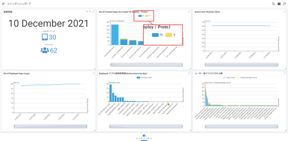
- Mark as New
- Bookmark
- Subscribe
- Mute
- Subscribe to RSS Feed
- Permalink
- Report Inappropriate Content
- Mark as New
- Bookmark
- Subscribe
- Mute
- Subscribe to RSS Feed
- Permalink
- Report Inappropriate Content
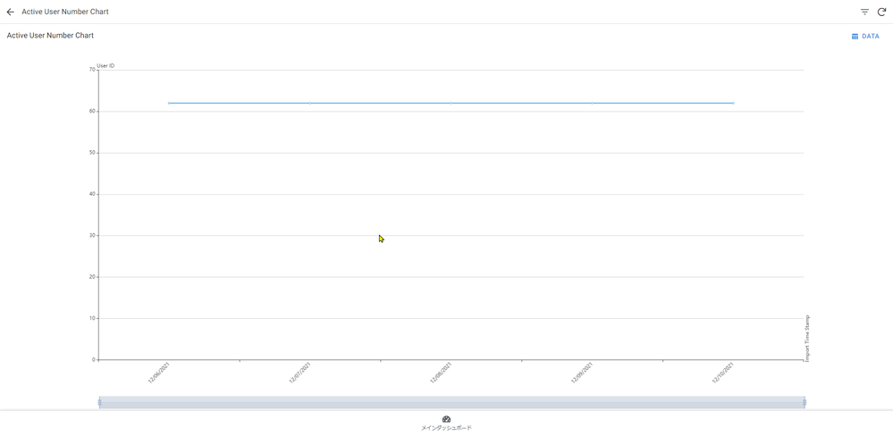
For both x and y axis, we better to have option to toggle “start from zero” kinda of optoin.
If we dont have much of flactuation, chart seems to be pretty much “Flat”.
- Mark as New
- Bookmark
- Subscribe
- Mute
- Subscribe to RSS Feed
- Permalink
- Report Inappropriate Content
- Mark as New
- Bookmark
- Subscribe
- Mute
- Subscribe to RSS Feed
- Permalink
- Report Inappropriate Content
Sir, you’re doing God’s work…
- Mark as New
- Bookmark
- Subscribe
- Mute
- Subscribe to RSS Feed
- Permalink
- Report Inappropriate Content
- Mark as New
- Bookmark
- Subscribe
- Mute
- Subscribe to RSS Feed
- Permalink
- Report Inappropriate Content
- Mark as New
- Bookmark
- Subscribe
- Mute
- Subscribe to RSS Feed
- Permalink
- Report Inappropriate Content
- Mark as New
- Bookmark
- Subscribe
- Mute
- Subscribe to RSS Feed
- Permalink
- Report Inappropriate Content
@TDhers Sent a PM to avoid messing with this very valuable Preview feedback thread
- Mark as New
- Bookmark
- Subscribe
- Mute
- Subscribe to RSS Feed
- Permalink
- Report Inappropriate Content
- Mark as New
- Bookmark
- Subscribe
- Mute
- Subscribe to RSS Feed
- Permalink
- Report Inappropriate Content
Sounds good. I just responded
Thierry
- Mark as New
- Bookmark
- Subscribe
- Mute
- Subscribe to RSS Feed
- Permalink
- Report Inappropriate Content
- Mark as New
- Bookmark
- Subscribe
- Mute
- Subscribe to RSS Feed
- Permalink
- Report Inappropriate Content
Charts being epic, are a game changer for us. Right now we’re having to send users to our own homegrown Apache superset install. But that makes user access and row level security a challenge. It also disconnects the user from consuming the data and being able to affect the data.
-
Account
3 -
Announcements
30 -
App Management
8 -
Automation
30 -
Data
31 -
Errors
17 -
Expressions
21 -
Integrations
24 -
Intelligence
5 -
Other
15 -
Resources
15 -
Security
5 -
Templates
13 -
Users
7 -
UX
34

 Twitter