- AppSheet
- Release Notes & Announcements
- Announcements
- Re: New Charts in AppSheet applications - in Previ...
- Subscribe to RSS Feed
- Mark Topic as New
- Mark Topic as Read
- Float this Topic for Current User
- Bookmark
- Subscribe
- Mute
- Printer Friendly Page
- Mark as New
- Bookmark
- Subscribe
- Mute
- Subscribe to RSS Feed
- Permalink
- Report Inappropriate Content
- Mark as New
- Bookmark
- Subscribe
- Mute
- Subscribe to RSS Feed
- Permalink
- Report Inappropriate Content
The following feature has been added to the Preview Program. Feel free to test the feature and report issues or possible improvements in this thread.
App Creators can now make use of our new chart editor and the new and improved charts it can create. There are still features to be added before general availability, and the new charts should not be used in production apps until general availability as they may be unstable in the future.
We’ve been trying to create a charting experience that allows creators to create charts with more flexibility than they currently have, and which tries to be smart about picking the type of chart that will best represent your data.
How do I start creating new charts?
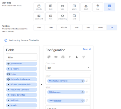
If you have enabled the preview program for your app (make sure to save after turning on the preview program), you should be able to see a toggle to switch between the current experience and the new experience the next time you are viewing a chart under UX → Views. Just press “Try it out” and you should be able to play with it.
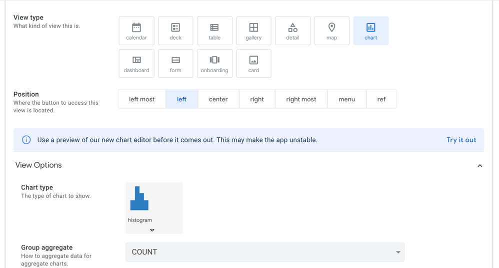
How do I use the new editor?
The new editor will show you the columns in your app, and you can drag them into appropriate Configuration slots. We will then try to guess the type of chart that is appropriate for that type of data - however you can change this should you wish.
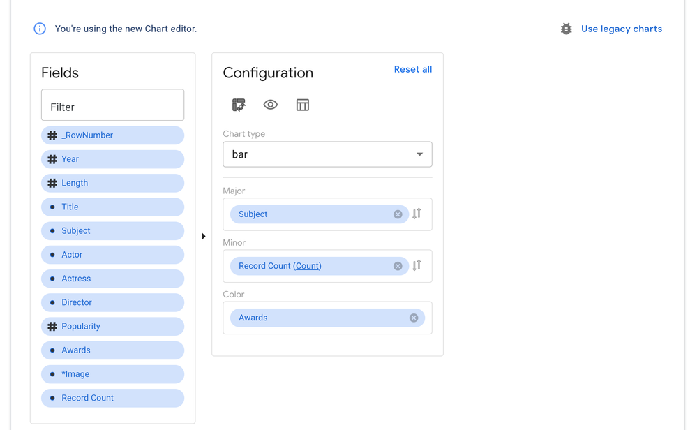
We’re also very interested in feedback as to the usability and discoverability of the features of this editor, so do please explore and let us know what you found.
What chart types are we supporting?
We are currently supporting bar, line, area, scatter, pie, and doughnut charts.
But what about my existing charts?
You can feel free to play around with this chart editor even on top of an existing chart, as they are co-existing alongside one another. You can switch back to your old chart by just pressing the “Use legacy charts” button.
What features are upcoming?
We’ll be rolling out new improvements to this periodically (so stay tuned to the Release Notes to get an exact accounting of what’s coming!), some notable features that will be coming soon are
- The ability to pick from several different themes for the colours in the chart
- The ability to show and hide the title and the ability to turn off clicking through the data on the chart
- The ability to customize what is in the tooltips that users see when over a chart
And more!
- Labels:
-
UX
- Mark as New
- Bookmark
- Subscribe
- Mute
- Subscribe to RSS Feed
- Permalink
- Report Inappropriate Content
- Mark as New
- Bookmark
- Subscribe
- Mute
- Subscribe to RSS Feed
- Permalink
- Report Inappropriate Content
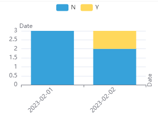
I played around with the Color Field. I was wondering what determines the order. I found that it is not the alphabetically order of the label and not the order of the DateTime value.
But it is the RowNumber: The value in the first row will be the first color.
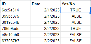
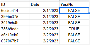
@ben can you confirm?
- Mark as New
- Bookmark
- Subscribe
- Mute
- Subscribe to RSS Feed
- Permalink
- Report Inappropriate Content
- Mark as New
- Bookmark
- Subscribe
- Mute
- Subscribe to RSS Feed
- Permalink
- Report Inappropriate Content
I like these charts, but do you have any idea why trendlines would stop showing on the chart?
- Mark as New
- Bookmark
- Subscribe
- Mute
- Subscribe to RSS Feed
- Permalink
- Report Inappropriate Content
- Mark as New
- Bookmark
- Subscribe
- Mute
- Subscribe to RSS Feed
- Permalink
- Report Inappropriate Content
@benhare I would like to view my related data in more than one chart view. Is it possible to have more than one chart view related to the same related data?
I have noticed you can only make a view a ref, but how do I go about making that ref view connect to specific related data list as it seems that the user can not control this.
- Mark as New
- Bookmark
- Subscribe
- Mute
- Subscribe to RSS Feed
- Permalink
- Report Inappropriate Content
- Mark as New
- Bookmark
- Subscribe
- Mute
- Subscribe to RSS Feed
- Permalink
- Report Inappropriate Content
Evolutions on Charts are great. Thanks.
Is there any evolution foreseen on bar charts where we could configure the width of the bars? In Google Sheets, there is a type of chart named Stepped Chart, which is, in the end, nothing more that a bar chart without space between the bars. Being able to configure the width of the bars until they touch each other would provide a new type of chart in AppSheet quite easily in my opinion? And I am of course really needing that stepped chart for my own app. 🙂
- Mark as New
- Bookmark
- Subscribe
- Mute
- Subscribe to RSS Feed
- Permalink
- Report Inappropriate Content
- Mark as New
- Bookmark
- Subscribe
- Mute
- Subscribe to RSS Feed
- Permalink
- Report Inappropriate Content
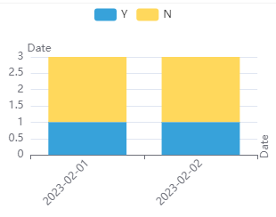
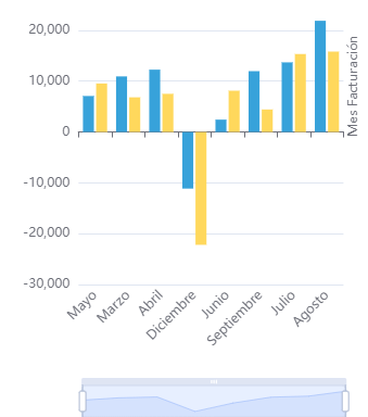
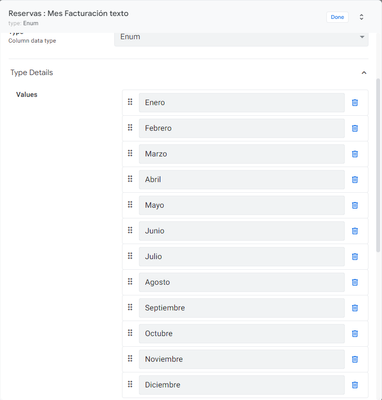
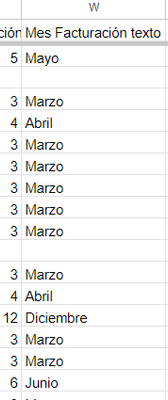
When you use a column Enum, the chart doesn't take the order specified in the column
Instead, is taking the first values founded on the sheet
- Mark as New
- Bookmark
- Subscribe
- Mute
- Subscribe to RSS Feed
- Permalink
- Report Inappropriate Content
- Mark as New
- Bookmark
- Subscribe
- Mute
- Subscribe to RSS Feed
- Permalink
- Report Inappropriate Content
2 years later....
- Mark as New
- Bookmark
- Subscribe
- Mute
- Subscribe to RSS Feed
- Permalink
- Report Inappropriate Content
- Mark as New
- Bookmark
- Subscribe
- Mute
- Subscribe to RSS Feed
- Permalink
- Report Inappropriate Content
Well Google owns looker studio and owns appsheet. It's next to eachother even in this pages burger menu....
How hard can this be to find integration of some sort instead of reinventing the wheel. Reporting/KPI has been required in companies for years and years. We have a data capturing method, we can create user experience and we can manipulate day in low code, this is a job well done, but is it that nobody in team knows how important this is, or going to surprise us perhaps soon or maybe nobody cares. Rule 1....
Data in = Data out
Endless possibilities data in and manipulate but data out seems forgotten in terms of remembering. Template reporting and KPI is priceless..... Interactive only a bonus, by now I think we should have both
@benhare Please help
- Mark as New
- Bookmark
- Subscribe
- Mute
- Subscribe to RSS Feed
- Permalink
- Report Inappropriate Content
- Mark as New
- Bookmark
- Subscribe
- Mute
- Subscribe to RSS Feed
- Permalink
- Report Inappropriate Content
@Denzil_Snyman wrote:
Well Google owns looker studio and owns appsheet. It's next to eachother even in this pages burger menu....
It appears that no more feedback is being considered. From this post and several others, it seems that AppSheet has turned into a silent graveyard.
- Mark as New
- Bookmark
- Subscribe
- Mute
- Subscribe to RSS Feed
- Permalink
- Report Inappropriate Content
- Mark as New
- Bookmark
- Subscribe
- Mute
- Subscribe to RSS Feed
- Permalink
- Report Inappropriate Content
In the dashboard view, the graphics are very small, when we use desktop mode, there should be some way to lock the displayed size, like a true dashboard, have a minimum of responsiveness on this screen. another function it could have would be card, text, with the possibility of formulation, for example total price, total working time, number of employees, presenting it this way would be cool, creating a true BI
- Mark as New
- Bookmark
- Subscribe
- Mute
- Subscribe to RSS Feed
- Permalink
- Report Inappropriate Content
- Mark as New
- Bookmark
- Subscribe
- Mute
- Subscribe to RSS Feed
- Permalink
- Report Inappropriate Content
Hi there,
Any updates on when these new charts will be released from the preview program?
- Mark as New
- Bookmark
- Subscribe
- Mute
- Subscribe to RSS Feed
- Permalink
- Report Inappropriate Content
- Mark as New
- Bookmark
- Subscribe
- Mute
- Subscribe to RSS Feed
- Permalink
- Report Inappropriate Content
Hi admin @benhare , @Arthur_Rallu
Please follow up yours content and feedbacks from many end users developer. We are very tired and disapointed because all feedback wasn't be responsed.
- Mark as New
- Bookmark
- Subscribe
- Mute
- Subscribe to RSS Feed
- Permalink
- Report Inappropriate Content
- Mark as New
- Bookmark
- Subscribe
- Mute
- Subscribe to RSS Feed
- Permalink
- Report Inappropriate Content
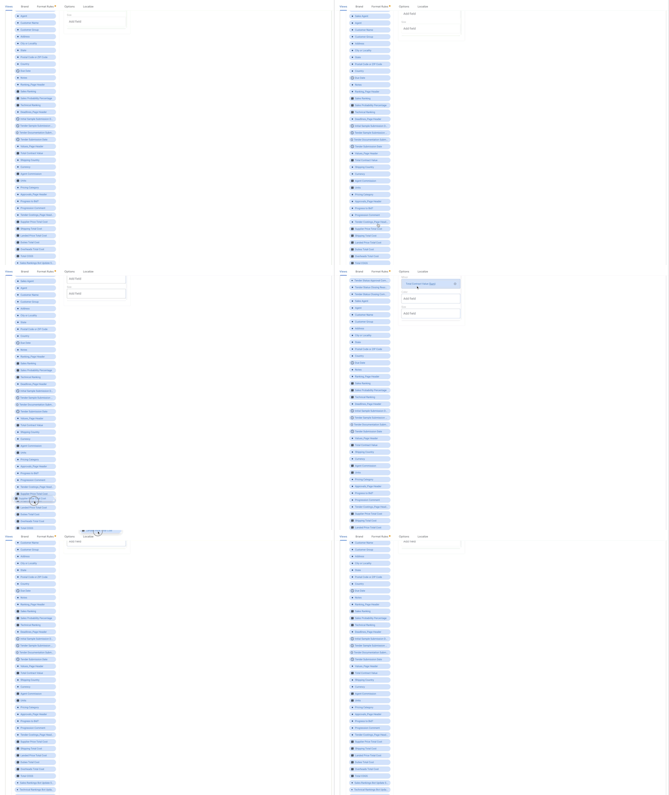
Can someone advise on how to append a column from an extensive list of columns to either the minor or major axis? I'm currently unable to do so.
- Mark as New
- Bookmark
- Subscribe
- Mute
- Subscribe to RSS Feed
- Permalink
- Report Inappropriate Content
- Mark as New
- Bookmark
- Subscribe
- Mute
- Subscribe to RSS Feed
- Permalink
- Report Inappropriate Content
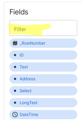
You can click in the FILTER to enter the column's name.
- Mark as New
- Bookmark
- Subscribe
- Mute
- Subscribe to RSS Feed
- Permalink
- Report Inappropriate Content
- Mark as New
- Bookmark
- Subscribe
- Mute
- Subscribe to RSS Feed
- Permalink
- Report Inappropriate Content
That was my oversight. I simply scrolled to the bottom and failed to notice that detail. Thank you. @Fabian_Weller
- Mark as New
- Bookmark
- Subscribe
- Mute
- Subscribe to RSS Feed
- Permalink
- Report Inappropriate Content
- Mark as New
- Bookmark
- Subscribe
- Mute
- Subscribe to RSS Feed
- Permalink
- Report Inappropriate Content
Clicking a data point on the chart will now open the associated row, rather than the same row every time. If multiple rows are aggregated under the same data point, clicking repeatedly will cycle between rows; this is working well on desktop with a window big enough for split panes, but could use some refinement in the case of tabs.
I've also fixed the related bug where clicking data points didn't work right in interactive dashboards.
- Mark as New
- Bookmark
- Subscribe
- Mute
- Subscribe to RSS Feed
- Permalink
- Report Inappropriate Content
- Mark as New
- Bookmark
- Subscribe
- Mute
- Subscribe to RSS Feed
- Permalink
- Report Inappropriate Content
Does this mean further development of this chart function is to take place?
- Mark as New
- Bookmark
- Subscribe
- Mute
- Subscribe to RSS Feed
- Permalink
- Report Inappropriate Content
- Mark as New
- Bookmark
- Subscribe
- Mute
- Subscribe to RSS Feed
- Permalink
- Report Inappropriate Content
I can't make any promises, as I did this on something of a volunteer basis. I felt that the community was right to complain about this feature. Now that I have dug into this component it is easier for me to fix other bugs, but adding new features might take time I don't have.
I have work in progress to fix one other set of bugs where the label display is broken.
- Mark as New
- Bookmark
- Subscribe
- Mute
- Subscribe to RSS Feed
- Permalink
- Report Inappropriate Content
- Mark as New
- Bookmark
- Subscribe
- Mute
- Subscribe to RSS Feed
- Permalink
- Report Inappropriate Content
@infinitejess I'll donate to the cause!
What's your cash app?
- Mark as New
- Bookmark
- Subscribe
- Mute
- Subscribe to RSS Feed
- Permalink
- Report Inappropriate Content
- Mark as New
- Bookmark
- Subscribe
- Mute
- Subscribe to RSS Feed
- Permalink
- Report Inappropriate Content
We can't just do that, there's paperwork involved.
- Mark as New
- Bookmark
- Subscribe
- Mute
- Subscribe to RSS Feed
- Permalink
- Report Inappropriate Content
- Mark as New
- Bookmark
- Subscribe
- Mute
- Subscribe to RSS Feed
- Permalink
- Report Inappropriate Content
Bahaha!!!
- Mark as New
- Bookmark
- Subscribe
- Mute
- Subscribe to RSS Feed
- Permalink
- Report Inappropriate Content
- Mark as New
- Bookmark
- Subscribe
- Mute
- Subscribe to RSS Feed
- Permalink
- Report Inappropriate Content
I'm really happy to see someone working on these charts again. You mentioned in another thread you couldn't get the Legacy Charts to open some type of list view when clicked. (I actually thought that's how they all worked because I've only ever used the aggregate charts. Woops!)
If you get a chance to look into this feature with the Preview Charts, I took a few screenshots of how the Legacy version works. It's kind of a long breakdown, so I'll describe that below.
Thank you!
- Mark as New
- Bookmark
- Subscribe
- Mute
- Subscribe to RSS Feed
- Permalink
- Report Inappropriate Content
- Mark as New
- Bookmark
- Subscribe
- Mute
- Subscribe to RSS Feed
- Permalink
- Report Inappropriate Content
The following is the Legacy Chart in the editor. Under For this data I selected my table called Tasks. Under Chart type I selected one of the aggregate data types, in this case Aggregate piechart. (*Note: you need to use one of the 4 aggregate charts, and there are several more options under Chart columns.) In this case I chose my column called Status Label.
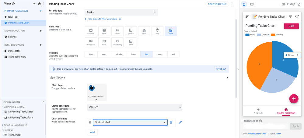
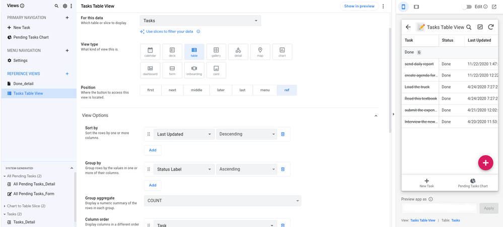
When you click on a segment of the chart it opens a list view with all the rows matching that segment. In this case I click on Done and it opens a table view of items where the "Status" column is equal to Done. I had already created a table view with the same data as the chart view. So the For this data is set to Tasks. View type must be set to either deck or table. Now you can modify the colums, etc for when you click on the chart.
*As I mentioned above this works for the 4 different aggregate charts:
- Histogram
- Horizontal histogram
- Aggregate piechart
- Aggregate donutchart
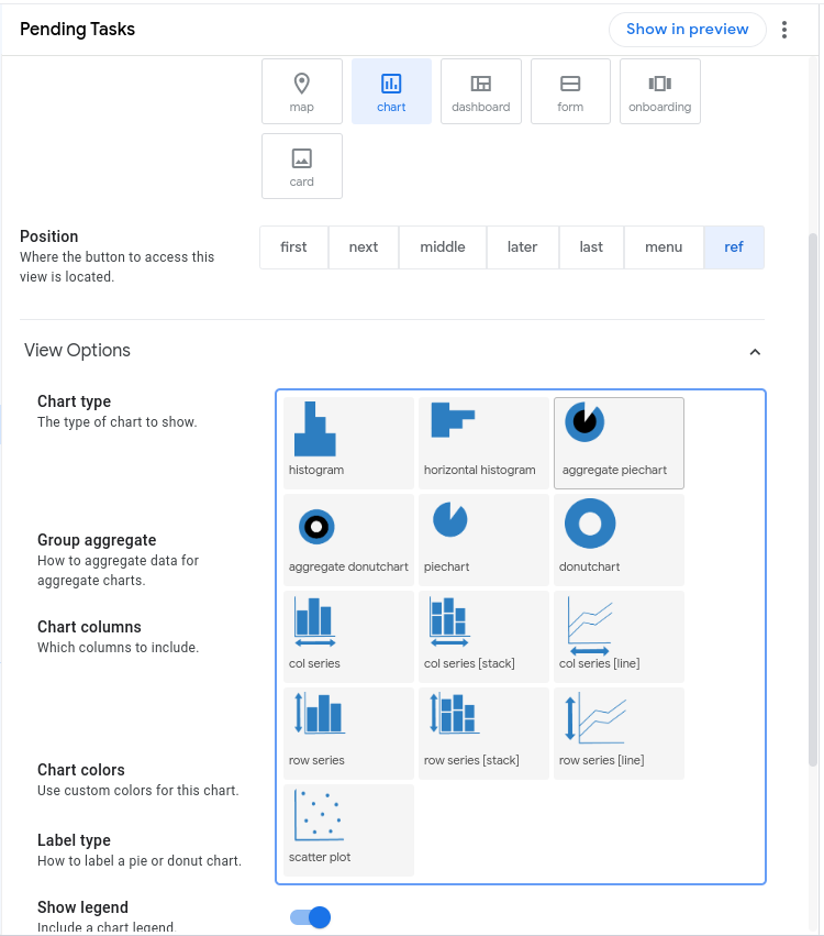
If you select one of those 4 Chart types then you have several options for Chart columns (and your charts will open a list view when clicked):
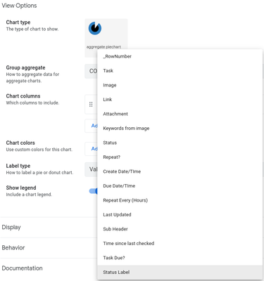
If you select any other Chart type then the Chart columns options are more limited, like this (and your charts will open a detail view when clicked):
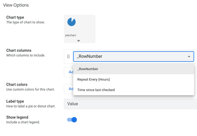
I hope this helps.
- Mark as New
- Bookmark
- Subscribe
- Mute
- Subscribe to RSS Feed
- Permalink
- Report Inappropriate Content
- Mark as New
- Bookmark
- Subscribe
- Mute
- Subscribe to RSS Feed
- Permalink
- Report Inappropriate Content
Much appreciated. I have narrow and deep expertise in how much of the app works, which is a different set of skills than how to use the app. Will take a crack at this, though it won't land for at least a couple weeks.
- Mark as New
- Bookmark
- Subscribe
- Mute
- Subscribe to RSS Feed
- Permalink
- Report Inappropriate Content
- Mark as New
- Bookmark
- Subscribe
- Mute
- Subscribe to RSS Feed
- Permalink
- Report Inappropriate Content
??😂🤣😂 ?
-
Account
3 -
Announcements
30 -
App Management
8 -
Automation
30 -
Data
31 -
Errors
17 -
Expressions
21 -
Integrations
24 -
Intelligence
5 -
Other
15 -
Resources
15 -
Security
5 -
Templates
13 -
Users
7 -
UX
34

 Twitter