- AppSheet
- AppSheet Forum
- AppSheet Q&A
- Re: Dropdown "Plus" Button
- Subscribe to RSS Feed
- Mark Topic as New
- Mark Topic as Read
- Float this Topic for Current User
- Bookmark
- Subscribe
- Mute
- Printer Friendly Page
- Mark as New
- Bookmark
- Subscribe
- Mute
- Subscribe to RSS Feed
- Permalink
- Report Inappropriate Content
- Mark as New
- Bookmark
- Subscribe
- Mute
- Subscribe to RSS Feed
- Permalink
- Report Inappropriate Content
Dear team,
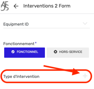
This is a silly question, but a user of my app have “issue” with the “plus” button of a dropdown list.
Please refer to the below picture for more details. Since the field “Type d’intervention” is not well visible (plus button is in light grey), most of the time the user miss to fill this section. The app primary color is dark blue, but the “plus button” on the dropdown goes to dark blue only is the user click on this field.
Is there a way to change the color of the “plus” button (when the field is inactive) or to put the title “Titre d’intervention” in Bolt?
Thanks for support,
Yoann
Solved! Go to Solution.
- Mark as New
- Bookmark
- Subscribe
- Mute
- Subscribe to RSS Feed
- Permalink
- Report Inappropriate Content
- Mark as New
- Bookmark
- Subscribe
- Mute
- Subscribe to RSS Feed
- Permalink
- Report Inappropriate Content
Hello Peter, Sorry for my late reply.
I think the team made some changes. The field is now clearly visible which is great for the app user.

Thanks again for your great support.
Yoann
- Mark as New
- Bookmark
- Subscribe
- Mute
- Subscribe to RSS Feed
- Permalink
- Report Inappropriate Content
- Mark as New
- Bookmark
- Subscribe
- Mute
- Subscribe to RSS Feed
- Permalink
- Report Inappropriate Content
Hi Yoann, unfortunately I don’t believe there’s a way to manually change that color, but I’ll make sure the team receives the feedback. Alternatively, have you tried making the field mandatory for users to complete?
- Mark as New
- Bookmark
- Subscribe
- Mute
- Subscribe to RSS Feed
- Permalink
- Report Inappropriate Content
- Mark as New
- Bookmark
- Subscribe
- Mute
- Subscribe to RSS Feed
- Permalink
- Report Inappropriate Content
Hello Peter, Sorry for my late reply.
I think the team made some changes. The field is now clearly visible which is great for the app user.

Thanks again for your great support.
Yoann
- Mark as New
- Bookmark
- Subscribe
- Mute
- Subscribe to RSS Feed
- Permalink
- Report Inappropriate Content
- Mark as New
- Bookmark
- Subscribe
- Mute
- Subscribe to RSS Feed
- Permalink
- Report Inappropriate Content
Glad to hear that @Yoann_Dubrulle, I agree it is much more visible - this was worked on by @Summer.
- Mark as New
- Bookmark
- Subscribe
- Mute
- Subscribe to RSS Feed
- Permalink
- Report Inappropriate Content
- Mark as New
- Bookmark
- Subscribe
- Mute
- Subscribe to RSS Feed
- Permalink
- Report Inappropriate Content
A special thank you to Madeline! ![]()
-
!
1 -
Account
1,686 -
App Management
3,133 -
AppSheet
1 -
Automation
10,363 -
Bug
994 -
Data
9,716 -
Errors
5,762 -
Expressions
11,832 -
General Miscellaneous
1 -
Google Cloud Deploy
1 -
image and text
1 -
Integrations
1,620 -
Intelligence
580 -
Introductions
86 -
Other
2,929 -
Photos
1 -
Resources
542 -
Security
832 -
Templates
1,315 -
Users
1,564 -
UX
9,136
- « Previous
- Next »
| User | Count |
|---|---|
| 35 | |
| 35 | |
| 28 | |
| 23 | |
| 18 |

 Twitter