- AppSheet
- AppSheet Forum
- AppSheet Q&A
- Re: Enumlist Graph (histogram) displays data in a ...
- Subscribe to RSS Feed
- Mark Topic as New
- Mark Topic as Read
- Float this Topic for Current User
- Bookmark
- Subscribe
- Mute
- Printer Friendly Page
- Mark as New
- Bookmark
- Subscribe
- Mute
- Subscribe to RSS Feed
- Permalink
- Report Inappropriate Content
- Mark as New
- Bookmark
- Subscribe
- Mute
- Subscribe to RSS Feed
- Permalink
- Report Inappropriate Content
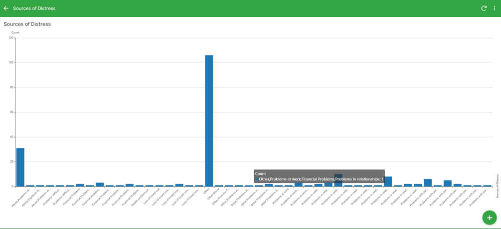
The graphs (eg: histogram) for an ‘EnumList’ attribute, display the data with each possible combination of the options separately, instead of displaying the total number of times a single option was selected. Is there a way to rectify this error or is this a bug in appsheet?

for eg in the image provided, I hovered over one of the bars in the graph and it represents a combination options selected. What I want is for the graph to display the total count for each option selected separately.
- Mark as New
- Bookmark
- Subscribe
- Mute
- Subscribe to RSS Feed
- Permalink
- Report Inappropriate Content
- Mark as New
- Bookmark
- Subscribe
- Mute
- Subscribe to RSS Feed
- Permalink
- Report Inappropriate Content
Don’t know that I would call this a bug more likely just a behavior that’s “not desired in this context”. I can think of situations where you would want the different combinations to be different columns. I don’t think there would be an easy solution to get your desired behavior. Would probably need like a table to hold each individual selection with workflows to create rows per selectioned and a whole bunch of other stuff just to make the graph work.
- Mark as New
- Bookmark
- Subscribe
- Mute
- Subscribe to RSS Feed
- Permalink
- Report Inappropriate Content
- Mark as New
- Bookmark
- Subscribe
- Mute
- Subscribe to RSS Feed
- Permalink
- Report Inappropriate Content
Did u solve it dude ? I have similar problem
-
!
1 -
Account
1,680 -
App Management
3,117 -
AppSheet
1 -
Automation
10,339 -
Bug
986 -
Data
9,696 -
Errors
5,746 -
Expressions
11,812 -
General Miscellaneous
1 -
Google Cloud Deploy
1 -
image and text
1 -
Integrations
1,615 -
Intelligence
578 -
Introductions
85 -
Other
2,916 -
Photos
1 -
Resources
541 -
Security
830 -
Templates
1,309 -
Users
1,562 -
UX
9,126
- « Previous
- Next »
| User | Count |
|---|---|
| 43 | |
| 34 | |
| 27 | |
| 23 | |
| 15 |

 Twitter