- AppSheet
- AppSheet Forum
- AppSheet Q&A
- Re: I can't see all the columns to add to dashboar...
- Subscribe to RSS Feed
- Mark Topic as New
- Mark Topic as Read
- Float this Topic for Current User
- Bookmark
- Subscribe
- Mute
- Printer Friendly Page
- Mark as New
- Bookmark
- Subscribe
- Mute
- Subscribe to RSS Feed
- Permalink
- Report Inappropriate Content
- Mark as New
- Bookmark
- Subscribe
- Mute
- Subscribe to RSS Feed
- Permalink
- Report Inappropriate Content
Hi, I’m new at this. So this is probably very simple. I search in videos and documentation but I can’t figure it out myself.
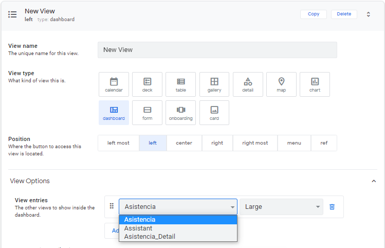
When creating the Dashboard, and wanting to add the elements, only 3 options appear, but not the ones I want. What I am looking for is to measure the percentage of attendance, sort it by company, and by each boss of each company. (I have these columns in my Database)
About the three options that appears, I only have the first one in my database
- Labels:
-
UX
- Mark as New
- Bookmark
- Subscribe
- Mute
- Subscribe to RSS Feed
- Permalink
- Report Inappropriate Content
- Mark as New
- Bookmark
- Subscribe
- Mute
- Subscribe to RSS Feed
- Permalink
- Report Inappropriate Content
Hi Miguel,
What you’re seeing there are actually ‘Views’ not columns. To list what you’re looking for you’ll need to create a new ‘View’ using the data you’d like to sort.
If you’d like to use only some of the columns from your data, say the attendance for example, then you’ll need to learn how to make a new ‘Slice’ which is like a filtered view of your data.
Hope this helps!
- Mark as New
- Bookmark
- Subscribe
- Mute
- Subscribe to RSS Feed
- Permalink
- Report Inappropriate Content
- Mark as New
- Bookmark
- Subscribe
- Mute
- Subscribe to RSS Feed
- Permalink
- Report Inappropriate Content
I appreciate your advice, as well as the immediacy.
I already created the Slice, and when I create a new view, these slices appear as an option.
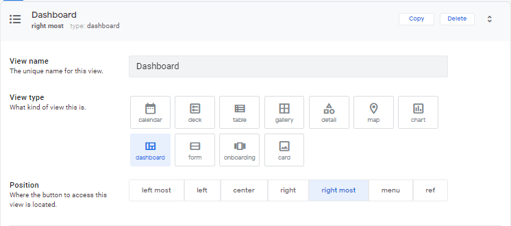
However, when I choose to make it Dashboard. The “for this data” option disappears.
- Mark as New
- Bookmark
- Subscribe
- Mute
- Subscribe to RSS Feed
- Permalink
- Report Inappropriate Content
- Mark as New
- Bookmark
- Subscribe
- Mute
- Subscribe to RSS Feed
- Permalink
- Report Inappropriate Content
A “Dashboard” is a collection of “Views”. Dashboards aren’t connected to individual Tables/Slices. You need to make Views for your Tables/Slices first, then add them into your Dashboard.
- Mark as New
- Bookmark
- Subscribe
- Mute
- Subscribe to RSS Feed
- Permalink
- Report Inappropriate Content
- Mark as New
- Bookmark
- Subscribe
- Mute
- Subscribe to RSS Feed
- Permalink
- Report Inappropriate Content
Marc_Dillon,
I appreciate your support, I already understood the nature of the dashboard. I already added the new views and was able to include them in the dashboard.
What I want to do is that when I select a company (left) in the view on the right you can see the bosses of that company (right).
However, what happens is that it takes me to the principal view.
I already activated the interactive mode, reload and save.
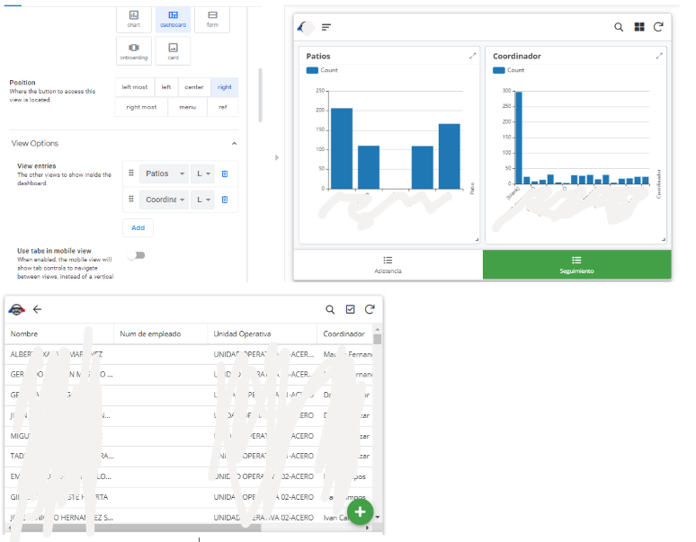
Something that I am doing wrong?
- Mark as New
- Bookmark
- Subscribe
- Mute
- Subscribe to RSS Feed
- Permalink
- Report Inappropriate Content
- Mark as New
- Bookmark
- Subscribe
- Mute
- Subscribe to RSS Feed
- Permalink
- Report Inappropriate Content
You mention “company” and “bosses” in your post, but your screenshot shows “patios” and “coordinators”. So at this point I have very little idea what you’re talking about, and thus cannot help. Please elaborate on, or clear up, your post.
- Mark as New
- Bookmark
- Subscribe
- Mute
- Subscribe to RSS Feed
- Permalink
- Report Inappropriate Content
- Mark as New
- Bookmark
- Subscribe
- Mute
- Subscribe to RSS Feed
- Permalink
- Report Inappropriate Content
Thanks for your feedback.
What i want to do, is when i tap in the left view (patios), filter the Coordinador (rigth view).
In each Patio, i have diferent coordinador.
But actually, when i tap patios, takes me to another view (my main view)
- Mark as New
- Bookmark
- Subscribe
- Mute
- Subscribe to RSS Feed
- Permalink
- Report Inappropriate Content
- Mark as New
- Bookmark
- Subscribe
- Mute
- Subscribe to RSS Feed
- Permalink
- Report Inappropriate Content
Charts views don’t work with interactive dashboards like that.
- Mark as New
- Bookmark
- Subscribe
- Mute
- Subscribe to RSS Feed
- Permalink
- Report Inappropriate Content
- Mark as New
- Bookmark
- Subscribe
- Mute
- Subscribe to RSS Feed
- Permalink
- Report Inappropriate Content
There is some method, in which it allows me to select the patio by button or image. And when I selected it, did I filter these graphs?
Sorry for the insistence, but I feel lost and I can not find documentation to guide myself
- Mark as New
- Bookmark
- Subscribe
- Mute
- Subscribe to RSS Feed
- Permalink
- Report Inappropriate Content
- Mark as New
- Bookmark
- Subscribe
- Mute
- Subscribe to RSS Feed
- Permalink
- Report Inappropriate Content
Try adding a “table” or “deck” view of Patios to your dashboard.
- Mark as New
- Bookmark
- Subscribe
- Mute
- Subscribe to RSS Feed
- Permalink
- Report Inappropriate Content
- Mark as New
- Bookmark
- Subscribe
- Mute
- Subscribe to RSS Feed
- Permalink
- Report Inappropriate Content
Marc, hi again.
I did what u suggest, but im very lost.
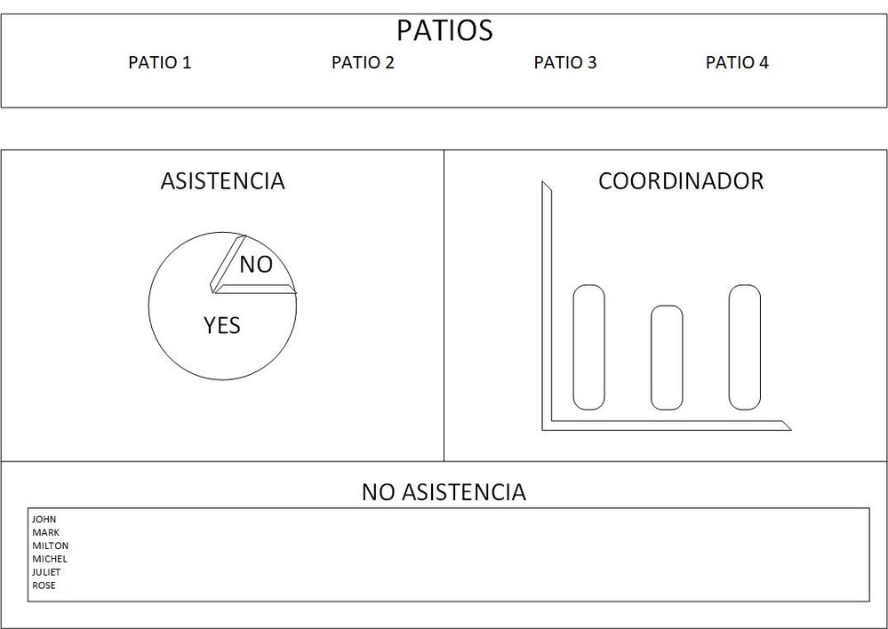
This application is to measure the percentage of training in the company, which is divided into “Patios”, and in each “Patio” I have different “Coordinators”, who have employees under their charge.
What I am looking for is, in the header have buttons or images of each of the patios (companies).
When selecting one, let me show the percentage of “Asistencia” on the pie chart.
Likewise, let me filter the coordinators that belong to that “Patio” (and also show the progress of the “Asistencia”).
And finally in the footer, show me those who have no assistance.
- Mark as New
- Bookmark
- Subscribe
- Mute
- Subscribe to RSS Feed
- Permalink
- Report Inappropriate Content
- Mark as New
- Bookmark
- Subscribe
- Mute
- Subscribe to RSS Feed
- Permalink
- Report Inappropriate Content
Make sure you read up on “interactive dashboards”
https://www.google.com/search?q=appsheet+interactive+dashboard
I’m not sure why you’re throwing in extra complication to your issue here when you don’t even seem to have solved the simpler version. So I’m just going to further respond to the simpler version.
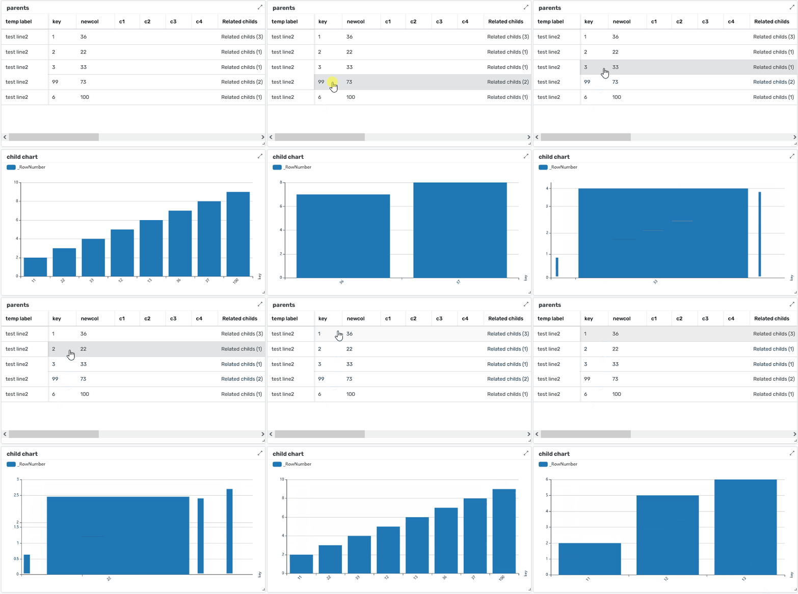
Here’s a similar setup:
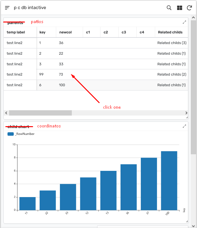
–after clicking one–
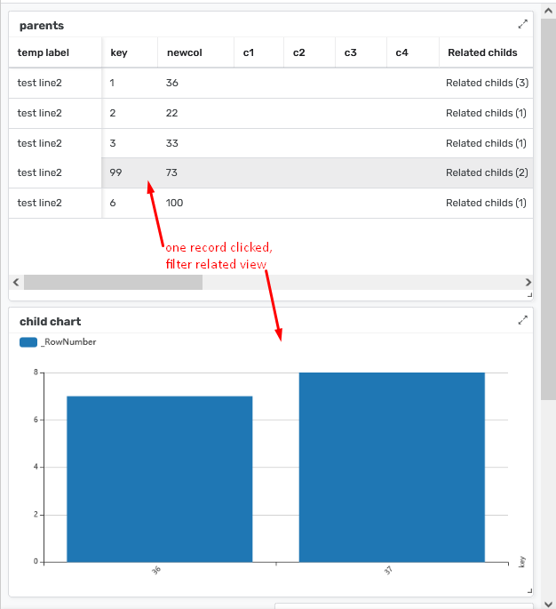
animated GIF of the same (hopefully this works I stopped posting GIFs a while back because they stopped working for me for some reason):
-
!
1 -
Account
1,679 -
App Management
3,116 -
AppSheet
1 -
Automation
10,338 -
Bug
986 -
Data
9,694 -
Errors
5,743 -
Expressions
11,811 -
General Miscellaneous
1 -
Google Cloud Deploy
1 -
image and text
1 -
Integrations
1,615 -
Intelligence
578 -
Introductions
85 -
Other
2,915 -
Photos
1 -
Resources
541 -
Security
830 -
Templates
1,309 -
Users
1,562 -
UX
9,125
- « Previous
- Next »
| User | Count |
|---|---|
| 42 | |
| 34 | |
| 26 | |
| 23 | |
| 15 |

 Twitter