- AppSheet
- AppSheet Forum
- AppSheet Q&A
- Re: New Bug Encountered: Background image is not r...
- Subscribe to RSS Feed
- Mark Topic as New
- Mark Topic as Read
- Float this Topic for Current User
- Bookmark
- Subscribe
- Mute
- Printer Friendly Page
- Mark as New
- Bookmark
- Subscribe
- Mute
- Subscribe to RSS Feed
- Permalink
- Report Inappropriate Content
- Mark as New
- Bookmark
- Subscribe
- Mute
- Subscribe to RSS Feed
- Permalink
- Report Inappropriate Content
Hey folks!
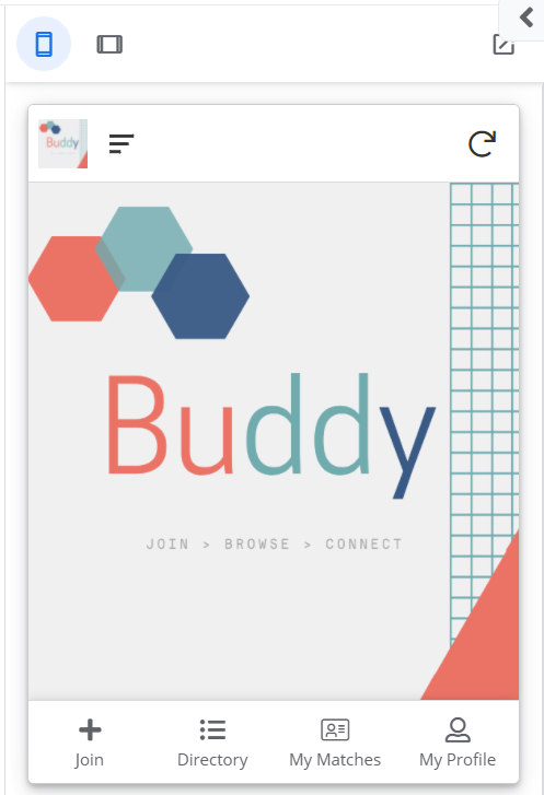
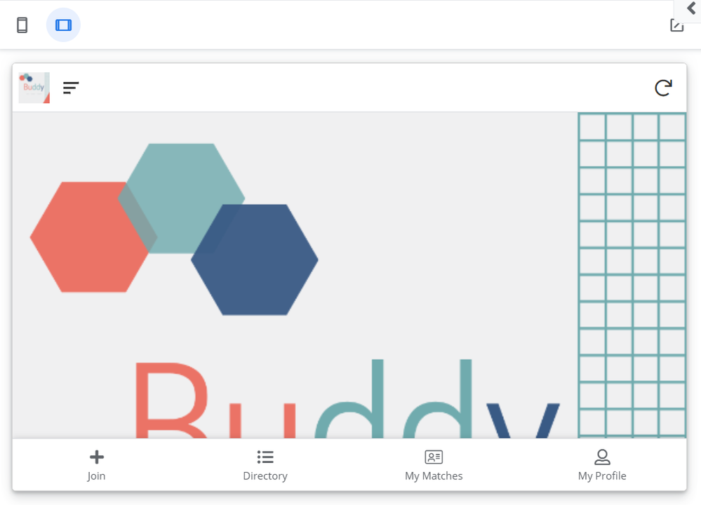
I’ve noticed that the background image I’m using in my app looks fine on mobile view but is only partially viewable in tablet/web view. The app is not responsive with the image. Is this a bug?
Mobile view

Tablet/web view

Please help!
- Labels:
-
Errors
- Mark as New
- Bookmark
- Subscribe
- Mute
- Subscribe to RSS Feed
- Permalink
- Report Inappropriate Content
- Mark as New
- Bookmark
- Subscribe
- Mute
- Subscribe to RSS Feed
- Permalink
- Report Inappropriate Content
the behavior shown “feels” like it is correct. Appsheet is trying to keep the aspect ratio the same which cuts off the bottom portion of the image.
- Mark as New
- Bookmark
- Subscribe
- Mute
- Subscribe to RSS Feed
- Permalink
- Report Inappropriate Content
- Mark as New
- Bookmark
- Subscribe
- Mute
- Subscribe to RSS Feed
- Permalink
- Report Inappropriate Content
Maybe, but it just makes the end result look unprofessional. App Sheet really should be able to address this.
- Mark as New
- Bookmark
- Subscribe
- Mute
- Subscribe to RSS Feed
- Permalink
- Report Inappropriate Content
- Mark as New
- Bookmark
- Subscribe
- Mute
- Subscribe to RSS Feed
- Permalink
- Report Inappropriate Content
I mean to address it they would have to squish your image which would also look unprofessional?
- Mark as New
- Bookmark
- Subscribe
- Mute
- Subscribe to RSS Feed
- Permalink
- Report Inappropriate Content
- Mark as New
- Bookmark
- Subscribe
- Mute
- Subscribe to RSS Feed
- Permalink
- Report Inappropriate Content
Ideally App Sheet should be able to resize the image to fit the active window regardless of device/view type. What I’m seeing is the top part and bottom half of the image completely cut off in tablet/web browser view, I’d be interested to know how the app is deciding what part of the image to show.
- Mark as New
- Bookmark
- Subscribe
- Mute
- Subscribe to RSS Feed
- Permalink
- Report Inappropriate Content
- Mark as New
- Bookmark
- Subscribe
- Mute
- Subscribe to RSS Feed
- Permalink
- Report Inappropriate Content
Resize=Squish it to look ugly.Heres a stretched version of your image now Join>Browse>Connect is unreadable.

I assume it takes the horizontal width of the screen and the aspect ratio of the original and then resizes the image while keeping the aspect ratio. You are either gonna end up with blank space, squished images, or cut off images. There is no magic way to display a 500x1000 image on a 1000x500 display and keep it looking the same.
Since you seem to be using a detail view to display this image, you could use CONTEXT(VIEWTYPE) to display a different image that is a different aspect ratio that would look better on a tablet or browser. I believe the CONTEXT is decided by the width of the window. This wouldn’t mean that you can resize the browser and have it switch images but it would display the image based on the initial size of whatever is viewing the page.
- Mark as New
- Bookmark
- Subscribe
- Mute
- Subscribe to RSS Feed
- Permalink
- Report Inappropriate Content
- Mark as New
- Bookmark
- Subscribe
- Mute
- Subscribe to RSS Feed
- Permalink
- Report Inappropriate Content
-
Account
1,677 -
App Management
3,100 -
AppSheet
1 -
Automation
10,325 -
Bug
984 -
Data
9,677 -
Errors
5,734 -
Expressions
11,782 -
General Miscellaneous
1 -
Google Cloud Deploy
1 -
image and text
1 -
Integrations
1,610 -
Intelligence
578 -
Introductions
85 -
Other
2,906 -
Photos
1 -
Resources
538 -
Security
828 -
Templates
1,309 -
Users
1,559 -
UX
9,113
- « Previous
- Next »
| User | Count |
|---|---|
| 43 | |
| 30 | |
| 24 | |
| 23 | |
| 13 |

 Twitter