- AppSheet
- AppSheet Forum
- AppSheet Q&A
- Please look at this, how bad this looks again and ...
- Subscribe to RSS Feed
- Mark Topic as New
- Mark Topic as Read
- Float this Topic for Current User
- Bookmark
- Subscribe
- Mute
- Printer Friendly Page
- Mark as New
- Bookmark
- Subscribe
- Mute
- Subscribe to RSS Feed
- Permalink
- Report Inappropriate Content
- Mark as New
- Bookmark
- Subscribe
- Mute
- Subscribe to RSS Feed
- Permalink
- Report Inappropriate Content
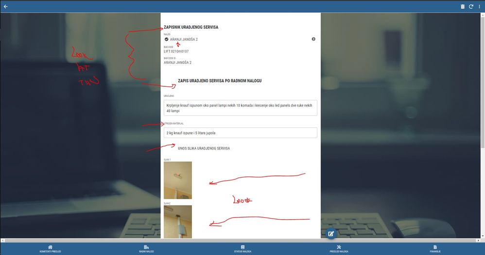
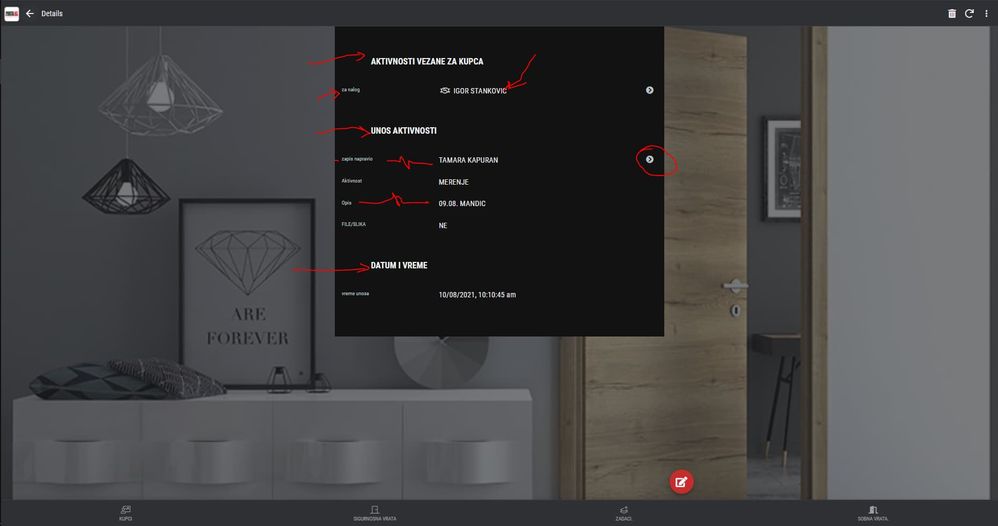
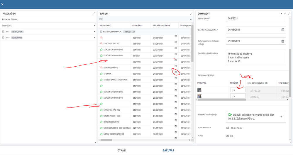
Look how ux design team is working, look how our apps look to our end user, it is like some kid has played with this.
Please fire who ever is doing this. it is still the worst ux design ever.
look how close to the edge this is and show columns doing their own thing.
everything is every ware it is funny and sad at the same time.


- Mark as New
- Bookmark
- Subscribe
- Mute
- Subscribe to RSS Feed
- Permalink
- Report Inappropriate Content
- Mark as New
- Bookmark
- Subscribe
- Mute
- Subscribe to RSS Feed
- Permalink
- Report Inappropriate Content
I agree.
- Mark as New
- Bookmark
- Subscribe
- Mute
- Subscribe to RSS Feed
- Permalink
- Report Inappropriate Content
- Mark as New
- Bookmark
- Subscribe
- Mute
- Subscribe to RSS Feed
- Permalink
- Report Inappropriate Content
I echo, but major constructions (for whole AppSheet UI/UX) are believed to be going on.
I just patiently wait for that to see the improvement.
- Mark as New
- Bookmark
- Subscribe
- Mute
- Subscribe to RSS Feed
- Permalink
- Report Inappropriate Content
- Mark as New
- Bookmark
- Subscribe
- Mute
- Subscribe to RSS Feed
- Permalink
- Report Inappropriate Content
6 mounts has past since they changed ux to this and they made it worse not better since.
formatting some data doesn’t work, when you enlarge some fonts it stay the same in the detail view, in quick edit mode detail view it cuts half of the field that you are trying to change, and so on.
it is ugly unprofessional and sad looking right now. Nothing has changed.
And it is not me talking, it is every of our costumer, and prospects when we go to present the apps that says the same.
it looks ugly confusing unappealing and unreliable. Plain and ugly

do not want to promote anybody but if they only new how other platforms look ant feel to the end user, they would do something about this.
If I was starting to learn and use the platform right now i would have no motivation to look and build the apps that look like this.
Please hire somebody that gives a f… about UX design.
Sorry but this is so frustrating
- Mark as New
- Bookmark
- Subscribe
- Mute
- Subscribe to RSS Feed
- Permalink
- Report Inappropriate Content
- Mark as New
- Bookmark
- Subscribe
- Mute
- Subscribe to RSS Feed
- Permalink
- Report Inappropriate Content
I agree.
- Mark as New
- Bookmark
- Subscribe
- Mute
- Subscribe to RSS Feed
- Permalink
- Report Inappropriate Content
- Mark as New
- Bookmark
- Subscribe
- Mute
- Subscribe to RSS Feed
- Permalink
- Report Inappropriate Content
Could you reach out to support@appsheet.com and let us take a look at your apps? Mention that the ticket should go straight to me (Arthur Rallu).
I was trying to recreate your issues, but it’ll be better for both of us if you can let us see how you’ve set up that dashboard.
Thank you
Note: I understand your frustration and it’s fair to say that
it looks ugly confusing unappealing and unreliable. Plain and ugly
However, please tone down some of the language, including in the name of screenshots. It doesn’t help anyone.
- Mark as New
- Bookmark
- Subscribe
- Mute
- Subscribe to RSS Feed
- Permalink
- Report Inappropriate Content
- Mark as New
- Bookmark
- Subscribe
- Mute
- Subscribe to RSS Feed
- Permalink
- Report Inappropriate Content
Ok, sorry for the for the bad words, but we a are very frustrated about ux of the apps, customers are complaining all the time about the look of it, and we can do nothing about it.
Not just one but everybody at some point mention how confusing and bad it look for users.
- Mark as New
- Bookmark
- Subscribe
- Mute
- Subscribe to RSS Feed
- Permalink
- Report Inappropriate Content
- Mark as New
- Bookmark
- Subscribe
- Mute
- Subscribe to RSS Feed
- Permalink
- Report Inappropriate Content
Let me know if/when you’re able to submit a support request on this. I haven’t seen one so far.
It will be difficult to solve these dashboard issues without a clean repro.
Thank you.
- Mark as New
- Bookmark
- Subscribe
- Mute
- Subscribe to RSS Feed
- Permalink
- Report Inappropriate Content
- Mark as New
- Bookmark
- Subscribe
- Mute
- Subscribe to RSS Feed
- Permalink
- Report Inappropriate Content
HI ok i will make it today state what app it is, but you can find that anomalies in almost all of the apps in my case, also formatting that doesn’t work, or where it cuts the icon in line view.
- Mark as New
- Bookmark
- Subscribe
- Mute
- Subscribe to RSS Feed
- Permalink
- Report Inappropriate Content
- Mark as New
- Bookmark
- Subscribe
- Mute
- Subscribe to RSS Feed
- Permalink
- Report Inappropriate Content
The web form is preferred over the email address.
- Mark as New
- Bookmark
- Subscribe
- Mute
- Subscribe to RSS Feed
- Permalink
- Report Inappropriate Content
- Mark as New
- Bookmark
- Subscribe
- Mute
- Subscribe to RSS Feed
- Permalink
- Report Inappropriate Content
- Mark as New
- Bookmark
- Subscribe
- Mute
- Subscribe to RSS Feed
- Permalink
- Report Inappropriate Content
- Mark as New
- Bookmark
- Subscribe
- Mute
- Subscribe to RSS Feed
- Permalink
- Report Inappropriate Content
I’ve escalated this internally.
-
Account
1,677 -
App Management
3,099 -
AppSheet
1 -
Automation
10,323 -
Bug
983 -
Data
9,676 -
Errors
5,733 -
Expressions
11,779 -
General Miscellaneous
1 -
Google Cloud Deploy
1 -
image and text
1 -
Integrations
1,610 -
Intelligence
578 -
Introductions
85 -
Other
2,904 -
Photos
1 -
Resources
538 -
Security
827 -
Templates
1,309 -
Users
1,559 -
UX
9,110
- « Previous
- Next »
| User | Count |
|---|---|
| 43 | |
| 28 | |
| 24 | |
| 24 | |
| 13 |

 Twitter