- AppSheet
- AppSheet Forum
- AppSheet Q&A
- Re: Theme / color question
- Subscribe to RSS Feed
- Mark Topic as New
- Mark Topic as Read
- Float this Topic for Current User
- Bookmark
- Subscribe
- Mute
- Printer Friendly Page
- Mark as New
- Bookmark
- Subscribe
- Mute
- Subscribe to RSS Feed
- Permalink
- Report Inappropriate Content
- Mark as New
- Bookmark
- Subscribe
- Mute
- Subscribe to RSS Feed
- Permalink
- Report Inappropriate Content
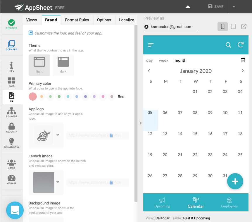
I’m looking at the following sample app and having a hard time figuring out how the appearance was set up:
As you can see in the following image, the top and bottom menus and the overlay action have a bluish color but the primary color chosen is “red.” Moreover, after copying the app and changing the primary color myself, the top and bottom menus became white and the overlay actions were displayed in the color I had chosen. I looked in the format rules, and there’s nothing there. Can someone help me understand how this works?

- Labels:
-
UX
- Mark as New
- Bookmark
- Subscribe
- Mute
- Subscribe to RSS Feed
- Permalink
- Report Inappropriate Content
- Mark as New
- Bookmark
- Subscribe
- Mute
- Subscribe to RSS Feed
- Permalink
- Report Inappropriate Content
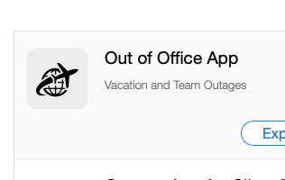
By the way, when I copied this app to practice with it, I noticed that the “brand” icon was changed automatically and randomly to one that has nothing to do with the nature of the app. The original brand icon was nice:
Is there are reason why AppSheet prefers to have logos randomized when sample and prototype apps are copied? In the past, I’ve requested that brand images be maintained with prototype and sample apps. I hope this adjustment can be made eventually. Thanks for your consideration.
- Mark as New
- Bookmark
- Subscribe
- Mute
- Subscribe to RSS Feed
- Permalink
- Report Inappropriate Content
- Mark as New
- Bookmark
- Subscribe
- Mute
- Subscribe to RSS Feed
- Permalink
- Report Inappropriate Content
When UI/color theme feature was changed, you can’t choose the background other than light or dark. Though old apps still have that option if you haven’t changed it.
- Mark as New
- Bookmark
- Subscribe
- Mute
- Subscribe to RSS Feed
- Permalink
- Report Inappropriate Content
- Mark as New
- Bookmark
- Subscribe
- Mute
- Subscribe to RSS Feed
- Permalink
- Report Inappropriate Content
Thanks! I see. This is an old feature. That makes sense. Thanks!
- Mark as New
- Bookmark
- Subscribe
- Mute
- Subscribe to RSS Feed
- Permalink
- Report Inappropriate Content
- Mark as New
- Bookmark
- Subscribe
- Mute
- Subscribe to RSS Feed
- Permalink
- Report Inappropriate Content
You’re welcome
-
!
1 -
Account
1,683 -
App Management
3,125 -
AppSheet
1 -
Automation
10,351 -
Bug
992 -
Data
9,708 -
Errors
5,757 -
Expressions
11,823 -
General Miscellaneous
1 -
Google Cloud Deploy
1 -
image and text
1 -
Integrations
1,619 -
Intelligence
580 -
Introductions
86 -
Other
2,925 -
Photos
1 -
Resources
542 -
Security
832 -
Templates
1,313 -
Users
1,563 -
UX
9,131
- « Previous
- Next »
| User | Count |
|---|---|
| 40 | |
| 34 | |
| 28 | |
| 23 | |
| 17 |

 Twitter