This website uses Cookies. Click Accept to agree to our website's cookie use as described in our Privacy Policy. Click Preferences to customize your cookie settings.
Turn on suggestions
Auto-suggest helps you quickly narrow down your search results by suggesting possible matches as you type.
Showing results for
- AppSheet
- AppSheet Forum
- AppSheet Q&A
- UI Changes: Table View Grouping Data
Topic Options
- Subscribe to RSS Feed
- Mark Topic as New
- Mark Topic as Read
- Float this Topic for Current User
- Bookmark
- Subscribe
- Mute
- Printer Friendly Page
Solved

Post Options
- Mark as New
- Bookmark
- Subscribe
- Mute
- Subscribe to RSS Feed
- Permalink
- Report Inappropriate Content
Reply posted on
--/--/---- --:-- AM
Post Options
- Mark as New
- Bookmark
- Subscribe
- Mute
- Subscribe to RSS Feed
- Permalink
- Report Inappropriate Content
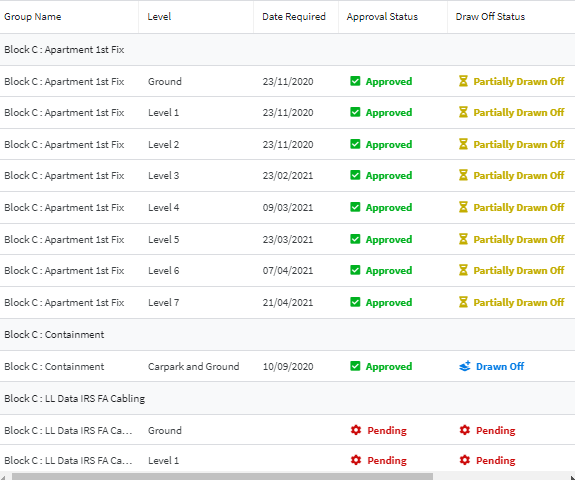
Hello, I notice some of the recent UI/Layout updates have changed the way in which the grouping is seen. I would say the majority of the views within the app is Table format, some users have pointed out that its harder to distinguish between the groupings as seen below; whereas previously the black bold heading was easily read.
I understand a lot of work has went into these changes, without meaning to criticise is there any way of making this easier for the readers?
1
1
119
Topic Labels
- Labels:
-
UX
1 REPLY 1
Post Options
- Mark as New
- Bookmark
- Subscribe
- Mute
- Subscribe to RSS Feed
- Permalink
- Report Inappropriate Content
Reply posted on
--/--/---- --:-- AM
Post Options
- Mark as New
- Bookmark
- Subscribe
- Mute
- Subscribe to RSS Feed
- Permalink
- Report Inappropriate Content
Top Labels in this Space
-
Account
1,677 -
App Management
3,099 -
AppSheet
1 -
Automation
10,325 -
Bug
983 -
Data
9,676 -
Errors
5,733 -
Expressions
11,781 -
General Miscellaneous
1 -
Google Cloud Deploy
1 -
image and text
1 -
Integrations
1,610 -
Intelligence
578 -
Introductions
85 -
Other
2,905 -
Photos
1 -
Resources
538 -
Security
828 -
Templates
1,309 -
Users
1,559 -
UX
9,110
- « Previous
- Next »
Top Solution Authors
| User | Count |
|---|---|
| 43 | |
| 28 | |
| 24 | |
| 21 | |
| 13 |

 Twitter