- AppSheet
- AppSheet Forum
- AppSheet Q&A
- Re: Which view would come close to a dashboard pre...
- Subscribe to RSS Feed
- Mark Topic as New
- Mark Topic as Read
- Float this Topic for Current User
- Bookmark
- Subscribe
- Mute
- Printer Friendly Page
- Mark as New
- Bookmark
- Subscribe
- Mute
- Subscribe to RSS Feed
- Permalink
- Report Inappropriate Content
- Mark as New
- Bookmark
- Subscribe
- Mute
- Subscribe to RSS Feed
- Permalink
- Report Inappropriate Content
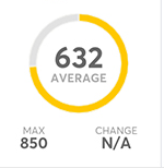
Within the limitations to existing view types (templates), I am trying to figure out how best to render a dashboard with a few key numbers presented in a dashboard like fashion.
Here’s an example I grabbed off the Net. I understand the circle would be hard to achieve. But can the layout of labels and numbers be achieved using any of the view templates?
Thanks!
I was able to get number in big font but it stayed at the top of the view, could not make it show up in center.
Likewise with the two numbers at the bottom, not sure it is possible to show them side-by-side
Solved! Go to Solution.
- Mark as New
- Bookmark
- Subscribe
- Mute
- Subscribe to RSS Feed
- Permalink
- Report Inappropriate Content
- Mark as New
- Bookmark
- Subscribe
- Mute
- Subscribe to RSS Feed
- Permalink
- Report Inappropriate Content
#1 - Yes, the font size will be identical
#2 - You can do that like…
[ColA]&CONCATENATE("
")&[ColB]
#3 - No it’s not, but it’s better way. The other way is calculating the summary in a virtual column. But then it will calclulate the same in every row which is not an effective way.
#4 - You can show data in the center with the option “Display mode” and set it as “Centered”. You can find it from the detail view’s definition.
- Mark as New
- Bookmark
- Subscribe
- Mute
- Subscribe to RSS Feed
- Permalink
- Report Inappropriate Content
- Mark as New
- Bookmark
- Subscribe
- Mute
- Subscribe to RSS Feed
- Permalink
- Report Inappropriate Content
Your bottom row is doable if you concatenate those values together. The number 632 + average text is possible as well with the same way (with the line break). The image is the challenge because it should change depending on the average value. I’m thinking this with a Detail view.
- Mark as New
- Bookmark
- Subscribe
- Mute
- Subscribe to RSS Feed
- Permalink
- Report Inappropriate Content
- Mark as New
- Bookmark
- Subscribe
- Mute
- Subscribe to RSS Feed
- Permalink
- Report Inappropriate Content
Thanks @Aleksi. I do understand the circle is an issue. But trying to understand the other suggestions:
-
If I do 632 + Average with line break and set formatting, won’t the data and label end with the same font size. Like in the example is it possible to get “632” show up much larger font than “Average”.
-
How does one introduce line break in a concatenation formula? Something like “\n”
-
The only way that I know to create a page like this where values are summarized from other tables is to create a dummy table and then add virtual column with formulas to bring in the summary value. For the bottom row, the virtual column would need to concatenate the summary values. Is using dummy table and virutal column the only way to achieve a dashboard view that summarizes data?
-
A more basic question, how does one make data and label show up at the center of the page
- Mark as New
- Bookmark
- Subscribe
- Mute
- Subscribe to RSS Feed
- Permalink
- Report Inappropriate Content
- Mark as New
- Bookmark
- Subscribe
- Mute
- Subscribe to RSS Feed
- Permalink
- Report Inappropriate Content
#1 - Yes, the font size will be identical
#2 - You can do that like…
[ColA]&CONCATENATE("
")&[ColB]
#3 - No it’s not, but it’s better way. The other way is calculating the summary in a virtual column. But then it will calclulate the same in every row which is not an effective way.
#4 - You can show data in the center with the option “Display mode” and set it as “Centered”. You can find it from the detail view’s definition.
-
!
1 -
Account
1,683 -
App Management
3,126 -
AppSheet
1 -
Automation
10,353 -
Bug
992 -
Data
9,708 -
Errors
5,757 -
Expressions
11,823 -
General Miscellaneous
1 -
Google Cloud Deploy
1 -
image and text
1 -
Integrations
1,619 -
Intelligence
580 -
Introductions
86 -
Other
2,925 -
Photos
1 -
Resources
542 -
Security
832 -
Templates
1,313 -
Users
1,563 -
UX
9,131
- « Previous
- Next »
| User | Count |
|---|---|
| 40 | |
| 34 | |
| 29 | |
| 23 | |
| 17 |

 Twitter