- AppSheet
- AppSheet Forum
- AppSheet Q&A
- Change Action Icon Colour
- Subscribe to RSS Feed
- Mark Topic as New
- Mark Topic as Read
- Float this Topic for Current User
- Bookmark
- Subscribe
- Mute
- Printer Friendly Page
- Mark as New
- Bookmark
- Subscribe
- Mute
- Subscribe to RSS Feed
- Permalink
- Report Inappropriate Content
- Mark as New
- Bookmark
- Subscribe
- Mute
- Subscribe to RSS Feed
- Permalink
- Report Inappropriate Content
Hi
Can seem to find a straight answer in the forum.
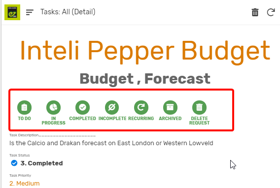
Is it possible to change the colour of action icons in the same way I was able to change them shown in Field Task Status (Where there is a blue icon instead of green)?
- Labels:
-
Automation
-
UX
- Mark as New
- Bookmark
- Subscribe
- Mute
- Subscribe to RSS Feed
- Permalink
- Report Inappropriate Content
- Mark as New
- Bookmark
- Subscribe
- Mute
- Subscribe to RSS Feed
- Permalink
- Report Inappropriate Content
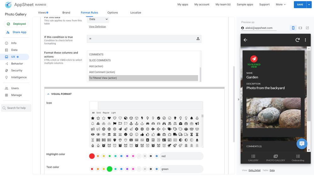
Yes you can change them with the Format Rule
- Mark as New
- Bookmark
- Subscribe
- Mute
- Subscribe to RSS Feed
- Permalink
- Report Inappropriate Content
- Mark as New
- Bookmark
- Subscribe
- Mute
- Subscribe to RSS Feed
- Permalink
- Report Inappropriate Content
I do not seem to find a way to do this. I am able to change the icon directly on the action setup, but I do not see a way on how to change the color of actions on the format rule.
Can you send a screen shot on how to do this in format rules.
- Mark as New
- Bookmark
- Subscribe
- Mute
- Subscribe to RSS Feed
- Permalink
- Report Inappropriate Content
- Mark as New
- Bookmark
- Subscribe
- Mute
- Subscribe to RSS Feed
- Permalink
- Report Inappropriate Content

- Mark as New
- Bookmark
- Subscribe
- Mute
- Subscribe to RSS Feed
- Permalink
- Report Inappropriate Content
- Mark as New
- Bookmark
- Subscribe
- Mute
- Subscribe to RSS Feed
- Permalink
- Report Inappropriate Content
Hi Aleksi,
I have a thumbs up action icon (which is only blue by default) but I just want to change its colour to green…So I went to format rules and put the same action but change to green. However, the overlay action is still blue. There is a condition for this action to be shown or applicable.
Thanks
-j- erry
I have observed that the changed action colour through formatting rule is applicable only if icon is displayed prominent. The formatting rule does not apply if the action is in overalay
- Mark as New
- Bookmark
- Subscribe
- Mute
- Subscribe to RSS Feed
- Permalink
- Report Inappropriate Content
- Mark as New
- Bookmark
- Subscribe
- Mute
- Subscribe to RSS Feed
- Permalink
- Report Inappropriate Content
- Mark as New
- Bookmark
- Subscribe
- Mute
- Subscribe to RSS Feed
- Permalink
- Report Inappropriate Content
- Mark as New
- Bookmark
- Subscribe
- Mute
- Subscribe to RSS Feed
- Permalink
- Report Inappropriate Content
Thanks Marc!
- Mark as New
- Bookmark
- Subscribe
- Mute
- Subscribe to RSS Feed
- Permalink
- Report Inappropriate Content
- Mark as New
- Bookmark
- Subscribe
- Mute
- Subscribe to RSS Feed
- Permalink
- Report Inappropriate Content
Actually this is not a bug. The functionality is decided in the past and is coming from the design. I don’t remember the exact reason but we try to avoid the Christmas tree effect.
- Mark as New
- Bookmark
- Subscribe
- Mute
- Subscribe to RSS Feed
- Permalink
- Report Inappropriate Content
- Mark as New
- Bookmark
- Subscribe
- Mute
- Subscribe to RSS Feed
- Permalink
- Report Inappropriate Content
Christmas tree effect means if we use too many colours, it will affect the look? I wanted to use red and green to reduce human mistake in clicking action buttons.
- Mark as New
- Bookmark
- Subscribe
- Mute
- Subscribe to RSS Feed
- Permalink
- Report Inappropriate Content
- Mark as New
- Bookmark
- Subscribe
- Mute
- Subscribe to RSS Feed
- Permalink
- Report Inappropriate Content
Bumping this…
Isn’t it our part, as developers, to decide whether or not colours are useful (e.g. decrease confusion/draw appropriate attention) or gaudy (e.g. christmas tree effect)?
- Mark as New
- Bookmark
- Subscribe
- Mute
- Subscribe to RSS Feed
- Permalink
- Report Inappropriate Content
- Mark as New
- Bookmark
- Subscribe
- Mute
- Subscribe to RSS Feed
- Permalink
- Report Inappropriate Content
Also bumping this. Rationale is we want the overlay button in Yellow so that users are reminded to press it to send a quote after they add items into a subtable. Since normal action butons are at the top and the subtable is at the bottom
- Mark as New
- Bookmark
- Subscribe
- Mute
- Subscribe to RSS Feed
- Permalink
- Report Inappropriate Content
- Mark as New
- Bookmark
- Subscribe
- Mute
- Subscribe to RSS Feed
- Permalink
- Report Inappropriate Content
I also think the designer/developer of the app should be able to decide wether changing color is or is not a problem for their user. While I can see the “Christmas tree” concern there are also many other user cases where an overlay icon with a different color could have a lot of meaning. This would depend of the specific user experience that is created for that user. I don’t think it’s a good idea for appsheet to limit this to only prominent icons.
- Mark as New
- Bookmark
- Subscribe
- Mute
- Subscribe to RSS Feed
- Permalink
- Report Inappropriate Content
- Mark as New
- Bookmark
- Subscribe
- Mute
- Subscribe to RSS Feed
- Permalink
- Report Inappropriate Content
Also, what is the difference between a Christmas-tree effect along the side vs along the top?? ![]()
-
Account
1,676 -
App Management
3,097 -
AppSheet
1 -
Automation
10,318 -
Bug
981 -
Data
9,675 -
Errors
5,731 -
Expressions
11,776 -
General Miscellaneous
1 -
Google Cloud Deploy
1 -
image and text
1 -
Integrations
1,607 -
Intelligence
578 -
Introductions
85 -
Other
2,901 -
Photos
1 -
Resources
537 -
Security
827 -
Templates
1,307 -
Users
1,558 -
UX
9,109
- « Previous
- Next »
| User | Count |
|---|---|
| 39 | |
| 29 | |
| 23 | |
| 23 | |
| 13 |

 Twitter