- AppSheet
- AppSheet Forum
- AppSheet Q&A
- New Format randomly appearing and making actions g...
- Subscribe to RSS Feed
- Mark Topic as New
- Mark Topic as Read
- Float this Topic for Current User
- Bookmark
- Subscribe
- Mute
- Printer Friendly Page
- Mark as New
- Bookmark
- Subscribe
- Mute
- Subscribe to RSS Feed
- Permalink
- Report Inappropriate Content
- Mark as New
- Bookmark
- Subscribe
- Mute
- Subscribe to RSS Feed
- Permalink
- Report Inappropriate Content
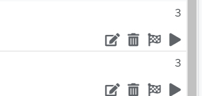
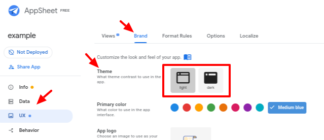
My app looks completely different now and my actions are all grey and not the mildly dark blue that my brand color is?
Solved! Go to Solution.
- Mark as New
- Bookmark
- Subscribe
- Mute
- Subscribe to RSS Feed
- Permalink
- Report Inappropriate Content
- Mark as New
- Bookmark
- Subscribe
- Mute
- Subscribe to RSS Feed
- Permalink
- Report Inappropriate Content
Thanks everyone for all the feedback. I was out for the past week or so and just getting caught up. I hear you on having a CHOICE on all these changes we’ve been pushing (font size, row height, content alignment, colors)… this is something as AppSheet we have a lot of room for improvement and I can’t wait to get you all those features that will make your experience as Editors much smoother and your apps getting the look and feel you want them to have. I will be sharing this internally as well ![]() .
.
- Mark as New
- Bookmark
- Subscribe
- Mute
- Subscribe to RSS Feed
- Permalink
- Report Inappropriate Content
- Mark as New
- Bookmark
- Subscribe
- Mute
- Subscribe to RSS Feed
- Permalink
- Report Inappropriate Content
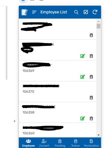
UPDATE:It only actions that are the same as my brand color??
- Mark as New
- Bookmark
- Subscribe
- Mute
- Subscribe to RSS Feed
- Permalink
- Report Inappropriate Content
- Mark as New
- Bookmark
- Subscribe
- Mute
- Subscribe to RSS Feed
- Permalink
- Report Inappropriate Content
As I understand it, as part of the “Material Design” redesign effort, all icons will be given your theme color. You’ll have to use format rules to change the color.
- Mark as New
- Bookmark
- Subscribe
- Mute
- Subscribe to RSS Feed
- Permalink
- Report Inappropriate Content
- Mark as New
- Bookmark
- Subscribe
- Mute
- Subscribe to RSS Feed
- Permalink
- Report Inappropriate Content
But this is the opposite? everything is being given gray that is my theme color.
Wait given the theme color?
- Mark as New
- Bookmark
- Subscribe
- Mute
- Subscribe to RSS Feed
- Permalink
- Report Inappropriate Content
- Mark as New
- Bookmark
- Subscribe
- Mute
- Subscribe to RSS Feed
- Permalink
- Report Inappropriate Content
- Mark as New
- Bookmark
- Subscribe
- Mute
- Subscribe to RSS Feed
- Permalink
- Report Inappropriate Content
- Mark as New
- Bookmark
- Subscribe
- Mute
- Subscribe to RSS Feed
- Permalink
- Report Inappropriate Content
So I have to make format rules now for every action, for every table, in every app i own?
- Mark as New
- Bookmark
- Subscribe
- Mute
- Subscribe to RSS Feed
- Permalink
- Report Inappropriate Content
- Mark as New
- Bookmark
- Subscribe
- Mute
- Subscribe to RSS Feed
- Permalink
- Report Inappropriate Content
Yep!
- Mark as New
- Bookmark
- Subscribe
- Mute
- Subscribe to RSS Feed
- Permalink
- Report Inappropriate Content
- Mark as New
- Bookmark
- Subscribe
- Mute
- Subscribe to RSS Feed
- Permalink
- Report Inappropriate Content
I have 24 Deployed Apps, 32 Prototypes, and am co-authored on 23 more apps. So I have to go through all 56 of my apps and for all the co-authored ones get my coworkers or myself to make format rules for all of these things?
I would much rather stick to the much uglier non material redesign layout than this…
- Mark as New
- Bookmark
- Subscribe
- Mute
- Subscribe to RSS Feed
- Permalink
- Report Inappropriate Content
- Mark as New
- Bookmark
- Subscribe
- Mute
- Subscribe to RSS Feed
- Permalink
- Report Inappropriate Content
Yep!
- Mark as New
- Bookmark
- Subscribe
- Mute
- Subscribe to RSS Feed
- Permalink
- Report Inappropriate Content
- Mark as New
- Bookmark
- Subscribe
- Mute
- Subscribe to RSS Feed
- Permalink
- Report Inappropriate Content
Has this change been rolled out to all users? I still see my brand color for actions, which is what I want.
@morgan @macastan @Mike_Moss @praveen
If you are changing all actions to default to the theme color, please allow us to set ONE SWITCH and have it show our BRAND color instead. I don’t have any thing like the number of apps that @Austin_Lambeth has but want to keep my brand showing throughout the app. I cannot afford the overhead that format rules will add to slow down my app.
- Mark as New
- Bookmark
- Subscribe
- Mute
- Subscribe to RSS Feed
- Permalink
- Report Inappropriate Content
- Mark as New
- Bookmark
- Subscribe
- Mute
- Subscribe to RSS Feed
- Permalink
- Report Inappropriate Content
It is not rolled out to all users, I am the only one on our 4 person team that has these changes atm.
- Mark as New
- Bookmark
- Subscribe
- Mute
- Subscribe to RSS Feed
- Permalink
- Report Inappropriate Content
- Mark as New
- Bookmark
- Subscribe
- Mute
- Subscribe to RSS Feed
- Permalink
- Report Inappropriate Content
It just hit me today. I do not like the gray action buttons. I really hope they make a setting to keep them the branded color or use the theme.
- Mark as New
- Bookmark
- Subscribe
- Mute
- Subscribe to RSS Feed
- Permalink
- Report Inappropriate Content
- Mark as New
- Bookmark
- Subscribe
- Mute
- Subscribe to RSS Feed
- Permalink
- Report Inappropriate Content
Amen.
Just so I understand; is it “material design” practice to default all interaction methods (read: buttons) grey?
- Mark as New
- Bookmark
- Subscribe
- Mute
- Subscribe to RSS Feed
- Permalink
- Report Inappropriate Content
- Mark as New
- Bookmark
- Subscribe
- Mute
- Subscribe to RSS Feed
- Permalink
- Report Inappropriate Content
As per my understanding, the website below seems to be Google’s guidelines of the material design.
Since AppSheet is part of Google now, I believe the AppSheet UI/UX guidelines will be based on the guidelines mentioned on this website.
- Mark as New
- Bookmark
- Subscribe
- Mute
- Subscribe to RSS Feed
- Permalink
- Report Inappropriate Content
- Mark as New
- Bookmark
- Subscribe
- Mute
- Subscribe to RSS Feed
- Permalink
- Report Inappropriate Content
Skimming the site @Suvrutt_Gurjar shared, I’d say no. Material Design is a collection of guidelines, not rules. MD suggests inactive elements should be dimmed, but MD also emphasizes usability and branding.
- Mark as New
- Bookmark
- Subscribe
- Mute
- Subscribe to RSS Feed
- Permalink
- Report Inappropriate Content
- Mark as New
- Bookmark
- Subscribe
- Mute
- Subscribe to RSS Feed
- Permalink
- Report Inappropriate Content
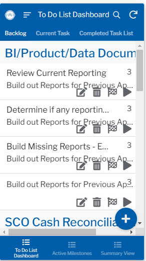
I believe I saw something that said the reason for the change was that people found the action colors distracting because they were so bright or what not. My counter argument to that is now actions are too hard to see if they are the theme color. Ignore how the re-design completely messed up my text sizing (thats not the point of this post and in my opinion what has been done outside of the gray actions is absolutely amazing and wonderful), my actions are now the same/almost the same color as my text. Given a large small text table I might not even notice inline actions due to them all being the same color. This method of changing just trades one problem where you need to apply a format rule to every action for another situation where you would need a format rule for every action. I think the best solution would be make a setting where we can control all action colors in 1 spot. Global format rules or just like global action and text colors. This way we don’t have to use so many format rules all over the place for either boat.
- Mark as New
- Bookmark
- Subscribe
- Mute
- Subscribe to RSS Feed
- Permalink
- Report Inappropriate Content
- Mark as New
- Bookmark
- Subscribe
- Mute
- Subscribe to RSS Feed
- Permalink
- Report Inappropriate Content

- Mark as New
- Bookmark
- Subscribe
- Mute
- Subscribe to RSS Feed
- Permalink
- Report Inappropriate Content
- Mark as New
- Bookmark
- Subscribe
- Mute
- Subscribe to RSS Feed
- Permalink
- Report Inappropriate Content
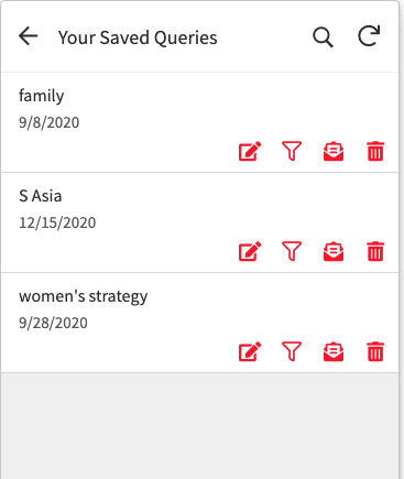
If we got access to these two-toned icons:
And if those icons did app theme for the outline (dark and light), and then theme color for 2nd tone by default, a lot of people would probably be happy.
- Mark as New
- Bookmark
- Subscribe
- Mute
- Subscribe to RSS Feed
- Permalink
- Report Inappropriate Content
- Mark as New
- Bookmark
- Subscribe
- Mute
- Subscribe to RSS Feed
- Permalink
- Report Inappropriate Content
Thanks everyone for all the feedback. I was out for the past week or so and just getting caught up. I hear you on having a CHOICE on all these changes we’ve been pushing (font size, row height, content alignment, colors)… this is something as AppSheet we have a lot of room for improvement and I can’t wait to get you all those features that will make your experience as Editors much smoother and your apps getting the look and feel you want them to have. I will be sharing this internally as well ![]() .
.
- Mark as New
- Bookmark
- Subscribe
- Mute
- Subscribe to RSS Feed
- Permalink
- Report Inappropriate Content
- Mark as New
- Bookmark
- Subscribe
- Mute
- Subscribe to RSS Feed
- Permalink
- Report Inappropriate Content
Thank you Maria for hearing our concerns.
-
Account
1,677 -
App Management
3,099 -
AppSheet
1 -
Automation
10,322 -
Bug
983 -
Data
9,676 -
Errors
5,733 -
Expressions
11,779 -
General Miscellaneous
1 -
Google Cloud Deploy
1 -
image and text
1 -
Integrations
1,610 -
Intelligence
578 -
Introductions
85 -
Other
2,904 -
Photos
1 -
Resources
538 -
Security
827 -
Templates
1,309 -
Users
1,559 -
UX
9,110
- « Previous
- Next »
| User | Count |
|---|---|
| 43 | |
| 28 | |
| 24 | |
| 24 | |
| 13 |

 Twitter