- AppSheet
- Release Notes & Announcements
- Announcements
- Re: Some visual changes to deck view
- Subscribe to RSS Feed
- Mark Topic as New
- Mark Topic as Read
- Float this Topic for Current User
- Bookmark
- Subscribe
- Mute
- Printer Friendly Page
- Mark as New
- Bookmark
- Subscribe
- Mute
- Subscribe to RSS Feed
- Permalink
- Report Inappropriate Content
- Mark as New
- Bookmark
- Subscribe
- Mute
- Subscribe to RSS Feed
- Permalink
- Report Inappropriate Content
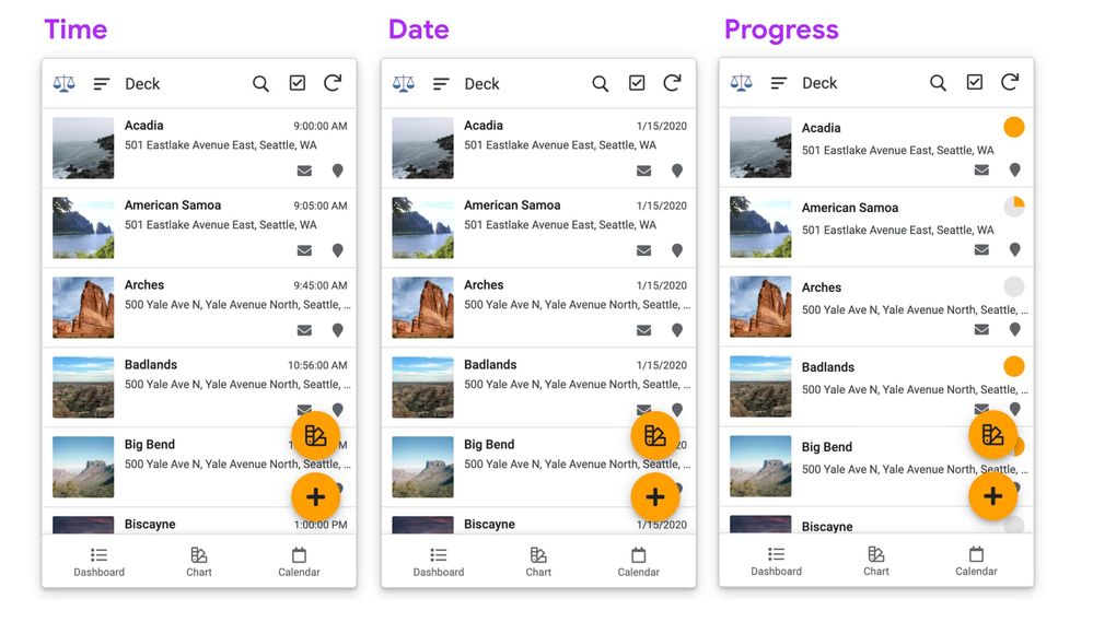
We’ve got a couple of changes rolling out for deck view. These are visual changes, plus one change in how we render a data type when set as a header (latLong).
1. Increased type contrast
- We’ve given the primary header a medium font weight, and reduced the secondary header by the equivalent of 1px. This gives a little more distinction between primary and secondary text.
2. Summary column width
- We’ve widened the column a tiny bit, and reduced the font size by 1px. This should allow the display of a standard date or timestamp format when the app is using the base (default) font size of 18.
- If you’re using the progress data type for the summary column, the harvey balls (progress circles) have been reduced by a few pixels, allowing them a little more breathing room from text that runs below them.
3. Email rendering bug: removed a break in email address when used in the summary column. Breaking to 2 lines was overlapping with secondary header text.

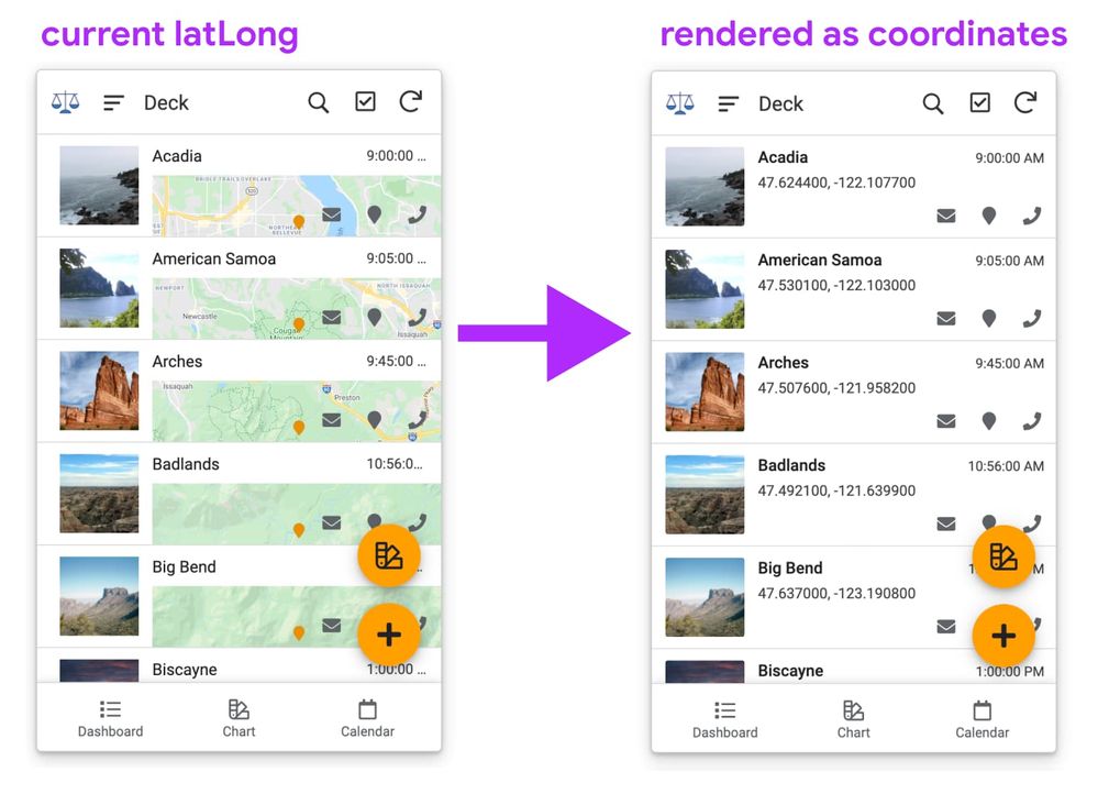
4. latLong display in deck view, when set as a header
- We’re looking at rendering latLong as coordinates for headers. Currently, the map chunk that gets rendered seems too small to be visually distinguished from the other rows, and is awkwardly placed behind the actions on mobile. One of the keys of deck view is visible actions per row, and this doesn’t play as well with that.
We’d rather you can see the lat / long coordinates as legible text in this form factor.
Anyone have examples where they’re using latLong maps embedded in deck rows?
- Let us know the context and the use case for a map in the deck view row, if you have one, and what problem it’s trying to solve.

Those are the changes, and wanted to give everyone a heads up.
Information wanted: use of Deck views on desktop
One thing that’s helpful is knowing about use of deck views, specifically in desktop viewports.
- In which context are you using it?
Any examples (screenshots) are always helpful to see…
I ask because we’re thinking that for wide viewports, we could split the deck rows into a couple columns, similar to cards, allowing you to both see more items, and keeping the actions closer to the primary and secondary text.
- Labels:
-
UX
- Mark as New
- Bookmark
- Subscribe
- Mute
- Subscribe to RSS Feed
- Permalink
- Report Inappropriate Content
- Mark as New
- Bookmark
- Subscribe
- Mute
- Subscribe to RSS Feed
- Permalink
- Report Inappropriate Content
This is currently in the Preview Program - please let us know if you have any feedback or comments!
- Mark as New
- Bookmark
- Subscribe
- Mute
- Subscribe to RSS Feed
- Permalink
- Report Inappropriate Content
- Mark as New
- Bookmark
- Subscribe
- Mute
- Subscribe to RSS Feed
- Permalink
- Report Inappropriate Content
Another Deck View visual issue I re-encountered yesterday. Increasing number of actions icons in action bar. It currently allows 7 (was 5) but there is room in the smallest form factor for 3 more. The max number should be, IMHO, based on the screen/window size.
But the biggest problem is that if you exceed this max number, the beginning icons are simply “pushed” out of the queue. This means we have reduced control over position and which icons remain visible.
I raised this issue 2 YEARS ago with the feature request below. Please consider placing it on your radar for improvement.
- Mark as New
- Bookmark
- Subscribe
- Mute
- Subscribe to RSS Feed
- Permalink
- Report Inappropriate Content
- Mark as New
- Bookmark
- Subscribe
- Mute
- Subscribe to RSS Feed
- Permalink
- Report Inappropriate Content
Thanks for raising this issue again - I’ve created an internal ticket so we don’t lose track of this!
- Mark as New
- Bookmark
- Subscribe
- Mute
- Subscribe to RSS Feed
- Permalink
- Report Inappropriate Content
- Mark as New
- Bookmark
- Subscribe
- Mute
- Subscribe to RSS Feed
- Permalink
- Report Inappropriate Content
Not working either on nested columns
- Mark as New
- Bookmark
- Subscribe
- Mute
- Subscribe to RSS Feed
- Permalink
- Report Inappropriate Content
- Mark as New
- Bookmark
- Subscribe
- Mute
- Subscribe to RSS Feed
- Permalink
- Report Inappropriate Content
This is very much true.
- Mark as New
- Bookmark
- Subscribe
- Mute
- Subscribe to RSS Feed
- Permalink
- Report Inappropriate Content
- Mark as New
- Bookmark
- Subscribe
- Mute
- Subscribe to RSS Feed
- Permalink
- Report Inappropriate Content
Escalated.
-
Account
3 -
Announcements
30 -
App Management
8 -
Automation
30 -
Data
31 -
Errors
17 -
Expressions
21 -
Integrations
24 -
Intelligence
5 -
Other
15 -
Resources
15 -
Security
5 -
Templates
13 -
Users
7 -
UX
34

 Twitter