- AppSheet
- AppSheet Forum
- AppSheet Q&A
- Re: Customize the Card Percent Circle Bar
- Subscribe to RSS Feed
- Mark Topic as New
- Mark Topic as Read
- Float this Topic for Current User
- Bookmark
- Subscribe
- Mute
- Printer Friendly Page
- Mark as New
- Bookmark
- Subscribe
- Mute
- Subscribe to RSS Feed
- Permalink
- Report Inappropriate Content
- Mark as New
- Bookmark
- Subscribe
- Mute
- Subscribe to RSS Feed
- Permalink
- Report Inappropriate Content
Hi All!
I have some display issues with circle bars in my app.
I have three tables with a percent columns in each table. The percent for each table is calculated by a cell formula in Spreadsheet.
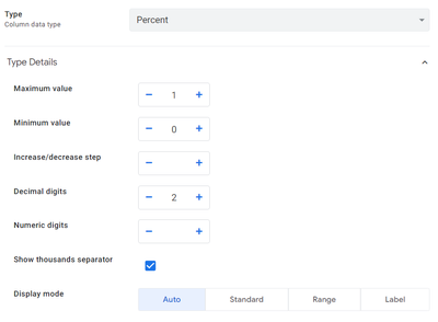
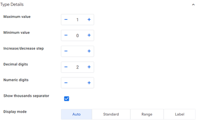
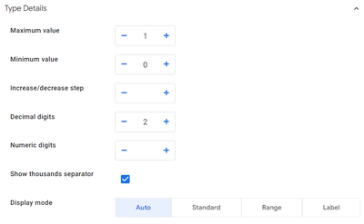
In card views there are displayed in different ways with the same settings. Is there any way to customize circle bars? I'd like to display them as in the first row, where the blue part is for the current percent and when the progress is 100% - the circle is formated in green colour.
| Display | Column settings |

| 
|

| 
|

| 
|
Solved! Go to Solution.
- Mark as New
- Bookmark
- Subscribe
- Mute
- Subscribe to RSS Feed
- Permalink
- Report Inappropriate Content
- Mark as New
- Bookmark
- Subscribe
- Mute
- Subscribe to RSS Feed
- Permalink
- Report Inappropriate Content
Consider using https://quickchart.io/gallery/ if Appsheet graphs don't do exactly what you need
Simon, 1minManager.com
- Mark as New
- Bookmark
- Subscribe
- Mute
- Subscribe to RSS Feed
- Permalink
- Report Inappropriate Content
- Mark as New
- Bookmark
- Subscribe
- Mute
- Subscribe to RSS Feed
- Permalink
- Report Inappropriate Content
Thank you!
This works:
-
!
1 -
Account
1,681 -
App Management
3,118 -
AppSheet
1 -
Automation
10,342 -
Bug
988 -
Data
9,700 -
Errors
5,750 -
Expressions
11,815 -
General Miscellaneous
1 -
Google Cloud Deploy
1 -
image and text
1 -
Integrations
1,615 -
Intelligence
579 -
Introductions
85 -
Other
2,919 -
Photos
1 -
Resources
541 -
Security
830 -
Templates
1,309 -
Users
1,562 -
UX
9,127
- « Previous
- Next »
| User | Count |
|---|---|
| 41 | |
| 36 | |
| 28 | |
| 23 | |
| 16 |

 Twitter