- AppSheet
- AppSheet Forum
- AppSheet Q&A
- Re: Displaying Duration as a chart
- Subscribe to RSS Feed
- Mark Topic as New
- Mark Topic as Read
- Float this Topic for Current User
- Bookmark
- Subscribe
- Mute
- Printer Friendly Page
- Mark as New
- Bookmark
- Subscribe
- Mute
- Subscribe to RSS Feed
- Permalink
- Report Inappropriate Content
- Mark as New
- Bookmark
- Subscribe
- Mute
- Subscribe to RSS Feed
- Permalink
- Report Inappropriate Content
Hi all,
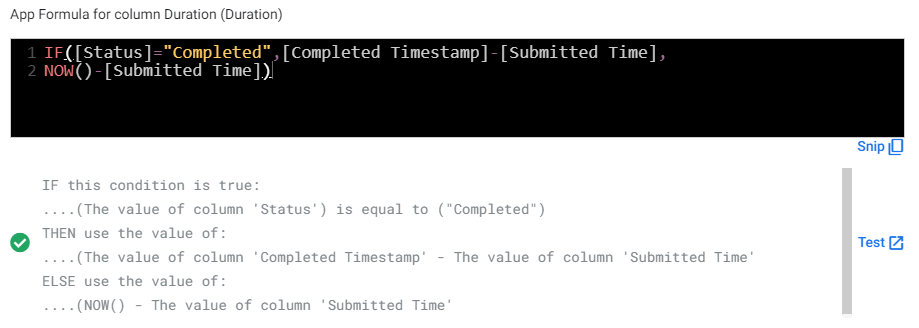
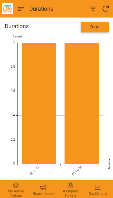
So I have a Virtual Column that calculates the duration between 2 DateTime Columns, basically [endtime]-[starttime], my problem is the requirement is to display this duration in a chart, preferably a histogram, but I am unable to do so as histrogram’s Y axis is only count am I doing something wrong is there no other way, what should I do about this, the requirement specifically calls for graphical representation of the durations (so they can quickly pick out records with high durations and look into it)
This is what I get
Any help will be greatly appreciated,
Thank you
- Mark as New
- Bookmark
- Subscribe
- Mute
- Subscribe to RSS Feed
- Permalink
- Report Inappropriate Content
- Mark as New
- Bookmark
- Subscribe
- Mute
- Subscribe to RSS Feed
- Permalink
- Report Inappropriate Content
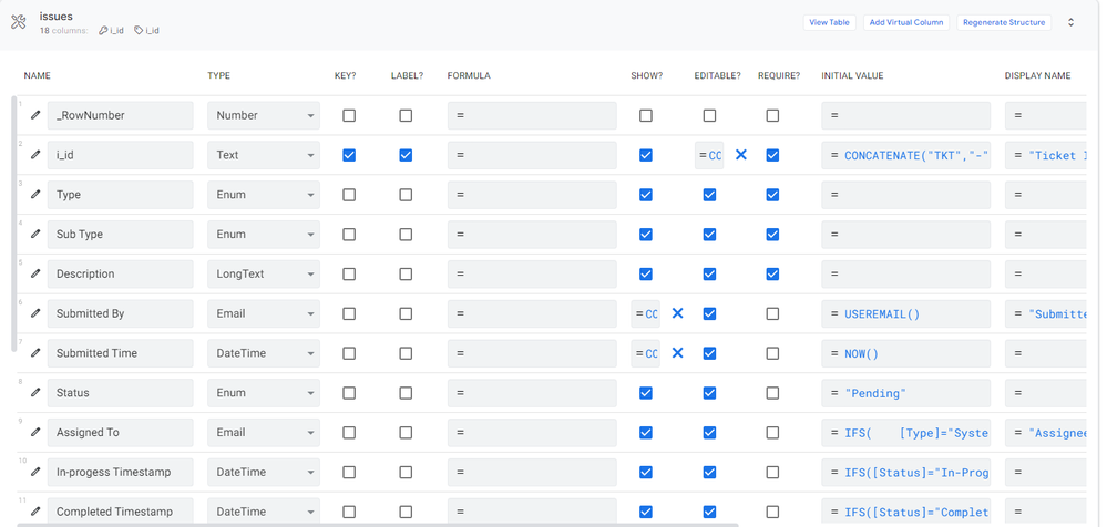
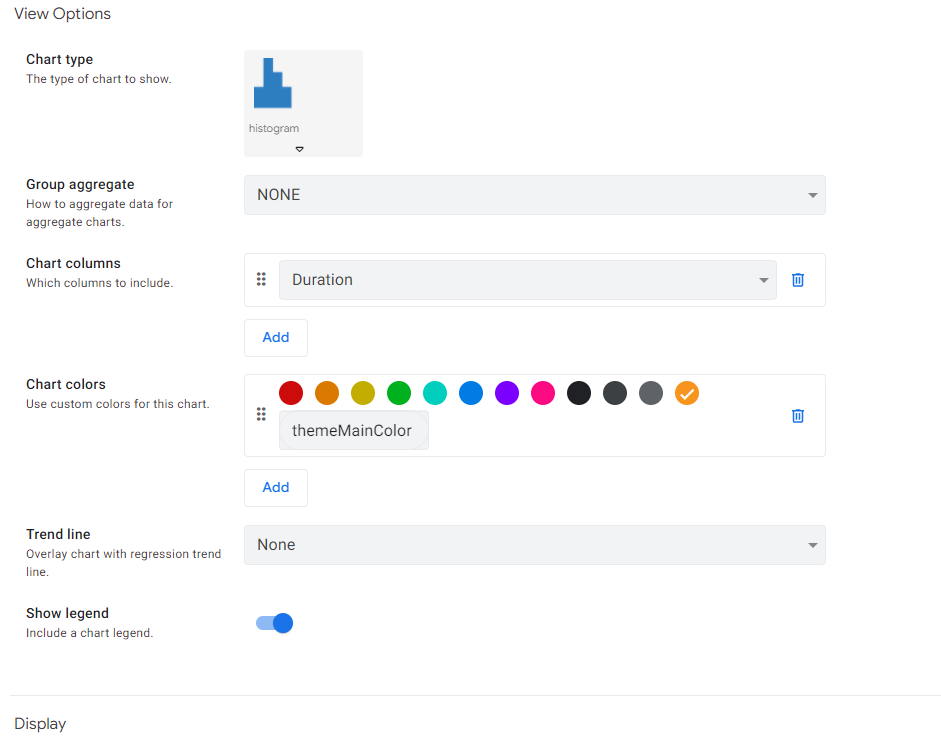
Post the table schema as well as a screenshot from the chart’s config
- Mark as New
- Bookmark
- Subscribe
- Mute
- Subscribe to RSS Feed
- Permalink
- Report Inappropriate Content
- Mark as New
- Bookmark
- Subscribe
- Mute
- Subscribe to RSS Feed
- Permalink
- Report Inappropriate Content
- Mark as New
- Bookmark
- Subscribe
- Mute
- Subscribe to RSS Feed
- Permalink
- Report Inappropriate Content
- Mark as New
- Bookmark
- Subscribe
- Mute
- Subscribe to RSS Feed
- Permalink
- Report Inappropriate Content
Try Column Series chart
- Mark as New
- Bookmark
- Subscribe
- Mute
- Subscribe to RSS Feed
- Permalink
- Report Inappropriate Content
- Mark as New
- Bookmark
- Subscribe
- Mute
- Subscribe to RSS Feed
- Permalink
- Report Inappropriate Content
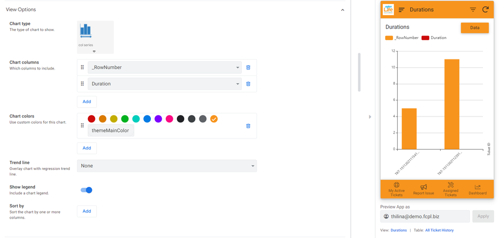
Then this is the result, honestly chart view has been the bane of my existence could never get it to do what I wanted @SkrOYC
Duration is blank, is this due to duration being calculated in a Virtual Column?
- Mark as New
- Bookmark
- Subscribe
- Mute
- Subscribe to RSS Feed
- Permalink
- Report Inappropriate Content
- Mark as New
- Bookmark
- Subscribe
- Mute
- Subscribe to RSS Feed
- Permalink
- Report Inappropriate Content
Personally, I translate duration to a decimal (01:30:00 to 1,5 for example) in order to see it on a chart.
Also, charting is not so good on AppSheet.
It’s replacement is on development.
You could give it a try
- Mark as New
- Bookmark
- Subscribe
- Mute
- Subscribe to RSS Feed
- Permalink
- Report Inappropriate Content
- Mark as New
- Bookmark
- Subscribe
- Mute
- Subscribe to RSS Feed
- Permalink
- Report Inappropriate Content
Please do tell what kind of expression you use to turn a duration to a decimal? this could prove useful in the future ![]() thank you anyways for trying
thank you anyways for trying
- Mark as New
- Bookmark
- Subscribe
- Mute
- Subscribe to RSS Feed
- Permalink
- Report Inappropriate Content
- Mark as New
- Bookmark
- Subscribe
- Mute
- Subscribe to RSS Feed
- Permalink
- Report Inappropriate Content
It is the simplest one
TOTALMINUTES([HOURS])/60
- Mark as New
- Bookmark
- Subscribe
- Mute
- Subscribe to RSS Feed
- Permalink
- Report Inappropriate Content
- Mark as New
- Bookmark
- Subscribe
- Mute
- Subscribe to RSS Feed
- Permalink
- Report Inappropriate Content
This was quite helpful thank you very much ❤️
-
!
1 -
Account
1,682 -
App Management
3,121 -
AppSheet
1 -
Automation
10,346 -
Bug
989 -
Data
9,703 -
Errors
5,753 -
Expressions
11,819 -
General Miscellaneous
1 -
Google Cloud Deploy
1 -
image and text
1 -
Integrations
1,615 -
Intelligence
579 -
Introductions
85 -
Other
2,922 -
Photos
1 -
Resources
541 -
Security
830 -
Templates
1,311 -
Users
1,562 -
UX
9,128
- « Previous
- Next »
| User | Count |
|---|---|
| 40 | |
| 35 | |
| 30 | |
| 23 | |
| 17 |

 Twitter