February 23, 2023

lizlynch
Staff

Deployment Time: 1:00 PM PST

Features & enhancements

None

Bug fixes

None

Rollout changes

Item Description
Bug For Desktop UI (preview), fixed inconsistent expression results in Desktop forms. Certain expressions were producing different results in Desktop mode, specifically those that involve searches (e.g. SELECT() or LOOKUP()) over the same table currently being edited in the form. With Desktop mode off, the pending changes in the unsaved form are not included in the result. With Desktop mode on, they were being included. After this change, they will again be omitted from the result.

New: Deployed to 100% of free users and 25% of paid users.
Previous: Deployed to 100% of free users.

Update: As part of this rollout, there is a fix for INPUT() modal form not showing changed values. The value would appear to revert to its initial state after focus leaves the input. This issue has been fixed.

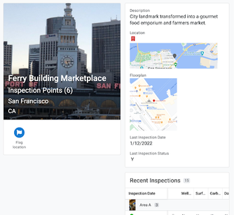
Enhancement For desktop UI (preview), there is an update to detail views. For some backgrounds, we wanted to follow UX best practices around legibility for out-of-the-box detail views, and also provide some consistency and better alignment with detail views that are organized with SHOW type columns.

There are two main changes:

  1. New non-card header - in a detail view if there are headers, a header image, or prominent actions specified and Use card layout is not toggled.
    For example:
    lizlynch_0-1677533746533.png
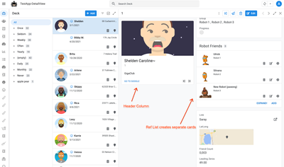
  2. Multi-columns + cards if view width > 768px
    (Previously this was only enabled if SHOW type headers were present)
    • Actions, headers, and header image are in the "header column"
    • Ref lists break into their own cards

For example:

lizlynch_1-1677187737622.png

If you have any comments on these changes, please let us know!

New: Deployed to 100% of free users and 50% paid users.
Previous: Deployed to 100% of free users and 25% paid users.

Preview announcements

Preview feature releases enable you to try out new app features that are not yet fully supported. See Product launch stages.

  • No new preview features were released today.

What's currently available in Preview?

The following tables summarize the preview features that are currently available.

Item Description
Feature AppSheet databases (Preview)

The new AppSheet database feature is now in preview release. An AppSheet database is a first-party, native data source for organizing and managing data powering AppSheet apps. An AppSheet database provides an easy and efficient way to build data models for any AppSheet app without needing to use an external data source solution such as cloud-based spreadsheets or databases.

For more information, see:

Enhancement Navigation improvements in AppSheet app editor (Preview)

The app editor includes navigation improvements, currently in preview, to facilitate the configuration of specific features. For example, the new Settings section in the left navigation gathers together all app-wide settings and makes it more intuitive for all app creators to find these types of settings.

For more information, see:

Enhancement Additional usability improvements in AppSheet app editor (Preview)

The app editor includes navigation and app setting improvements, currently in preview, to facilitate the configuration of specific features. The navigation improvements now include a secondary navigation panel that lets you quickly scan all of your components. In addition, there are more direct links in your View component to the table, column, or action that you want to check or edit. Finally, error and warning messages are more prominently displayed in the app.

For more information, see:

Feature AppSheet apps for desktop users (Preview)

The new desktop design, currently in preview, is optimized for desktop browsers, presenting a more complete view of information with a consistent organization and structure. The new desktop design lets users navigate their apps more easily and access information in context, and provides an efficient way to edit existing records without losing context. The legacy desktop design, enabled by default, provides an experience similar to the mobile and tablet device.

For more information, see:

The following features require opt-in to the AppSheet preview program. The AppSheet Preview program lets app creators try out new app features that are not yet fully supported.

Item Description
Feature Chat apps with AppSheet (Preview)

Create and publish Chat apps using AppSheet. Chat apps are web applications or services that run in Google Chat. By creating a Chat app with AppSheet, you enable users to interact directly with your app in Google Chat rather than clicking out to view the AppSheet app in a separate window.

See:

Feature Table view

Table View now supports freezing the first column while scrolling horizontally. For details, see Freezing the first Column of a Table View - in Preview Program.

Feature Chart Editor

App Creators can now make use of our new chart editor and the new and improved charts it can create. Learn more.

Feature Detail views

Rich text formatting is now available in Detail views. For details, see this announcement in the community.

3 9 347
Authors
9 Comments
EliK
Silver 1
Silver 1

@lizlynch the detail card view update just hit my account, and I hate it. It results in a lot of wasted space and squishes the detail views into just a quarter of the  screen space. Is there anyway to disable it for my account? Or on an app by app basis?

lizlynch
Staff

@EliK - Let me find out. But just FYI, the team is actively working on providing options to improve the experience. See:
https://www.googlecloudcommunity.com/gc/Announcements/In-Preview-New-UI-design-for-desktop-users/m-p...

SkrOYC
Gold 5
Gold 5

@lizlynch wrote:

For example:
lizlynch_0-1677187706073.png


Btw @lizlynch, this looks like multi-image support for header images as well as some sub-header stuff... comments?

Mike_Moss
Staff

Updated layout controls coming

@EliK The link that Liz posted explains the layout changes that you'll have two options:

  • A multicolumn view
  • A single column view

These will be options on each detail view within an app. That is, if you have dense detail records and a big monitor, you get more information with a multicolumn view. If you have a simple record with just several properties, you can choose to display a single column. 

EliK
Silver 1
Silver 1

@Mike_Moss I don't understand how that gives you more room for the details. I assume you mean that since the Header is in it's own column, that allows more space for the details. But the space lost underneath the header card is always going to be greater than the amount you save by putting the header card in it's own column. Dividing the header column will always make the detail column only half of the size, while the header card is always less than a quarter of the screen.

SkrOYC
Gold 5
Gold 5

Hi @Mike_Moss, I've been playing with the Desktop Mode for a little bit less than a year now (since the private preview) and I find the multi-column detail view to be good enough for me, I actually add a Show column at the beginning of all of my tables to make use of it.

Now, I've seen the same thing all other users "wasted" space below the header. My solution would be to allow us to chose another section to also be pinned, so that it's shown below the header section. This way we can add like a second image, some basic data, a related view, etc, that will always be there, basically having the same benefits of the header

Mike_Moss
Staff

Support for headers in detail views

Hi @SkrOYC ,

Some more things in the works here. Let's address them:

1. Multi-image support: This is something we're working on (no timeline at the moment). This post was not about this first item you remarked on.

2. Header and image support: This is something that we are releasing. Let's discuss.

Current header and image UI

Dynamic type resizing: AppSheet uses a dynamic sizing system to accommodate header text for multiple headers. We've found that this has quite a wide variance in type size when traversing records (i.e. long titles suddenly get way smaller than the previous record, and can keep jumping up and down in size as you navigate a split view. 

White text and a drop shadow: This works okay on dark images, but gets fairly illegible with lighter images and 'busy' background images. 

What's changing:

1. Stable type sizes for header hierarchy:  Rather than have large jumps in type size and placement, we use a left aligned series of headers to reduce the large visual variance we currently have.

2. Background contrast with a gradient: We're adding a dark-to-transparent gradient pinning the typography along the bottom of the image. So now you have both stable type sizing for header hierarchy (see above), but you have a more stable placement relative to the image with a gradient to provide contrast with the background, making it easer to read the headers with images of all types. We are continuing to evolve this with as many image contrast examples. 

When you have a single header it sits along the bottom left portion of the image, and builds upward with each extra header. 


lizlynch
Staff

@SkrOYC -  I updated the image (with Mike's help) to minimize confusion. 

Mike_Moss
Staff

Hi @SkrOYC ,

In regards to the 'gap' underneath the header card: 

  • We do have thoughts about allowing for more 'reserved / pinned' content in the detail pane.
  • Our first goal was to get a combination of stable areas (top left) with scrollable areas. Our default is not to fill the entire space. We'd rather consider that additional space intentional placement for the app creator. Again, considered for the future, not in the near future at the moment.